Part four
Leave a reply

Brief
Revisit one of the exercises on daylight, artificial light or controlled light from Part Four (Ex 4.1, Ex 4.2 or Ex 4.3) and develop it into a formal assignment submission. The submission requirement for this assignment is a set of between six and ten high-quality photographic prints. There are many ways to edit and the most valuable one is probably to show your work to friends, family and your OCA peers for feedback – you are guaranteed to discover something new in your work. Another tip is to pin the work up on the wall and live with a for a few days. ‘A Quick Guide to Editing Your Photo Series using Stickies’ on the IPO (Invisible Photographer Asia) website, but bear in mind that this is not a narrative assignment – you’re not required to produce a story.
http://invisiblephotographer.asia/2013/11/18/editing101-quickguidestickies/
Assessment of photography in any context is an assessment of images and accompanying words so please Include a written analysis of your work outlining:
I decided to develop my original exercise 4.2 Artificial Light .
At the end of that exercise I had taken a shot of a narrow lamplit street (Fig.16) at night and it reminded me of one of Christopher Doyles/Wong Kar Wai’s films. When I looked at it my image on screen, I was surprised at the different colours with the light on the left lighting up the side of a building in a different colour to the street lamps, all captured using auto white balance. I also noticed the wet foot prints in the foreground, which I hadn’t noticed when taking the shot. There is a person walking down the right hand side of the street close to the wall, making them look a bit furtive or maybe even a bit worried or scared. Perhaps I should have waited and taken the shot as they passed under the next lamp?

Img.16
When researching for exercise 4.2, I noted when Christopher Doyle explained how one of his scenes for the film “In the Mood for Love” came about.
“It didn’t happen because we thought it through. It happened because this space with this light, with this particular possibility gave us this moment”.
Rather than having thought out the scene first, then finding a location, the location was found, and it determined the scene. I found this idea fascinating as I had always thought that the scene was planned out in advance, then a suitable location found, rather than visa versa.
For the assignment I wondered if it would be possible to look for streets, where something about the location itself would allow additional creativity?
Image 16 also reminded me of the films of Alfred Hitchcock, although I couldn’t remember a scene in any of his films that was similar. I did a bit of searching and the only film still I came up with was from the start of the movie “The Wrong Man’ where Hitchcock himself is giving an introduction (Fig.1). The lighting is quite harsh, in contrast to the soft lighting often used by Christopher Doyle.

Fig.1 Alfred Hitchcock “The Wrong Man”
Lighting can be used to give a romantic feel, as in the movie “In the Mood for Love’ or a feeling of suspense, anxiety or fear. Fear of becoming a victim perhaps, or fear of being caught as a perpetrator.
I came across a still from the movie “The Third Man” (Fig.2) a 1949 film directed by Carol Reed, written by Graham Greene with cinematography by Robert Krasker.

Fig.2 The Third Man
Robert Krasker, an Australian cinematographer, was born in 1913. He worked on more than fifty films during his career, including “The Third Man” and “Brief Encounter”.
The Third Man was shot in several locations with most of the night time shots taken on the streets and in the sewers of Vienna.
Harsh lighting is very much a theme throughout the film, along with wet streets (causing refection), shadows projected onto walls and silhouettes of people lit by either unseen sources or lamplight (Fig.4,5).
The harsh lighting acts like a search light looking for an escaping prisoner and heightens sense of anxiety, fear and of “being caught”. The silhouettes give a sense of mystery, with the viewer not being able to see the person’s face clearly or anything else that might give them clues as to the person’s identity or intent.

Fig. 4
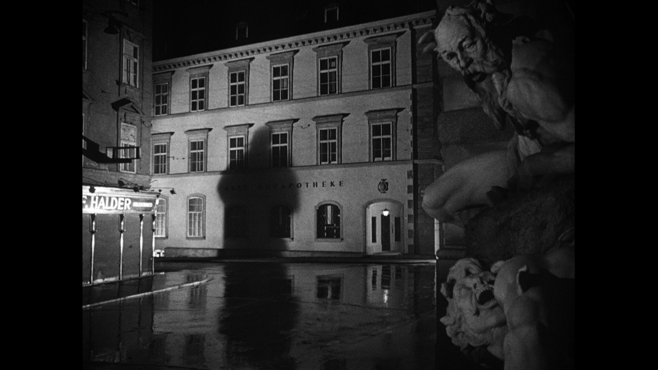
Fig. 5
Brief Encounter (1945) on the other hand was filmed using softer light (Fig 6,7). There are some similarities to The Third Man however, with shadows and some harsh light which makes for intense moments in the film (Fig. 6-9).

Fig.6

Fig.7

Fig.8

Fig.9
Although there are similarities between the two films Brief Encounter and The Third Man there are also similarities between “Brief Encounter”, “In the Mood for Love” (Fig. 10,11) and the photographs of Brasssai in his series “Paris by Night” (1936) (Fig.12). In Fig.11 from Brief Encounter the female face is softly but clearly lit while the male face is in the shadow, Fig.11 from ‘In the Mood for Love’ shows the same lighting being used along with a very similar framed shot.

Fig.10 In the Mood for Love

Fig.11 Brief Encounter

Fig.12
During my research, falling into the “Noir” genre was unavoidable although I didn’t want to go down that specific road. I am surprised at how much I’m getting out of the cinematography angle rather than the photographic. I think I have always tended to separate them in the past but now realise that that was a mistake!
When looking to set up and start planning some test shots, I was aware that trying to get the bright harsh light and potential strong shadows was going to be a challenge. I was relying on lamp light and other artificial lights for the softer shots. I came up with the idea of using car headlights, either from passing cars, if I can find the right location, or positioning my car so as to cast bright harsh light in the right direction.
I was surprised by my results for the first set of test shots. (Contact sheet 001)
I found a fairly open square that had different types of lighting and walls large enough to host shadows. I tried a variety of exposures so that I could compare them later. I also used the car headlights to throw some harsh, stronger light into the scene. This worked quite well and I used it to help create the shadows.
For image 0811 in contactSheet 001, I used a long exposure and asked a friend to walk under the lamp and away from me.
There was a fluorescent light on the other side of the arch which appeared very green (0773,0781,0782,) I rather liked this effect so didn’t try and change it leaving the white balance on Auto 2 which was giving nice results for the lamps and the headlights. Some of the shots were overexposed and some under. It was difficult to focus at times due to the lack of light. I didn’t want the shots to be particularly grainy, so kept the ISO at 3600.

ContactSheet-001
Converting them to black and white changed the atmosphere of the images to something a bit more sinister. In colour they are softer without a particularly threatening edge.

ContactSheet-002
There were several sources of light which caused the main shadow Images JLM0796 – JLM0800 to have a very indistinct edge, almost like movement blur. I was really looking for a stronger shadow.
I feel image 1 (JLM00811) has more impact in black and white. The wall and railings are clearer, leading the eye into the darkness. The figure blends better as he walks head down, into the darkness.

Img.1 _JLM0811BW 85mm, 1,3Sec, f/16, ISO 320
This was also the case for Img. 4 being in black and white, as it takes on a more sinister edge without the distraction of colour.

Img.4
Having looked at the initial images it occurred to me that because I had been influenced so much by film, I might unconciously be creating photographs that resemble film stills! Certainly Img.1 could have come from a movie. I like the fact that it is ambiguous and could be from movies of different genres. Romantic/Horror/Thriller………….
Doing a bit of research I came across a French science fiction still film by Chris Marker called La Jetee (1962) which is almost entirely made up of black and white photographs with a soundtrack and narrative. It was also the inspiration for the 1995 Terry Gillingham film “12 Monkeys”.
For this assignment it states that we are not required to create a story but I might be suggesting a story without meaning to!
For some of the shots I wasn’t able to control the light at all and had instead to use the light sources in different ways to create strong shadows and contrasting areas of light and dark. (ContactSheet-003)

ContactSheet-003
The slow shutter speed has given the lamp a soft look and a whisper of a person leaving the scene on the left side (JLM0820). I converted this to black and white to see how it would sit with the previous images. (Img.5). Although I prefer the image in black and white I think they work as either.

Img.5
Another technique used in both “Brief Encounter” and the “The Third Man” was to tilt (Canted framing) the camera at moments of high tension or drama (Fig.13,14).

Fig.13

Fig.14 The Third Man
I gave this technique a go (Img.6) but may have overdone the tilt!

Img.6
For my final selection I wanted a mix of images that had a strong shadow or some suggestion of movement. I also realised that I was selecting images that would illicit a very different emotion when viewed in colour or black and white.
Final selection:


_JLM0811BW

_JLM0933BW

_JLM0801BW

_JLM0891BW

_JLM0883BW

_JLM0820BW

_JLM0811

_JLM0933

_JLM0801

_JLM0891

_JLM0883

_JLM0820
Conclude your notes with a personal reflection on how you’ve developed the exercise in order to meet the descriptors of the Creativity criteria. Write 500–1,000 words.
Part four of this course has been the most difficult so far. Finding a personnel voice and being creative is a hard thing to judge. Using film as my inspiration may possibly have limited my voice but I enjoyed looking at the films with a fresh perspective, appreciating how they had been shot and learning the techniques cinematographers used to illicit feelings.
The idea of producing a set of images that would illicit emotions developed as I worked my way through the assignment, and in the exercise on the quality of light in particular. I became very conscious of how the colour, intensity and angle of the light can change an image.
I was keen not to pre-determine what form the images would take, but rather to find interesting locations with dramatic light sources, and to produce images that were a response to each. At he beginning of this assignment I wrote “For the assignment I wondered if it would be possible to look for streets, where something about the location itself allows some additional creativity?” This was in response to the way Christopher Doyle came up with some of the scenes in the film “In the mood for love”. Looking back at my images there is no doubt that the locations made them. Although I had plenty of ideas in my head about what images I wanted, many of them came about because the location allowed for more creativity than I had imagined. For example, the shadow on the foreground wall in image JLM0993 allowed me to include the illuminated background wall and steps, which gave depth and direction whilst the fluorescent light causing a strong green colour through the arch (ContactSheet-001)
My starting point was the capture of the human shadows, which is not itself original, but I feel I introduced imagination and creativity by omitting the subject casting the shadows, by the placement of the shadows in the frame, and by changing the angles from which the images were shot from. I also intentionally selected images that had a shadow of a person, a person or none at all. I wanted the viewer to actively seek a human presence in the image where it was actually missing.
So, in image JLM0891 for example, I disguised the shadow in the strong verticals caused by the different lights shining on the walls with the intention that it would not be noticed immediately. This worked rather too well on one occasion when I opened the image and the shadow made me jump, as I had forgotten it was there!. The opposite is true for image JLM0883 where I was happy for the shadow to be the first thing you notice.
Similarly, in image JLM0881, by using a slow shutter speed and asking my subject to walk away from the camera, I was able to capture a strong figure but with blurred feet. Having the person walk into the dark part of the car park, gave the image a dark feeling.
Although the brief states that “this is not a narrative assignment – you’re not required to produce a story”, I realised that a different story could be present in the black and white and the colour images. This led me to wonder that if people were asked to come up with a narrative when looking at the sets of images, if or how much the narrative would differ depending on which set they were looking at. I don’t have time to pursue this idea for this assignment but will set it up as an ongoing project.
Having selected my final set of images I was left with the difficult task of deciding on black and white or colour. Rather than take this decision, I decided to include both to celebrate the fact that the different versions of the photos suggested different moods, and in turn different stories.
It is becoming clear to me that the course as a whole is having a strong influence on my photography. It has enhanced my technical skills, my ability to read photographs, and my knowledge of other photographers and the techniques they adopted in their work. I am building on the skills and concepts I have learned and understand ideas at a much deeper level. In performing this part of the course I adopted an approach and techniques that I think allowed me to produce my own images, but images I would, and indeed could, not have created before.
My Tutor feedback was really helpful and was centered mainly around keeping the series tight and some aspects of framing. He also mentioned that he like the fact that I had given the colour plenty of “space”. I had done this unconsciously but on reviewing the images I really understood what he meant. I do find it very hard to communicate why I like or indeed why I dislike an image (either mine or someone else’s) but I have no doubt that I chose some of the images for the space (which was full of the lovely golden yellow hue) as well as the objects in the space.
When I look through the viewfinder or review images I have taken on a screen for the first time , It is often just a feeling I get, rather than any conscious analytical process. I’m sure that I tend to dwell on the object more than the space, which in hindsight isn’t always the best way and something I will be addressing in future images.
One of my biggest issues during this course has been around creating a cohesive series and although I do feel like I have improved, I still tend to view the images individually instead of as a series. It was suggested in my feedback that I have a look at Rut Blees Luxemburg ‘Liebesleid’, Rut Blees Luxemburg in conversation with David Campany and the film ‘Only Lovers Left Alive’ by Jim Jarmusch in relation to the colour of my images. Although I had already looked at Luxemburg work in a previous exercise I had not been aware of how closely some of my images resembled the colour and content found in her images (Fig 15 and JLM0806). There was no intent at the time to use these as influence for this assignment, although in hindsight I suspect I should have made the connection. Luxemburg born in 1967 is a German photographer who takes images at night using large a large format camera and long exposures.
The photograph that I took at the end of exercise (Img.16), the one that inspired this assignment, is reminiscent of several of Rut Blees Luxemburg’s images. In particular the colour and wet footprints visible in “In deeper” (Fig. 16)

Fig.15 Liebeslied 1997, Rut Blees Luxemburg

JLM0806
Img.16

Fig.16 Rut-Blees-Luxemburg_InDeeper
Rut Blees Luxembourg talks about space. In an interview with David Campany in 1999, she states “I am attracted to the Heimlichkeit of a space in public. A space that allows for a moment of repose”
(Campany, 2014)
Taking street, city or town images at night is a very different experience from going out during the day. Generally it is quieter (I guess that depends on the location) and I found that very much the case when I was taking my night time shots. I used 2 locations, one which is a small hill top village in Italy and another larger more industrial town also in Italy. The shots were taken in the winter later in the evening which meant there were very few people around. To date I hadn’t had the opportunity to wander these streets at this time of night in winter time and I was fascinated how different the places seemed.
In the summer the hill top village is teaming with locals and tourists and one would have to wait for the very early hours of the morning to get the peace and quiet of empty streets and squares. I do love wandering around places and often will wander without my camera prior to shooting a project. I was interested to note that the theme of wandering came up several time in Luxembourg’s interview with Campaney when discussing the image In Deeper (Fig.16).
“And here a very golden quality to water as it is lit. This image is also very much about absence. You see the footsteps on the mud? They are expressive of something that runs right through the Liebeslied series, which became about a possible poet who is wandering the city in a way that is in contrast to the flâneur made famous by Baudelaire. The flâneur’s relation to the city is very much about a pleasure or diversion. The poet’s wandering is more about an encounter” and “I do walk alone although occasionally when I come to shoot on large format I’ll take an assistant, but by that stage the wandering has been done”
(Campany, 2014).
I would really like my images to have a feel of solitude and space, particularity in locations where normally there is a lot of activity and people.
After some thought, discussion and the feedback from my tutor I have decided on the following re work.
Removing the human shadow from the colour set is a conscious decision based upon the fact that they don’t really enhance the images in any way. In fact they interfere with the space which I have now see as being what the images can be about. This isn’t necessarily true for the black and white images where the human shadows give them something dark and threatening.
The above plans for re taking some of the images has been put on hold due to the covid-19 lockdown situation. I have no idea when I will be able to re visit the locations in Italy so have decided to have a look at all the original images I took for the assignment and see if any of them are suitable in light of my scuppered plans. I will also look at using Photoshop to edit where appropriate.
For the colour images:
As I currently be able to retake the shots I won’t be able to reframe image 0820 to allow more space in the foreground.
Most of the feedback was in relation to the colour set. I was quite confused about which set to submit initially and it was only when I received the feedback and discussed it with my tutor did I realise how very different the sets were. The colour set is just that. It is all about colour and space. This renders the shadows unnecessary and distracting.
For the black and white images I feel the shadows do give them a sense of mystery and make them more noirish. Image 0811 sits better in this set so I intend to leave it in.
Re-worked colour set
In the feedback my tutor had commented on the green and gold “In a series keep things tight – if it’s gold and green, stick to that throughout”. I can now see what he meant and it is now far more apparent that images 0883, 0820 and 0801 sit well together with the green and gold hues. (The green is not quite so apparent in 0801)
Without the shadows there is more space to appreciate the colour and space.
In image 0820 the space has allowed colour to jump out but unfortunately showed up the tight crop even more than before.

0820

0883

0801

0933

0891
Bibliography
Christopher Doyle methods
At:https://www.youtube.com/watch?v=iDMRB5cCrzY
[Accessed 02/12/2020]
Figure 1
At: http://internationalcinemareview.blogspot.com/search?q=hitchcock+the+wrong+man
[Accessed 10/01/2020]
Figure 2
At: https://www.theguardian.com/film/filmblog/2013/nov/29/top-10-film-noir
[Accessed 14/01/2020]
Figure 3
At: https://www.imdb.com/title/tt0041959/mediaviewer/rm1999096832
[Accessed 19/01/2020]
Figure 4
At: https://ogsmoviereviews.files.wordpress.com/2012/01/screenshot-lrg-25.png
[Accessed 19/01/2020]
Figure 5-9
At: https://www.bfi.org.uk/news-opinion/news-bfi/features/location-location-location-vienna-third-man
[Accessed 20/01/2020]
Figure 10
At: https://www.indiewire.com/2012/12/watch-bbc-docu-about-christopher-doyle-his-work-on-in-the-mood-for-love-chungking-express-more-103091/
[Accessed 01/12/2019]
Figure 11
At: https://www.criterion.com/films/345-brief-encounter
[Accessed 20/01/2020]
Figure 12
At: https://americansuburbx.com/2012/05/brassai-paris-by-night.html
[Accessed 01/12/2019]
Figure 13
At: https://slideplayer.com/slide/9870706/
[Accessed 23/01/2020]
Figure 14
At: http://pcafilmscreenings.blogspot.com/2016/12/the-third-man.html
[Accessed 23/01/2020]
Figure 15
At: https://rutbleesluxemburg.com/liebeslied-2.html
[Accessed 18/02/2020]
Campany, D. (2014). Art and photography. London: Phaidon.
Brief
Taking the photography of Mann, Atget or Schmidt or a photographer of your own choosing as a starting point, shoot a number of photographs exploring the quality of natural light. The exercise should be done in manual mode and the important thing is to observe the light, not just photograph it. In our learning log, and using the descriptions above as your starting point, try to describe the quality of the light in your photographs in your own words.
I started by exploring the following photographers:
Sally Mann:
Born 1951 is an American photographer whose haunting images, often in black and white, are reminiscent of early Victorian photographs. The use of her own children in her series “Immediate family”, together with subjects including death and desolation have made her a well known, if sometimes infamous and controversial photographer.
“I am deeply romantic. My works are not sentimental, but romantic and very, very tough, too.” (Sally Mann 2010).
I find Sally Manns images haunting but not always romantic. They are sometimes mysterious and thought provoking and, in her series “Southern Landscapes”, have a timeless feel about them. She uses the quality of natural light, camera aberrations and faults to give her images a feel that is often ghostly, as if they have been found in the dusty attic of an old house. Mist coming off water, pale watery sunshine, deep shadows and overblown highlights are used to illicit deeper emotion and show the landscapes in an almost unnatural state.
Having spent time working for the police, they reminded me of crime scene photos and in particular I found Sally Manns “Southern Landscapes” similar to crime scene images produced from glass plates in the 1940s. They too included aberrations and faults Mann purposely introduced into her images.

Fig.1 Sally Mann (nd) “Southern Landscapes”

Fig.2 Sally Mann (nd) “Southern Landscapes”

Fig.3 Sally Mann (nd) “Southern Landscapes”
Michael Schmidt:
Born 1945 in East Berlin, Schmidt’s approach seems to be the opposite of Sally Mann’s in that he used flat mid day light to ensure that the viewer would not be distracted by deep shadows or other mood effects. He wanted to portray his subjects objectively.
“This means that the viewer is able to form an objective opinion about the image from a neutral standpoint independent of his subjective colour perception. He is thus not emotionally distracted”. (Michael Schmidt: “Thoughts About My Way of Working” 1979).
His book Natur (Nature) (1987–1997) captured very similar viewpoints of the German landscape to those of Sally Mann’s American South, but the differences between the images are great.
Schmidt’s images use flat stark light with little shadow or natural light effects which lessen the emotional impact of the image but heightens the objectivity.

Fig.4 Michael Schmidt Natur (Nature) (1987–1997)

Fig.5 Michael Schmidt Natur (Nature) (1987–1997)

Fig.6 Michael Schmidt Natur (Nature) (1987–1997)
Schmidt preferred to work with natural diffused light and in black and white to ensure viewer objectivity.
Eugene Atget:
Born in 1857 in France he worked to produce images that were objective in a similar way to Michael Schmidt. This may have been due, in part, to his early career as a photographer, taking pictures of documents and producing studies for artists and architects which all relied on objective qualities. As his work progressed, he started to use different natural lighting conditions to create mood and illicit emotion.
Photographer Man Ray, whose studio was in the same street as Atget’s, came across his photographs around 1923 and became a fan. Man Ray, famous for his surrealistic images, would include some of Atget’s photographs in his publication La revolution Surréaliste in 1926. But it was Man Ray’s assistant Berenice Abbott who raised his profile after his death
“In her rich introduction to the book The World of Atget (1964) she recalled ‘Their impact was immediate and tremendous. There was a sudden flash of recognition – the shock of realism unadorned. The subjects were not sensational, but nevertheless shocking in their very familiarity”. (Campany, D (2009) “Eugène Atget’s Intelligent Documents”)

Fig.7 Eugene Atget (nd)

Fig.8 Eugene Atget (nd)

Fig.9 Eugene Atget (nd)
It seems that the photographers above were, at times, working at different ends of the scale as far as their use of light and conditions were concerned. Either moody and thought provoking or objective and instructional.

Fig.10
After looking at different aspects of light, it seems that there are four main characteristics that make up the quality of light. They are often used in varying degrees to illicit emotion and or enhance mood in images.
1. Quantity or intensity
The quantity or intensity is certainly apparent when taking a photo. Too much light and the image may be overexposed, too little and the it may be underexposed. The settings on the camera such as shutter speed, ISO or items such as filters may help to get the correct exposure under these conditions but problem becomes exacerbated when there are very bright and or very dark areas in the same scene.
2. Direction
The direction of the light can enhance shape and form and expose texture, although this can greatly affected the other aspects of light.
3. Soft/Hard
Soft light is often a light source that is being diffused in some way, either naturally by something like cloud cover, by using a diffuser such as a flash with a white umbrella, or by bouncing light off a surface.
Soft light tends to smooth out shadows and highlights, and can add a romantic feel. It can also cause images to look flat and lack any shape or form; hard light can give strong shadows and highlights and, depending on the intensity, a feeling of drama.
4. Colour
Looking at the Kelvin scale for colour temperature (Fig.10), there is a range from 1000k (warm) to 10,000k (cool).
Fig.10 gives descriptions for the ranges sold by a company making bulbs and lighting equipment. Although the descriptions are meant for internal artificial lighting conditions, I thought they could equally describe natural light conditions.
For natural light there is only one initial source, the sun, which we can assume always emits the same colour of light. However, the colour that reaches the camera depends on two subsequent factors: how the sunlight has been affected by the atmosphere as it travels into our scene and how that light is reflected towards the subject and finally into the camera lens. As sunlight passes through the earth’s atmosphere the air particles scatter it. This effect varies with wavelength, with the blue light being scattered more than the red. The atmosphere therefore changes the colour of the sunlight reaching the scene. The more atmosphere the sunlight has to pass through, the greater this effect. At dawn or dusk the sun is at its lowest and the light must pass through the most atmosphere. So the effect on the colour is at its greatest, with the most blue light being lost giving us orange and red sunrises and sunsets. Conversely, at midday, the sun is overhead, the light passes through the least amount of atmosphere, the effect is at its weakest and the sunlight reaching us is close to its original white colour.

Fig.11
Colour temperature can also be used to illicit feelings of warmth and intimacy or cold and invigorating.
All the images from the photographers I examined at the beginning of this exercise were in black and white. So the mood, or lack of it, must have been brought about by one or more of the other characteristics rather than by the colour temperature.
Another aspect that can affect the quality of light include the differences in weather. Fog, in particular, can give a soft, sometimes eerie feeling to images, again, subject to other characteristics present.
In selecting a stone wall as my subject I hope to be able to detect some or all of the characteristics above, across a variety of images taken at different times of the day, both in direct sunlight, shade, with and without cloud cover.
Images taken in the shade are more blue (Img.1); images taken in sunlight are warmer (Img.2).

Img.1

Img.2
In sunlight the images taken in the morning (Img.3) and evening (Img.4) are warmer than those taken in the middle of the day (Img.5).

Img.3

Img.4
Img.5
There is more texture and form in the images taken when the sunlight was coming from a lower angle (Img. 6).

Img 6.
The images taken in the shade are flat with little or no shape or form (Img.7).

Img.7
These images have been converted to black and white which has emphasised form in Image.6 and flatness in Image.7.


Contact sheet

Contact sheet 1. Images 34 – 37 taken mid morning. Images 38 – 46 taken mid day. Images 47 – 49 taken mid afternoon. Images 50 – 58 taken late afternoon.
Further shots of trees and the countryside taken during clear skies at different times of the day produced similar results in relation to shadows and highlights and colour temperature; warmer light in the late afternoon, and far more contrast at midday.
In the first set of images I preferred the late afternoon version (Img.8), as it showed the dappled soft warm light coming through the trees and leaves. This effect was not as strong or appealing in the version taken at midday, more objective (Img.9).
In the second set I preferred the version taken at midday (Img.11). It had far more interest with deep shadows and highlights, leading you down the path. The late afternoon version looks a bit washed out with very little interest other than warmer tones.


Contact sheet

Contact sheet 2. Images 61-67 taken midday. Image 69 – 74 taken late afternoon
I wanted to take some images of the same scene on a bright but overcast day to see if the images would be more objective.

Img.12 14:00hrs Bright Overcast sky

Img.13 14:00hrs Bright Overcast sky

Img.14 14:00hrs Bright Overcast sky
The light is soft with the sun diffused through the clouds, resulting in images that are quite flat but with enough shadow and highlight to give some shape and form; they are more objective in the style of Michael Schmidt.

I converted Img.12 to black and white to further objectify the image.

Img. 12 B&W
Whilst taking some shots of a Christmas rowing race, I realised I was being distracted by the vibrancy of colours. The day was bright but completely overcast with a diffused light creating vibrancy to colour with a softness coming from the lack of harsh shadows and highlights.

Img 13.

Img. 15

Img. 16

Img. 17

Img. 18
Ironically the final image (Img. 18) is of a boat in fancy dress, representing white light through a prism with the colours of the rainbow!
Bibliography
Figures 1-3 Sally Mann (nd) Southern Landscapes
At: https://www.sallymann.com/new-gallery-2/
[Accessed 14/10/2019]
Schmidt, Michael. “Thoughts about my way of working” (1979)
At: https://americansuburbx.com/2010/10/michael-schmidt-thoughts-about-my-way-of-working-1979.html
[Accessed 13/10/2019]
Figures 4-6 Schimdt, M Natur (1987–1997)
At: https://www.art-service.de/fotografie/michael-schmidt-natur.html
[Accessed 14/10/2019]
Figures 7-9 Atget, E (nd)
At: https://www.icp.org/browse/archive/constituents/eugène-atget?all/all/all/all/0
[Accessed 14/10/2019]
Campany, D Eugene Atget’s “Intelligent documents”
At: https://davidcampany.com/atget-photographe-de-paris/
[Accessed 14/10/2019]
Mann, Sally “The touch of an angel” (2010) Interview
At: https://americansuburbx.com/2013/01/interview-sally-mann-the-touch-of-an-angel-
[Accessed 10/10/2019]
Figure 11
At: https://westinghouselighting.com/color-temperature.aspx
[Accessed 21/10/2019]
Brief
Capture the beauty of artificial light in a short sequence of shots (beauty is, of course, a subjective term). The correct white balance setting will be important; this can get tricky – but interesting – of there are mixed light sources of different colour temperatures in the same shot. You can shoot indoors or outside and the light can be ambient or handheld flash.
Add the sequence to your learning log. In your notes try to describe the differences in the quality of light from the daylight shots in exercise 4.1
I started this exercise by looking at some of the references in the notes.
Christopher Doyle:
Looking at the film In the mood for love by Wong Kar-Wai “In the mood for love”, I was fascinated by the lighting used throughout, which led me to look in more detail at the work of cinematographer Christopher Doyle.
When listening to him discuss his methods, I was struck by his comments on the way a scene comes into being. He describes one scene as coming about because of the space and its possibilities:
“It didn’t happen because we thought it through. It happened because this space with this light, with this particular possibility gave us this moment” (Christopher Doyle (2014) BBC documentary). He emphasises keeping things simple: “and then, for some reason, as soon as I put the lights here which was very simple lighting, the actors were throwing shadows on the wall” (Christopher Doyle (2014) BBC documentary).
The scene he was referring to involves a street with a wall that he describes as giving a sense of loneliness and falling apart. When the actors were lit, they threw shadows onto the wall that he describes as giving an additional level of intensity and detachment. Rather than place the camera in the street, he chose to shoot through the windows of the house opposite which gave an additional level of detachment (Fig.1).
So rather than thinking out the scene first, then finding the location, the location is found, and then it dictates the scene.

Fig.1 Wong Kar-Wai “In the mood for love”
Sato Shintaro:
In his series Night Lights, the Japanese photographer fills his images with light. He frames many of them so that they included very little background (Fig. 4). This makes for a very vibrant image and something I would like to try and find. In the reference it mentions the fact that he used the “blue hour” between dusk and night to ensure that the backgrounds, when they were in the frame, were not too dark (Fig. 2-3).

Fig.2 Nishi-ikebukuro, Toshima Ward, Tokyo 2006

Fig.3 Shiba, Minato Ward, Tokyo 2004

Fig.4 Nishi-kamata-Shibuya
Some of Sato Shintaro images reminded me of the Walt Disney films Tron and Tron Legacy. The films, which are part film and part computer generated special effects, use light to suggest the the players are living inside a computer game. In particular, in the scenes with the motorcycles (Fig. 5-6), the light trails looked similar to those you might see in a photograph using a slow shutter speed. In the film, these computer generated light trails were also used as a weapon as they acted like a solid wall. I realised that these light trails could be seen as artificial, artificial light! (ie. computer generated artificial light).

Fig.5 Tron

Fig.6 Tron https://www.youtube.com/watch?v=4SmWz-UK_H4
Brassai:
Brassai was a Hungarian born, French photographer. In 1933 he produced “Paris by Night”, a photobook which depicted Paris from his own particular viewpoint. Prior to taking up photography he was a painter. When asked if he had ever been influenced by other photographers, he said “Not really. I knew Andre Kertesz. Perhaps I was influenced a little in Paris by Night by the painter Georges de la Tour with his candlelight paintings which gave me an idea of what things can produce at night, the hidden things and concealed lights” (Brassai with Tony Ray-Jones, Creative Camera, April, 1970).
It is very apparent in the images from “Paris by Night” that he uses light and shadow to give a mood or feel that enhances the way in which the images are viewed, and the conclusions that the viewer may come to about the circumstances or context in which Brassai wanted them to be seen.
Some of the images look similar to scenes from Wong car-Wai’s “In the Mood for love” (fig.1,10, 11). In both Brassai’s images and Wong Kar-Wai’s scenes, the light is being used to enhance the mood and make them more than just images or scenes. In Won Kar-Wai’s scenes (Fig.10,11), the use of soft warm light has made them more atmospheric. Had they been in black and white they may well have taken on a different feel.
Fig.7 Brassai “Paris by Night” 1933

Fig.8 Brassai “Paris by Night” 1933

Fig.9 Brassai “Paris by Night” 1933
Fig.10 Wong Kar-Wai “In the mood for love”

Fig.11 Wong Kar-Wai “In the mood for love”
Wanting to try a variety of artificial light images, I started with night time city.
This reminded me of Sato Shintaro’s series “Night Lights” (Img.1). Although it is not a selection of neon signs and lights, it is vibrant and bright and fills the frame.

Img.1
(Img 2.) This is a fairground ride with people in small pods that rotate round the central pole whilst ascending . The image surprised me, and I realised that it was the length of exposure that has isolated the tower and the carriages at the top making it interesting. The background is almost completely black and it looks like the pods are floating mid air rather than attached to the tower.

Img.2
All the images were taken with the white balance set to auto. For image 3, this allowed the lights inside the building to show up as different colours. The outside of the building has a blue tinge which is a reflection from lights across the road. I wanted the windows to look isolated but without losing the sense of the building.

Img.3
With image 4 & 5 I tried a few different exposures and I prefer image 5 where there is some detail in the sky and buildings.

Img.4

Img. 5
Again I tried different exposures for images 7 & 8, to try and enhance the reflections on the water.

Img.6

Img.8
For all the images above, I wasn’t using a tripod and so there is blurring at the very low shutter speeds. I also didn’t pay too much attention to other details in the images so they may not be as well composed as I would like instead. I was concentrating on the light and dark and the difference exposure made to the look of the image. I found this a very interesting exercise because I realise that there is no “correct” exposure; it is all down to what you want the image to look like or to portray. I already knew this but hadn’t really thought of it in such clear terms.
Comparing these to the daylight shots in the previous exercise, it was immediately obvious that the artificial light in the city images was far more colourful and vibrant.
Building on what I had learned by taking the first few shots, I waited for a clear day and went to look for more artificial lights. I ensured I was at the location before dusk so that I could experiment with keeping the exposure high, so that the lights still had some back ground detail (Img.9).

Img.9
The next set of images were also taken in the blue hour, just moving into night. I used a wide angled lens which has given an interesting perspective of the fairground lights and rides.

Contact sheet
The images I selected where the ones that had an interesting perspective, and were vibrant and colourful.

Img.10

Img.11

Img.12

Img.13

Img.14

Img.15
On my way home I found this street (Img.16) which again reminded me of some of the scenes in Wong Kar-Wai’s “In the mood for love”, I wasn’t able to stay and think exactly what I wanted from this scene, but I will definitely revisit.

Img.16
Bibliography
Tony Ray-Jones Interviews Brassai (1970)
At: https://americansuburbx.com/2011/08/interview-brassai-with-tony-ray-jones.html
[Accessed 01/12/2019]
Christopher Doyle methods
At:https://www.youtube.com/watch?v=iDMRB5cCrzY
[Accessed 02/12/2020]
Figures 2-4
At: https://www.lensculture.com/sshintaro?modal=project-1861
[Accessed 11/12/2019]
Figure 5
At: https://www.popularmechanics.com/culture/movies/a11706/are-tron-legacys-3d-fx-ahead-of-their-time/
[Accessed 04/12/2019]
Figure 6
At: https://www.youtube.com/watch?v=4SmWz-UK_H4
[Accessed 04/12/2019]
Figures 7-9
At: https://americansuburbx.com/2012/05/brassai-paris-by-night.html
[Accessed 01/12/2019]
Figures 1, 10-11
At: https://www.indiewire.com/2012/12/watch-bbc-docu-about-christopher-doyle-his-work-on-in-the-mood-for-love-chungking-express-more-103091/
[Accessed 01/12/2019]
Brief
Use a combination of quality, contrast, direction and colour to light an object in order to reveal its form. For this exercise, we recommend that you choose a natural or organic object such as an egg or stone rather than a man-made object. Man-made or cultural artefacts
can be fascinating to light but they’re already authored to some degree, which requires interpretation by the photographer; this exercise is just about controlling the light to reveal form.
You don’t need a studio light for this exercise; a desk lamp or even window light will be fine, although a camera flash that you can use remotely is a useful tool. The only proviso is that you can control the way the light falls on the subject.
Take some time to set up the shot. If you’re shooting an egg, you should think about emptying it first so that it will stand up. This is really a topic for advanced students at Level 3 but you may get some help from Google. The background for your subject will be crucial. For a smallish object, you can tape a large sheet of paper or card to the wall as an ‘infinity curve’ which you can mask off from the main light source by pieces of card. You don’t need to use a curve if you can manage the ‘horizon line’ effectively – the line where the surface meets background. Taking a high viewpoint will make the surface the background, in which case the surface you choose will be important to the shot.
Exposure times will be much longer than you’re used to (unless you’re using flash) and metering and focusing will be challenging. The key to success is to keep it simple. The important thing is to aim for four or five unique shots – either change the viewpoint, the subject or the lighting for each shot.
Add the sequence to your learning log. Draw a simple lighting diagram for each of your shots showing the position of the camera, the subject and the direction of the key light and fill. Don’t labour the diagrams; quick sketches with notes will be just as useful as perfect graphics.
Before starting this exercise I looked at the work of John Baptiste Huynh as referenced in the student handbook.
Born in 1966 in France John Baptiste Huynh taught himself printing and lighting techniques.
The first thing that struck me about his images was that bright, strong light does not have to be hard light! This was, for me, a huge lesson! I have been shying away from using strong light in so many situations because I didn’t want harsh shadows and highlights! It didn’t occur to me that I could have both bright and soft light (Fig.1). By using a large soft box close to his subjects he achieved a soft wraparound effect. Using a large soft box also helped reduce the appearance of sharp reflective highlights on surfaces such as those in Fig. 2. The strip of vertical light gives the brush handle form and depth without losing the softness of the image. This is also evident in Fig.4.

Fig.1 Jean Babtiste Huynh 2004
This soft and bright light was not only evident in his portraits of people, but in his other works as well (Fig.2-4).

Fig.2 Jean Babtiste Huynh 2002

Fig.3 Jean Babtiste Huynh 2007

Fig.4 Jean Babtiste Huynh 2002
Irving Penn:
Born in the US in 1917, Irving Penn was both a painter and photographer. He often created images using natural light as his only light source. He used plain backgrounds and kept away from props, keeping his images simple. In many of his images the background looks like a generic background from a painted portrait (Fig.5). His images often have higher contrast than those of Huynh and therefore tend to have a more dramatic look and feel.

Fig.5 Irving Penn 1947
Whilst setting up a light box on a glass table, I noticed that a circular opening in the top of the light box was combining with a ceiling light above to create a circular pool of light. I decided to use an onion as my subject, and so placed it in the pool of light to see what kind of image it would produce (Img. 1). Camera set to manual with white balance on Auto.
As an experiment, I took a series of shots with different white balance settings (Img.1 – 7).
Image 1 :
Using Auto white balance seemed the best setting in relation to what I was actually seeing. The circle of light is fairly white with the unlit area around it appearing quite grey by comparison.

Img.1, 105mm, 1/160sec, f3, ISO 500, WB Auto
Image 2:
Using Tungsten white balance, the image has a blue/green cast.

Img.2, 105mm, 1/160sec, f3, ISO 500, WB Tungsten
Image 3:
Using Fluorescent white balance gave what looks like a pink/lilc cast.

Img.3, 105mm, 1/160sec, f3, ISO 500, WB Fluorescent
Image 4:
Using direct sunlight white balance gave a pale yellow warm cast.

Img.4, 105mm, 1/160sec, f3, ISO 500, WB Direct Sunlight
Image 5:
Using flash white balance resulted in a stronger brighter yellow/orange cast than image 4.

Img.5, 105mm, 1/160sec, f3, ISO 500, WB Flash
Image 6:
Using cloudy white balance also resulted in a warm yellow/orange cast which is a bit more evident than the sunlight setting.

Img.6, 105mm, 1/160sec, f3, ISO 500, WB Coudy
Image 7:
Using white shade balance produced the warmest image, with a strong yellow/orange cast

Img.7, 105mm, 1/160sec, f3, ISO 500, WB Shade
Placing them side by side as thumbnails help reveal the differences. I decided to keep white balance to Auto for the remainder of this exercise as it seems to be doing a good job.


I hadn’t compared white balance in such detail before for a single subject, and was fascinated by the differences. This might be something to look at in more detail at a later date.
Looking at the other aspects of the lighting, the shadow isn’t too strong under the subject but enough to show depth and form. The direction of the light hitting the subject allows for some shadow around the outer layer giving a bit of texture.
Set up for images 1-7

In the next shot I used a main light situated low and directed across the subject from the side. There was a bit of natural light coming from the opposite window but it was late in the day so it wasn’t bright (Img. 8). This produced an image with high contrast, strong highlights and deeper shadows (Img .8).

Img.8
Setup for image 8.

I decided to try and even out the contrast without losing the texture and form. I placed a piece of A4 size white paper on the other side of the subject to bounce some of the light coming from the right hand side back onto the left of the onion (Img.9). I was really pleased at how this turned out, although there is still a very bright area on the right of the subject, placing the paper on the left has reduced the contrast without losing form.

Img.9
Setup for image 9

In the next shot I used a white diffuser positioned close to the main light coming from the right, to try and reduce the bright area on the right of the subject (Img.10). It helped a bit, but not as much as I would have liked. I then added the white A4 paper reflector as used in image 9, (Img.11). This again reduced the contrast and made the left hand side of the subject a bit brighter. I am assuming the light coming from the right hand side would be classed as the key light, and the light being bounced from the left as fill light.

Img.10

Img.11
Setup for image 10:

Setup for image 11:

I was still not satisfied with the bright patch on the right of the subject. Going back to the work of Jean Baptiste Huynh who’s bright but soft light comes from a large light source close to the subject, I thought I would experiment by varying the distance of the diffuser from the subject to see if it would affect the reduction of the bright area and general overall contrast. The light was kept the same distance from the diffuser and subject. The aim was to have a bright but diffused soft light, but still with enough contrast to show depth and from.
I took four shots:

Img.12
Setup for image 12:


Img.13
Setup for image 13:


Img.14
Setup for image 14:

Img.15
Setup for image 15:

I was a bit disappointed with the grey background but after achieving a satisfactory soft light on the subject, I wanted to see the effect of using gold and silver coloured reflectors (Img.16-17).
I kept the camera setup the same except for an additional light placed alongside the main light source to try and get a stronger main light.
Using the gold reflector gave the image a warmer look. The silver reflector brightened the image slightly when compared to image 15 with the white fill. Although the setup plan shows the reflectors directly to the left of the subject I did experiment with the direction that the light was being reflected, and it is actually being reflected from the left and down rather then directly across from left to right.


Img.16 Silver reflector

Img.17 Gold reflector
Setup for image 16:

Setup for image 17:

I then decided to change the direction of the light as, up to this point, I had generally only used light coming straight down or from the side. I wondered if I could get rid of the grey background by using several lights shinning in different directions.
My first attempt was somewhat successful (Img.18). By shining a main light directly up and underneath the subject, the opaque white background has enough light to allow a correct exposure, without underexposing the subject. However I did notice what appears to be overblown highlights where the subject meets the surface, and where the majority of the light is being directed. It looks like it is floating in mid air.

Img.18
Setup for image 18:

The set up for image 19 was the same as for 18, but with the addition of a large diffuser underneath and close to the subject. This reduced the brightness and brought back the blown area. It still looks like its floating in mid air, which I really like.

Img.19
This exercise has taught me several things, but I think the most surprising was the ability to harden or soften the light using the distance between the diffuser and the subject. This will allow me to change the quality of the light in respect of its softness/hardness. In a previous exercise (part two, Collecting) I was frustrated with the bright highlights on some of the tools and although I took steps to try and soften them, I now realise that it would have been a good idea to use the diffuser near the subjects, when the main light source coming through the window was too hard.
Bibliography
Figure 1. Huynh, Jean Baptiste, JAPON Portrait 20, 2002
Figure 2. Huynh, Jean Baptiste, JAPON Pinceau, 2002
Figure 3. Huynh, Jean Baptiste, Metiorite 3, 2007
Figure 4. Huynh, Jean Baptiste, Insectes Scarabe noir, 2002
At: http://www.jeanbaptistehuynh.com
[Accessed 04/11/2019]
Figure 1. Penn, Irving, John Marin, New York, 1947
At: http://www.irvingpenn.com/portraits
[Accessed 04/11/2019]
After completing the Research point for The Decisive Moment, (Link) there were two areas that interested me more than any others. Cartier-Bressons feeling of intuition, luck and coincidence, coupled with the ability to see, and John Suler’s Psychology of The Decisive Moment, where he breaks things down into ten distinctive features.
I am a great believer in breaking things down to understand them better and also considering the extremes of a concept to get an insight into the practicalities.
The extremes of a Decisive moment go from completely blind shooting to controlled staged shots. I believe the Decisive Moment lies somewhere in between.
To try and find a decisive moment in the traditional sense, I decided that I needed to break it down, and I also to think more about “looking”.
I was going to have to leave my comfort zone, having never really attempted street photography in its true sense. I thought it would be good idea to first go out into the streets without my camera and just look. However, at the decisive moment (sorry)! I couldn’t make myself leave the house without it as I would have kicked myself if a DM had occurred whilst I was sitting there with no camera!
To break it down and try to fully understand what a DM is, I decided that it might be useful to take pictures that corresponded with some of Suler’ elements. In addition, I wanted to incorporate Henri Cartier-Bressons ideas concerning the ability to see, taking into account his comment, looking for it means you are unlikely to find it. I hoped that if I was focusing on a single feature of the decisive moment, then I’m not actually looking for the complete DM shot, one might present itself.
“You can’t go looking for it; you can’t want it, or you want get it” Henri Cartier-Bresson , (1997) American Photo , Page: 96
At this point, I’m not sure if these shots will make the final assignment images or not. I still feel that they are more a process to get me to a deeper level of understanding and seeing.
I spent about 3 hours out on the streets “looking”. I had my camera with me but didn’t take any shots! This was without a doubt one of the best things I could have done at the start of this assignment. One of the biggest hurdles it got me over was being noticed. I realised that there are so many people taking pictures in the City where I live that I probably won’t have a problem at all.
I was looking for several things; people, their interactions, movements and expressions. I was also looking at the surroundings, the backgrounds and the general makeup of the streets. The nice thing was that I gave my self time to look at these things individually and tried not to see a whole picture in one go. I think I may have found one of the reasons for doing the exercise 3.3 What matters is to look!
I came away feeling more certain that I should take the ten individual shots that correspond with Suler’s elements of the DM.
Before doing this I looked at another photographer to see if I could could recognise any of Sulers’ or Cartier Bressons’ elements.
I decided to select images by Vivian Maier.
She was born and brought up in America and only became well know as a street photographer after her death in 2009. She took the majority of her better known photographs in her spare time during the 50s and 60s. I love the fact that photography was a hobby and that she had no idea what she was producing. Her technique of holding the camera at waist height gave her images a viewpoint that was so different to other photographers at the time and a symmetry that makes them very easy to look at. I wondered if she was a photographer that had the ability to take a DM shot in the ways that both Henri Cartier-Bresson and John Suler described. I only chose one image per feature, although there were many images that could have been selected for each.
1. Composition, Visual Coalescence, and Gestalt Psychology
“A sophisticated composition in which the visual coalescence of the photographed scene capitalizes on the principles of Gestalt psychology to create a “prägnanz” atmosphere of balance, harmony, simplicity, and unity” Suler, J (2012)
Horizontal and vertical lines – everything balanced with the eye being drawn down and along the line of women. The image looks very formal and geometric. The shadow also helps the geometry. The women like they have been instructed to stand behind the line on the pavement. It almost gives the feeling of a firing squad!

Fig. 1 Vivian Maier, October 31, 1954. New York, NY
2. Figure/Ground Relationships and the Gestalt Field
“A sophisticated background to the subject that interacts both visually and psychologically with the subject in a synergistically meaningful figure/ground relationship” Suler, J (2012)
The eye is drawn from the subjects coming out of the shop, up to the ladder and the sign, then back down to the people on the pavement. The background contributes to the overall look and feel of the shot, giving context and additional meaning.

Fig. 2 Vivian Maier, 1956. New York, NY
3. Closure, The Gap, Anticipation
“The visual as well as psychological anticipation of completion and closure, which often surfaces as a visual gap, interval, or suspension of some kind” Suler, J (2012)
It looks like the child on the right is waiting for something to be dropped, perhaps from a window? Is this where all the other items have come from? I don’t think this works in the same way as the Henri Cartier-Bresson image where the foot is just about to hit the puddle (or not), but there is definitely a sense of anticipation. Perhaps if there had been an object visible in the top of the image then it might have fitted this feature more.

Fig. 3 Vivian Maier, September 1953. New York, NY
4. Ambiguity and Curiosity
“An element of ambiguity, uncertainty, and even contradiction that rouses the viewer’s curiosity about the meaning or outcome of the scene depicted” Suler, J (2012)
(To fit this feature it is best viewed without reading the caption). Is she asking the policeman for help? Has she just had an accident?, or perhaps a parking ticket! (given the parking machine in the foreground). Is she praying? Or is she being arrested? Is the policeman asking her for something? There is so much ambiguity in this image. She was in fact fighting, but it’s not clear who she was fighting as there don’t seem to be many other people near them.

Fig. 4 Vivian Maier, Armenian woman fighting on East 86th Street, September, 1956. New York, NY
5. Capturing the Unique Fleeting Moment
“The capture of a unique, fleeting, and meaningful moment, ideally one involving movement and action” Suler, J (2012)
I believe this image fits with so many of Sulers’ (and Cartier – Bresson’s) features that I have written a separate paragraph at the end of this section.

Fig.5 Vivian Maier, (nd) Chicago, IL
6. The One Hit Wonder
“A precisely timed, unrepeatable, one-chance shot” Suler, J (2012)
The composition could have changed at any moment. This is a beautifully composed image and unless it was staged (which I doubt), it seems Maier most definitely had the ability to “see” in the Cartier – Bresson sense. This image reminded me of a Cartier-Bresson image taken in 1969 in France (fig.7a)

Fig. 7 Vivian Maier, June 1963. Chicago, IL

Fig.7a Henri Cartier-Bresson, FRANCE. The Alpes de Haute-Provence ‘department’. Town of Simiane-la-Rotonde. 1969.
7. Candid Shots of People in Real Life
“An unobtrusive, candid, photorealistic image of people in real life situations” Suler, J (2012)
The fact that the photographer is behind the subjects makes this very unobtrusive

Fig.7 Vivian Maier, Chicago, IL (nd)
8. Meaning and Emotion
“A dynamic interplay of objective fact with subjective interpretation that arouses meaning and emotion about the human condition” Suler, J (2012)
I used this image earlier in Ambiguity and Curiosity, but I believe it is also a very an emotionaly meaningful image. Note the expression on the woman’s face and the way her hands are being held tightly by the policeman.
Fig. 8 Vivian Maier, Armenian woman fighting on East 86th Street, September, 1956. New York, NY
9. The Shoot leading to DM shots
“The overarching context of a productive photography session – or “good hour” – that starts with tension, then culminates in a personal and artistic realisation that is the DM image” Suler, J (2012)
I am not entirely sure I fully understand this feature but as Maier was taking pictures in her spare time, I suspect her timings were very often more when she could, than when she wanted to. It is not known whether Maier had any great knowledge of other photographers or their work. Geoffrey Dyer wrote “Did she take certain pictures because consciously or not, they resembled work she had seen in exhibitions or magazines?” Dyer, G (2011)
10. Skills in Capturing the Decisive Moment
“The DM photo as a product of a unique set of technical, cognitive, and emotional skills developed from extensive training and experience in photography, as well as from a psychological knowledge of people” Suler, J (2012)
I can’t find any evidence that Maier had any extensive training in photography although there were photographers in her life as she grew up, but It is obvious that she had the technical, cognitive and emotional skills or she would not have been able to be able to produce these amazing images.
When I was looking through her images there was one that for me stood out amongst all the others (fig.5) The image is balanced, the background helps to frame and organise the main subjects, there is anticipation, ambiguity and curiosity, the moment is almost fleeting, it is candid and there is meaning and emotion. There are so many of Suler’s and Cartier-Bresson’s ideas of the DM in this image. The way the the eyes of the female passer by are looking furtively to the right, but her shoulders are angled to the left as if protecting herself. The body language of the couple by the wall suggests an argument, the male has his arm up as a barrier to stop her moving; is his other arm holding her back? She has her feet apart as if to keep herself steady. Are they shouting at each other? Her expression and the closeness of their faces says yes; there definitely seems to be a lot of tension in the body language. The doorway is also interesting. Is it a bar that they have just come out of? or is it just a coincidence that they stopped by the doorway?
The two sets of subjects seem to mirror each other but perhaps in a different place and time. Perhaps the couple by the wall were walking hand in hand a few minutes before like the passers by? This feeling is enhanced by the similarity in clothing (pale coats and dark suits).
Fig.5 Vivian Maier, (nd) Chicago, IL
Going through this process has really helped me to understand what I need to be able to achieve in order to try and capture a DM shot in the Cartier-Bresson sense, whilst also taking Sulers’ psychological elements into account.
I need some luck, be able to see what is going on, what is about to happen, what the composition and background are giving and the skills to take the shot at the right time. How intuitive this will all be I have no idea!
Bibliography
Cartier-Bresson, H (1969) Simiane-la-Rotonde.
At: https://pro.magnumphotos.com/C.aspx?VP3=SearchResult&STID=2S5RYDYMZR5E
[Accessed 23/09/2019]
American Photo (September/October 1997) page 96
At: https://books.google.co.uk/books?id=AU_di09SdbkC&pg=PA96&lpg=PA96&dq
[Accessed 18/09/2019]
Dyer, G (2011) Geof Dyer on Vivian Mayer, (Foreward) Vivian Maier Street Photographer, (2011) USA, Powerhouse Books p8
Brief
Watch the Henri Cartier-Bresson documentary ‘L’amour de court’ (‘Just plain love’, 2001) available on Vimeo: https://vimeo.com/106009378 [accessed 19/01/18]
Write up your research on the decisive moment in your learning log taking care to give a proper account of the three differing views offered above, and any further research you’ve undertaken independently. What do you feel personally about the decisive moment as a visual strategy, or just as a way to take pictures? Conclude your post with your own perspective on the debate at this point in time.
The mysterious and mythical “Decisive Moment”
Although Henri Cartier-Bresson is often credited as the person who first coined the phrase “The Decisive Moment’, at the very start of his book by the same name, there is a quote which came from the memoirs of Cardinal de Retz: “Il n’y a rien en ce monte qui n’air un moment decisive” this translates as “There is nothing in this world that doesn’t have a decisive moment”.
The title finally chosen for the French version of the book ” Images a la Sauvette” which loosely translates as “Images on the run”. Cartier-Bresson had been musing on the title well in advance of its publication and produced a list of fortyfive possibilities. It is interesting to note that many of these titles included notions such as instant, time, vivacity, moment and eye. The title for the American versions proposed by his French publisher from the quote by Cardinal de Retz and selected by his American publisher. When asked about the title in an interview in an with Sheila Turner-seed in 1979, Cartier-Bresson stated that he had “nothing to do with it”. Henri Cartier Bresson (1979)
Trying to discover what Cartier-Bresson and others meant by “The decisive moment” has taken me on a very interesting journey one that frequently returns to the notion of intuition.
“Composition must be one of our constant preoccupations, but at the moment of shooting it can stem only from our intuition, for we are out to capture the fugitive moment, and all the interrelationships involved are on the move”. Cartier-Bresson (1952)
He also talks often about luck and coincidence.
In the documentary “Lamour de court” (2001) he says: “It’s always luck. It’s luck that matters, you have to be receptive, that is all”
One of his most iconic photographs Behind the Gare Saint-Lazare, Paris 1932 (Fig.1), was purely down to luck as he could not actually see what he was shooting. This has to be absolute luck. I doubt that Cartier-Bresson meant that in order to achieve the decisive moment we should close our eyes and press the shutter, but this is a great example of an extreme decisive moment. I believe he felt that the decisive moment is the intuitive moment when everything is “right”. When the golden rule is adhered to by intuition and not staged. “When applying the Golden Rule, the only pair of compasses at the photographers disposal is his own pair of eyes” Henri Cartier-Bresson (1952).
He saw the geometry of an image as vital but felt should be found with the eyes, and instinctively, rather than by technical means.

Fig.1 Henri Cartier-Bresson, Behind the Gare Saint-Lazare, Paris 1932
Another photograph taken by Cartier-Bresson in Heres, France in 1932 (Fig. 2) shows a moving figure on a bicycle passing the bottom of some steps. It is hard to know if Cartier-Bresson found the view from the steps first and waited for something to come round the corner, or if the whole scene came to him in an instant. The fact that he took the shot at the moment the cyclist was in a particular position, he would say is intuition. The balance and the geometry coming from the eye. “To me, photography is the simultaneous recognition, in a fraction of a second, of the significance of an event as well as of a precise organisation of forms which give that event its proper expression” Cartier-Bresson (1952)

Fig. 2 Henri Cartier-Bresson, Passing Cyclist, Paris 1932
In 1947 Henri Cartier-Bresson, Robert Capa, George Rodger and David Seymour established Magnum Photos. “The agency was set up in order to give photographers the freedom to determine their own fate and not be beholden to magazine or newspaper editors with agendas that might compromise the integrity of the photographer”. (Tate Modern, n.d.)
Documentary photography and photojournalism had tended to focus on a main event or subject, but Liz Wells suggested in Photography: A Critical Introduction: “Increasingly, documentary turned away from attempting to record what would formally have been seen as its major subject’. She also observed: “The endeavour to make great statements gave way to the recording of little dislocated moments which merely insinuated that some greater meaning might be at stake”. When I read this last sentence It reminded me of something I had wondered when viewing the series Heads (1999) by Philip-Lorca DiCorcia. It is always possible that the expressions on the faces of the people do not accurately depict their current feelings, a second before or after they might have been showing the opposite emotion and it was purely the fragmented moment that captured them happy, sad or indifferent for the “life” of the photograph. I am not suggesting this as a criticism, but as the viewer, we make a judgement on what we see, and the fragment is all we are offered when making that judgement.
To a certain extent I agree with the idea that the “Decisive Moment’ can be seen as just part of a much bigger picture and therefore potentially lacking. In his review of Paul Grahams book The Present, Colin Pantell suggests that what Graham wants us to see is the absolute opposite of the decisive moment; what we get is “a very contemporary contingency, a street with moments so decisively indecisive that we don’t really know what we are looking at or looking for” Colin Pantell (2012). I feel Paul Graham is simply saying: here it is, whatever that might be, good or bad.
In his “the indecisiveness of the decisive moment” (2014), Zouhair Ghazzi sees the decisive moment as having become somewhat of a cliche and questions the relevance in the 21st century given the fast changing landscapes and modernity.
The more I dig into the meaning of “The decisive Moment”, the more I feel that it is not something that can be pinned down and perhaps has been interpreted in such a variety of ways , become mythical. Ghazzi certainly suggests this ” the decisive moment is more of a cliche than a reality, even for its own creator, it still has the status of a myth with too much of an unconscious impact on photojournalism to be dismissed too easily.” Ghazzi (2014). He seems to feel that the modern landscapes which are “monotonous and dull” are incapable of offering up a decisive moment”. I don’t neccessarily agree with this statement, asI suspect it’s down to how one defines a Decisive Moment! If it’s become a mythical notion, with so mean people defining it in their own way, perhaps almost any photograph could be a DM: but not, perhaps, in the wa Cartier-Bresson felt it!
“If you examine online photo sharing groups devoted to Decisive Moment photography, each groups defines it differently” Suler (2012)
One of the most interesting articles I came across on this journey into the decisive moment was The Psychology of the Decisive Moment by John Suler (2012). He is a writer, photographer, and Professor of Psychology at Rider University New Jersey. Suler has applied his research to a specific new field of psychology that he calls Photographic Psychology. He tried to identify “the specific psychological elements of the decisive moment” Suler (2012)
He broke it down into ten key features:
1. Composition, Visual Coalescence, and Gestalt Psychology
“A sophisticated composition in which the visual coalescence of the photographed scene capitalizes on the principles of Gestalt psychology to create a “prägnanz” atmosphere of balance, harmony, simplicity, and unity”
2. Figure/Ground Relationships and the Gestalt Field
“A sophisticated background to the subject that interacts both visually and psychologically with the subject in a synergistically meaningful figure/ground relationship”
3. Closure, The Gap, Anticipation
“The visual as well as psychological anticipation of completion and closure, which often surfaces as a visual gap, interval, or suspension of some kind”
4. Ambiguity and Curiosity
“An element of ambiguity, uncertainty, and even contradiction that rouses the viewer’s curiosity about the meaning or outcome of the scene depicted”
5. Capturing the Unique Fleeting Moment
“The capture of a unique, fleeting, and meaningful moment, ideally one involving movement and action”
6. The One Hit Wonder
“A precisely timed, unrepeatable, one-chance shot”
7. Candid Shots of People in Real Life
“An unobtrusive, candid, photorealistic image of people in real life situations”
8. Meaning and Emotion
“A dynamic interplay of objective fact with subjective interpretation that arouses meaning and emotion about the human condition”
9. The Shoot leading to DM shots
“The overarching context of a productive photography session – or “good hour” – that starts with tension, then culminates in a personal and artistic realization that is the DM image”
10. Skills in Capturing the Decisive Moment
“The DM photo as a product of a unique set of technical, cognitive, and emotional skills developed from extensive training and experience in photography, as well as from a psychological knowledge of people”
If we consider all ten of these elements, we would be hard pushed to find any images that would fit all of them; even Cartier-Bresson’s own images.
When I first started trying to understand what a Decisive Moment was, I had the feeling that it might end up being something rather personal. A photographer could justify classifying any image as a DM depending on the subject, the reasons it was taken, the feelings surrounding it and the photographers own feelings. I still feel drawn to the Cartier-Bresson ideas of luck, coincidence and intuition, but open to other interpretations.
To illustrate my point, whilst I was watching the Henri Cartier-Bresson documentary L’amour de court (2001) our front doorbell rang so rather annoyingly I had to pause the video and answer the door. I was already looking away from the screen when I clicked on paused. When I came back to the paused screen I was somewhat taken a back at the frame I had paused on, and immediately took a screen shot (fig 3). It occurred to me that I may have caught a “Decisive Moment” in the true Cartier-Bresson meaning. I wasn’t looking at the screen when I froze the image. Of course it is not a photograph and I wasn’t actually doing the filming, I wasn’t in charge of the composition, but it struck me that the way in which it came about was very similar. I repeated the experiment by pausing at random moments later in the video but didn’t get any other screenshots where there were elements Cartier-Bresson and others would consider to be a Decisive Moment.

Fig 3. Screenshot Cartier-Bresson documentary. The three heads keep the viewers eye in the centre of the frame. There is ambiguity and curiosity . Is the person grabbing the arms of the boy trying to help or take the camera off him? What is the boy trying to take a photo of?
During the previous assignment, Collections, I spend hours using a macro lens with a fairly shallow depth of field looking at the detail on tools. I turned them round, moved them away then forward, turned them upside down, looked at them head on etc. etc. There were many views that I didn’t like and therefore didn’t take a shot, and many views where wasn’t sure, took the shot and dismissed later. There were however a few shots that I took and knew that they were “right”. When I looked at these shots on the computer screen, some of them were indeed “right” and some somewhere in between. But for most of them I would find it very hard to explain why any of them were “right”. I was not consciously using the rule of thirds or any other geometric rule. These shots might not be right for anyone else but they intuitively felt right to me. I’m sure that they could all be criticised in relation to their geometric form and composition, but for me, at this point in my photography, learning and ability “to see”, they are about as right as I could imagine. Perhaps, as I learn to “see” better, I may no longer view these shots as “right”
“What is important is to look. But people don’t look” Henri Cartier Bresson, “L’amour tout court” (2001)
I have always believed that the ability to take a well framed geometric interesting shot is something that can be taught. The ability to use intuitively something that has been learned, is a whole different matter!
Bibliography
Figure 1. Cartier-Bresson, Henri (1932) Behind the Gare Saint-Lazare, Paris
At: https://www.moma.org/collection/works/98333
[Accessed 15/09/2019]
Figure 2. Cartier-Bresson, Henri (1932) Passing Cyclist, Paris
At: https://www.metmuseum.org/art/collection/search/2866
[Accessed 15/09/2019
Turner-Seed, (1973)
At: https://aperture.org/blog/cartier-bresson-live-look/
[Accessed 01/09/2019]
Tate Modern (n.d.) Website.
At: https://www.tate.org.uk/art/art-terms/m/magnum-photos
[Accessed 27/08/2019]
Cartier Bresson, Henri (2001) L’amour de court
At: https://vimeo.com/106009378
[Accessed 27/08/2019]
Cartier-Bresson. H, The Decisive Moment 2nd Stiedl Edition (2018), Germany Gerhard Stiedl. Forward/Composition
Suler, J (2012) The Psychology of The Decisive Moment
At: http://truecenterpublishing.com/photopsy/decisive_moment.htm
[Accessed 28/08/2019]
Magnum Photos (nd)
At: https://www.tate.org.uk/art/art-terms/m/magnum-photos
[Accessed 29/08/2019]
Pantell, C (2012) The Present
At: https://www.photoeye.com/magazine/reviews/2012/05_17_The_Present.cfm?
[Accessed 15/09/2019]
Ghazzal, Z (2014) the indecisiveness of the decisive moment
At: http://zouhairghazzal.com/photos/aleppo/cartier-bresson.htm
[Accessed 15/09/2019]
Brief
Do your own research into some of the photographers mentioned in this project.
Look back at your personal archive of photography and try to find a photograph that could be used to illustrate one of the aesthetic codes discussed in Project 2. Whether or not you had a similar idea when you took the photograph isn’t important; find a photo with a depth of field that ‘fits’ the code you’ve selected. The ability of photographs to adapt to a range of usages is something we’ll return to later in the course.
Add the shot to your learning log and include a short caption describing how you’ve re-imagined your photograph.
Reading the suggested examples, I realised I hadn’t thought about the different styles as being aesthetic codes, but it does help to make sense of them, and suggests when to use them to make a “statement”.
The title “Panem et Circenses”, of the series by Gianluca Cosci, translates as bread and circuses : sustenance and entertainment provided by government to appease public discontent. At first I don’t think I really understood, and indeed Gianluca himself states “I think my work has a certain political atmosphere, even though, perhaps, it is not immediately detectable”. He also comments: “Often one is forced to have only restricted views” (Gianluca Cosci, 2006) which seems to equate to his use of a wide aperture restricting the view itself. I really liked some of the images and find the the things around us that go un-noticed, and taken for granted intriguing.
One approach I always try to take when viewing images is to try and look at them before reading any titles, explantations or reviews. I believe this helps me to get a much more personal idea of an image. I did this when looking at Mona Kuhn’s Evidence series and I was immediately reminded of the Portugese film Sunburn. I searched out some stills from the film and they do use a similar aesthetic code in order to convey a message of tension. Both the film and the Kuhns series are described using similar words:
A review from Cineuropa by Vladan Petkovic (2018) describes the film as: “Portuguese filmmaker Vicente Alves do Ó’s fourth feature is a drama involving four characters bristling with tension because of the unexpected return of an old friend and lover”.
In an excerpt from a forward by Gordon Baldwin (n.d) of Mona Kuhn’s Evidence series, he uses the phrase: “Psychological tensions presumably resulting from their interactions with each other”.
For my image below, I chose a wide aperture to make sure the cheetahs stood out from the background. I was aware at the time of shooting that the one in the background would be blurred along with the bushes and trees but I did think it might make a nice composition. The eye is drawn to the cheetah in the foreground, then wanders over the rest of the image and eventualy to the second cheetah who is blending in nicely. He looks like he has been sent to the naughty corner! There are lots of ways this image could be interpreted but without doubt the cheetah in the foreground is the focus of the image. The one in the background however, once noticed, could fire the viewers imagination and bring a whole new narrative to the scene.

“In the dog house” 400.00mm, 1/500sec, f/5.6, ISO 800
Bibliography
Mona Kuhn (n.d) Available from:https://www.monakuhn.com/portfolio/works/ [Accessed 1st July 2019]
The Open Reel (n.d) Available from: https://www.theopenreel.com/portfolio-item/sunburn/ [Accessed 8th July 2019]
Vladan Petkovic (2018) Available from: https://cineuropa.org/en/newsdetail/364467/ [Accessed 4th July 2019]
Brief
Read the reviews on Thomas Ruffs Jpegs by Campany and Colberg, and if you haven’t already done so, use them to begin the Research section of your learning log. Try to pick out the key points made by each writer.
If you wish, you could add a green grab of an image from Ruffs Jpeg series, and one or two of your own.
Write about 300 words.
At first glance both reviews seem to be saying something completely different but both reviewers appreciate Ruff’s work even if, for different reasons.
Colberg seems to have doubts about the relevance of the pixels and feels that they do not necessarily add anything to what he already thinks of as beautiful images. He does, however, give Ruff full credit for pushing the boundaries of photography but wonders if the concept itself is thin. He also doubts the reasoning behind the large prints, suggesting that it might be a bit pretentious”. On the other hand, he has great praise for the images when printed in book form and for Ruff’s work in general and admits that he may be just have been expecting too much.
It was quite difficult to work out quite what Campany was trying to say in his review which was very wordy and hard to understand. He clearly likes to make contradictory statements in a single sentence presumably believing that this adds merit to the prose. Unlike Colberg, he does believe the pixels play a large part in the impact that the images have. He also highlights the archival grid from which the images came. He comments rightly on the fact that we currently see pixels negatively rather than as something that could add to the image and gives Ruff some credit for changing our response. He likens Ruff’s pixels to photographic grain, in the sense that grain changed from an unwanted artefact to a useful quality. But the example he gives of grain changing the feel of a photo is one in which it was used accidentally, whereas I presume we are to assume that Ruff’s use of pixels is deliberate. Campany believes that the viewer can only fully appreciate what Ruff is trying to do if one views them in their normal photographic state, then in the large pixelated state, and then back again and suggests that this rationality and irrationality has “something of the character of modern life”.
There are a couple of common themes throughout both reviews considering they seem to be at generally at different ends of a spectrum; they both admire Ruff’s work itself and his ability to push photographic boundaries.


Make a series of six to twelve photographs in response to the concept of ‘The Square Mile’. Use this as an opportunity to take a fresh and experimental look at your surroundings. You may wish to re-trace places you know very well, examining how they might have changed; or, particularly if you’re in a new environment, you may wish to use photography to explore your new surroundings and meet some of the people around you.
You may wish to explore the concept of Y Filltir Sgwar further, or you may deviate from this. You may want to focus on architecture and landscape, or you may prefer to photograph the people who you think have an interesting connection to the square mile within which you currently find yourself.
You’ll need to shoot many more than 12 photographs from which to make your final edit. You should try to make your final set of photographs ‘sit’ together as a series. Don’t necessarily think about making a number of individual pictures, but rather a set of photographs that complement one another and collectively communicate your idea. You may wish to title your photographs or write short captions if you feel this is appropriate and would benefit the viewer.
However you choose to approach this assignment, it should communicate something about you: your interests, motivations, and your ambitions for your photography. Think of it as a way to introduce yourself to your tutor. There’s no ‘right’ or ‘wrong’ way to respond to this brief, as long as you try to push yourself out of your comfort zone in terms of subject matter. Try out new approaches rather than sticking to what you think you’re most successful at.
I currently spend about one third of my time in Italy at a house we bought towards the end of 2016. The house is quite isolated, situated on a ridge overlooking several valleys, surrounded by oak forest, small areas of farmland, villages and vineyards.
Although we have been visiting the area for a while, there are still places close to the house that we haven’t explored. This seemed like a good opportunity to go and wander into areas yet undiscovered.
When I looked at the recommended practitioners I particularly liked the images by Karen Knorr and Jodi Taylor.
The Karen Knorr collection Belgravia (1979 – 1981) started with an image of a street which I felt put the rest of the images in context. The black and white images looked clean and sophisticated, words that come to mind when I think of the area of Belgravia in London. Although I have no idea if that is true in real terms! The collection gives an impression of the people and interiors from minimal and youthful, to elaborate and historical. This set of images is a great example of how to get across the feel of a location by both the style and content.


The images by Jodi Taylor (2013) Memories of Childhood, are very different in style and content. Her style is reminiscent of the photos we used to have printed when I was young. She used 35mm film which fits perfectly with the subject matter of her visiting her old childhood haunts. Once again style seems to be important in the overall feel of the images.
After thinking through some of my initial ideas, I decided to try and create photos that allow the viewer to get a feel for the area around the house without including images of the house itself.
Whilst this might be a mistake in a holiday/home style magazine, my aim was not to encourage the viewer to visit but rather to show what the area means to me, and what comes to mind when I think about it.
When I started looking for images of this kind for inspiration, I found most of them were indeed focused around a house.
One photographer caught my eye, however, and although there were a great many interiors in his collection there were also a lot of landscape and exterior shots. I liked the abstract nature of some of the images and the closeup, layered aspect of some of the subjects.
Michael Paul (n.d) is a New Zealander based in London and is “one of the most respected photographers in the field of food, interiors and still life”.
The selection of his photos shown above give an impression of the location. But the tractor, in particular, gives a feel of industry in amongst the peacefulness of the streets and the flowers. This is typical of the area I intend to use for this assignment.
I decided to start by writing down words and phrases that came to mind when I thought of area which I hope will give me some focus.
I also wanted to try and find an image to put at the beginning of the set to give the rest of the images some context, in a similar way to Karen Knorr’s first image.
My words and phrases were:
1. Trees (Forests both wild and cultivated).
2. Fields (filled with crops and newly ploughed).
3. Farm equipment (old and new).
4. Secure and sometime unwelcoming gates leading to isolated unseen houses.
5. Tracks and small roads leading into unknown territory.
6. Flora and fauna of all kinds (including a wide variety of insects).
7. Religion, churches, chapels often on small isolated roads and religious celebrations.
8. The sky (amazing sunsets, dark, wild storms and eerie mists).
9. Vineyards – straight rows of twigs in winter, beautiful grape laden hedges in summer.
10. Food
The area is very rural and I want the style of the photos to reflect that.
Once I started taking pictures I realised that is was going to be very easy to go off track and forget the brief! I decided that I needed to re-read it every time I set off to take photos or write. This has really helped, and in a couple of days I have gone from having a set of images that I wasn’t particularity happy with, to a set of images that I hope fit the brief, and my own take on it.


I wanted to try and come out of my comfort zone as per the brief and attempted to do this by trying to avoid architectural type shots emphasising lines and curves, that seem to be something that pop up in my images all the time. Unfortunately when I looked at the final images I realise that there are still a number of lines and curves that I have focused on and not many images without! I guess it’s hard to not see things sometimes.
One of the things I find very challenging is produce a set of coherent images. I’m never quite sure what it means and found it particularly problematic for this project due to the differing nature of the images themselves. I do feel that the final set of images are coherent but I’m not quite sure why! I suspect it is the colour and tones but it would be good to get some feedback on what makes up a set of coherent images.
I found this a very interesting project from several different perspectives. The realisation that I find it hard to see past lines and curves was something I was aware of but didn’t realise it was controlling my ability to see other aspects of a scene or subject quite so much.
Being able to go back to a location and re take a shot taught me how small changes can make huge differences. In particular, changing the angle from which I took the stair and abandoned machinery shots really improved the images. I really liked both subjects but it took me a while to realise it was a change of angle that was required. I trying very hard not to take “architectural” shots allowed me to start seeing other things. When I took the shot that I included in the final set, the feeling that it was better was immediate. I tried not to analyse why too much as I didn’t want to get back into a loop of not being able to see anything at all!
This was my first shot off the abandoned machine taken straight side on.

Changing the angle produced a much more interesting shot.

Abandoned
I had a similar problem with the shot of the stairs and although I quite liked the straight on view the angled shot was far more interesting, gave context and made the stairs look quite isolated which was what I was aiming for.

Dead end

Stairs to nowhere
I realised that spending too much time trying to work out why an image isn’t right can be counter productive, taking a break and looking at them with a fresh pair of eyes often reveals the problem at first glance.
I had decided to use my small Canon camera rather than my more complicated Nikon as I had not used the latter for some time. It seems to have worked out OK, although there were times when I felt I needed more control. I think I now need to dust off the Nikon and remind myself how to use it!
I think this first assignment has been a great way to start the course and has helped me to remember why I love photography, reminding me of things I had forgotten about my own take on it all and that I need to challenge this.
I also learned that there is nothing wrong with going back and taking a shot a second, third or even fourth time and just because the first shots didn’t make the cut, it doesn’t mean I can’t work out what will.
After obtaining feed back from my tutor it was clear that I really didn’t understand the idea of a “series” much at all. Re reading the brief and taking onboard the feedback and discussions with my tutor, I can see that there is some coherence in my final images but they are several smaller sets of images rather than one coherent set. I had already mentioned this while working through the assignment so it was great to get feedback that really has started to help me to clarify it.
Looking back at the final images i decided to divide them up into what I feel are the images that make up the smaller perhaps more coherent images to try and work out that a cohesive set might be.
Set 1 – Flowers
I was disappointed with how much these didn’t work as a set once I had isolated them from the others. I think this might be due to the colours , depth of field and distance. The only thing they seem to have in common is that they are flowers!


Set 2 – Wood
I think this set of images works better than set 1. The green of the middle one tends to stand out but I think it is helped by the distressed texture which fits with the others on either side. These are a similar tone although the insect now looks a bit out of place!


Set 3 – Landscapes
Once again I was disappointed at how much these didn’t work as a series. Perhaps the first two are ok together but Im not sure the third one fits particularly well. It might be a landscape but in a completely different way to the others!


Set 4 –
This set seems to work better but they still aren’t sitting as well together as I would like. The first image is perhaps a bit too busy compared to the isolated piece of machinery in the second. My eye was drawn to the little splash of turquoise to the left in image one and I realised that the same colour was contained in image two. This might have worked better if there weren’t so many different colours in image one and I had picked up on the turquoise in the first place and isolated it a bit more!


It has become clear through trying to split my final images out into smaller series that they really are very much individual photographs. In light of that, I decided to go back and look all the original photographs that I took for the assignment and see if its possible to create a cohesive set (or sets) with my new understanding and knowledge.
I found myself struggling to think of more than a few things at a time, when it came to viewing the images, but came up with four sets that I think are more cohesive than my original final set of images.
Set 1. I was immediately attracted to these four when viewing all the images together in a grid. The green and yellow stood out along with the brickwork. The last image doesn’t fit quite so well, perhaps because of the focal distance and aspect going off into the distance.


Set 2. I think this set works quite well and I was pleased that the second image seems to fit even though it was taken in a different place than the others and is not the same subject matter. (something I was having trouble with)


Set 3. Not sure if having the animals in the first image makes it less cohesive. I think perhaps the last two images work well together.


Set 4. Tone, colour, depth of field made me feel that these sit quite nicely together.


I wasn’t keeping the “Square Mile” idea in mind when bringing new sets together as I wanted to try and get a visually cohesive idea in my head. I would say however that set 2 and 3 would fit with my “Square Mile” more than the others.
I think I have a much better idea about creating a series now than I did at the start of this assignment and it’s something that I am going to have to work hard at as it doesn’t seem to be something I can produce easily. It also is important for all the other assignments in EVY, so I really need to make this a bit of a priority going forward.
Bibliography
Knorr, K. (1979 – 1981) Belgravia [Internet]. Available from: https://Karenknorr.com/photography/belgravia [Accessed 5th May 2019]
Paul, M (n.d) [Internet]. Available from: https://michaelpaulphotography.co.uk [Accessed 5th May 2019]
Taylor, J (2013) Memories of Childhood [Internet]. Available from: http://www.weareoca.com.photography/photography-and-nostalga/ [Accessed 5th May 2019)


