Brief
Revisit one of the exercises on daylight, artificial light or controlled light from Part Four (Ex 4.1, Ex 4.2 or Ex 4.3) and develop it into a formal assignment submission. The submission requirement for this assignment is a set of between six and ten high-quality photographic prints. There are many ways to edit and the most valuable one is probably to show your work to friends, family and your OCA peers for feedback – you are guaranteed to discover something new in your work. Another tip is to pin the work up on the wall and live with a for a few days. ‘A Quick Guide to Editing Your Photo Series using Stickies’ on the IPO (Invisible Photographer Asia) website, but bear in mind that this is not a narrative assignment – you’re not required to produce a story.
http://invisiblephotographer.asia/2013/11/18/editing101-quickguidestickies/
Assessment of photography in any context is an assessment of images and accompanying words so please Include a written analysis of your work outlining:
- how you have developed the assignment from the original exercise in Part 4
- which practitioners you’ve looked at for inspiration and how their work has influenced you
- your technical approach and any particular techniques you incorporated
- the strengths and weaknesses of particular photographs and your project as a whole (self-assessment.
Conclude your notes with a personal reflection on how you’ve developed the exercise in order to meet the descriptors of the Creativity criteria. Write 500–1,000 words.
I decided to develop my original exercise 4.2 Artificial Light .
At the end of that exercise I had taken a shot of a narrow lamplit street (Fig.16) at night and it reminded me of one of Christopher Doyles/Wong Kar Wai’s films. When I looked at it my image on screen, I was surprised at the different colours with the light on the left lighting up the side of a building in a different colour to the street lamps, all captured using auto white balance. I also noticed the wet foot prints in the foreground, which I hadn’t noticed when taking the shot. There is a person walking down the right hand side of the street close to the wall, making them look a bit furtive or maybe even a bit worried or scared. Perhaps I should have waited and taken the shot as they passed under the next lamp?

Img.16
When researching for exercise 4.2, I noted when Christopher Doyle explained how one of his scenes for the film “In the Mood for Love” came about.
“It didn’t happen because we thought it through. It happened because this space with this light, with this particular possibility gave us this moment”.
Rather than having thought out the scene first, then finding a location, the location was found, and it determined the scene. I found this idea fascinating as I had always thought that the scene was planned out in advance, then a suitable location found, rather than visa versa.
For the assignment I wondered if it would be possible to look for streets, where something about the location itself would allow additional creativity?
Image 16 also reminded me of the films of Alfred Hitchcock, although I couldn’t remember a scene in any of his films that was similar. I did a bit of searching and the only film still I came up with was from the start of the movie “The Wrong Man’ where Hitchcock himself is giving an introduction (Fig.1). The lighting is quite harsh, in contrast to the soft lighting often used by Christopher Doyle.

Fig.1 Alfred Hitchcock “The Wrong Man”
Lighting can be used to give a romantic feel, as in the movie “In the Mood for Love’ or a feeling of suspense, anxiety or fear. Fear of becoming a victim perhaps, or fear of being caught as a perpetrator.
I came across a still from the movie “The Third Man” (Fig.2) a 1949 film directed by Carol Reed, written by Graham Greene with cinematography by Robert Krasker.

Fig.2 The Third Man
Robert Krasker, an Australian cinematographer, was born in 1913. He worked on more than fifty films during his career, including “The Third Man” and “Brief Encounter”.
The Third Man was shot in several locations with most of the night time shots taken on the streets and in the sewers of Vienna.
Harsh lighting is very much a theme throughout the film, along with wet streets (causing refection), shadows projected onto walls and silhouettes of people lit by either unseen sources or lamplight (Fig.4,5).
The harsh lighting acts like a search light looking for an escaping prisoner and heightens sense of anxiety, fear and of “being caught”. The silhouettes give a sense of mystery, with the viewer not being able to see the person’s face clearly or anything else that might give them clues as to the person’s identity or intent.

Fig. 4
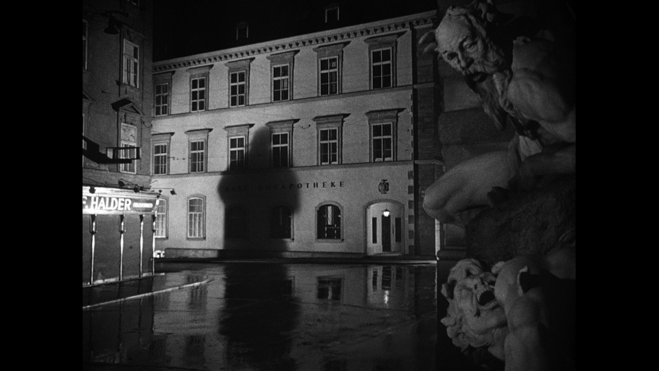
Fig. 5
Brief Encounter (1945) on the other hand was filmed using softer light (Fig 6,7). There are some similarities to The Third Man however, with shadows and some harsh light which makes for intense moments in the film (Fig. 6-9).

Fig.6

Fig.7

Fig.8

Fig.9
Although there are similarities between the two films Brief Encounter and The Third Man there are also similarities between “Brief Encounter”, “In the Mood for Love” (Fig. 10,11) and the photographs of Brasssai in his series “Paris by Night” (1936) (Fig.12). In Fig.11 from Brief Encounter the female face is softly but clearly lit while the male face is in the shadow, Fig.11 from ‘In the Mood for Love’ shows the same lighting being used along with a very similar framed shot.

Fig.10 In the Mood for Love

Fig.11 Brief Encounter

Fig.12
During my research, falling into the “Noir” genre was unavoidable although I didn’t want to go down that specific road. I am surprised at how much I’m getting out of the cinematography angle rather than the photographic. I think I have always tended to separate them in the past but now realise that that was a mistake!
When looking to set up and start planning some test shots, I was aware that trying to get the bright harsh light and potential strong shadows was going to be a challenge. I was relying on lamp light and other artificial lights for the softer shots. I came up with the idea of using car headlights, either from passing cars, if I can find the right location, or positioning my car so as to cast bright harsh light in the right direction.
I was surprised by my results for the first set of test shots. (Contact sheet 001)
I found a fairly open square that had different types of lighting and walls large enough to host shadows. I tried a variety of exposures so that I could compare them later. I also used the car headlights to throw some harsh, stronger light into the scene. This worked quite well and I used it to help create the shadows.
For image 0811 in contactSheet 001, I used a long exposure and asked a friend to walk under the lamp and away from me.
There was a fluorescent light on the other side of the arch which appeared very green (0773,0781,0782,) I rather liked this effect so didn’t try and change it leaving the white balance on Auto 2 which was giving nice results for the lamps and the headlights. Some of the shots were overexposed and some under. It was difficult to focus at times due to the lack of light. I didn’t want the shots to be particularly grainy, so kept the ISO at 3600.

ContactSheet-001
Converting them to black and white changed the atmosphere of the images to something a bit more sinister. In colour they are softer without a particularly threatening edge.

ContactSheet-002
There were several sources of light which caused the main shadow Images JLM0796 – JLM0800 to have a very indistinct edge, almost like movement blur. I was really looking for a stronger shadow.
I feel image 1 (JLM00811) has more impact in black and white. The wall and railings are clearer, leading the eye into the darkness. The figure blends better as he walks head down, into the darkness.

Img.1 _JLM0811BW 85mm, 1,3Sec, f/16, ISO 320
This was also the case for Img. 4 being in black and white, as it takes on a more sinister edge without the distraction of colour.

Img.4
Having looked at the initial images it occurred to me that because I had been influenced so much by film, I might unconciously be creating photographs that resemble film stills! Certainly Img.1 could have come from a movie. I like the fact that it is ambiguous and could be from movies of different genres. Romantic/Horror/Thriller………….
Doing a bit of research I came across a French science fiction still film by Chris Marker called La Jetee (1962) which is almost entirely made up of black and white photographs with a soundtrack and narrative. It was also the inspiration for the 1995 Terry Gillingham film “12 Monkeys”.
For this assignment it states that we are not required to create a story but I might be suggesting a story without meaning to!
For some of the shots I wasn’t able to control the light at all and had instead to use the light sources in different ways to create strong shadows and contrasting areas of light and dark. (ContactSheet-003)

ContactSheet-003
The slow shutter speed has given the lamp a soft look and a whisper of a person leaving the scene on the left side (JLM0820). I converted this to black and white to see how it would sit with the previous images. (Img.5). Although I prefer the image in black and white I think they work as either.

Img.5
Another technique used in both “Brief Encounter” and the “The Third Man” was to tilt (Canted framing) the camera at moments of high tension or drama (Fig.13,14).

Fig.13

Fig.14 The Third Man
I gave this technique a go (Img.6) but may have overdone the tilt!

Img.6
For my final selection I wanted a mix of images that had a strong shadow or some suggestion of movement. I also realised that I was selecting images that would illicit a very different emotion when viewed in colour or black and white.
Final selection:
-

-
_JLM0811BW
-

-
_JLM0933BW
-

-
_JLM0801BW
-

-
_JLM0891BW
-

-
_JLM0883BW
-

-
_JLM0820BW
-

-
_JLM0811
-

-
_JLM0933
-

-
_JLM0801
-

-
_JLM0891
-

-
_JLM0883
-

-
_JLM0820
_JLM0811BW

_JLM0933BW

_JLM0801BW

_JLM0891BW

_JLM0883BW

_JLM0820BW

_JLM0811

_JLM0933

_JLM0801

_JLM0891

_JLM0883

_JLM0820
Conclude your notes with a personal reflection on how you’ve developed the exercise in order to meet the descriptors of the Creativity criteria. Write 500–1,000 words.
Part four of this course has been the most difficult so far. Finding a personnel voice and being creative is a hard thing to judge. Using film as my inspiration may possibly have limited my voice but I enjoyed looking at the films with a fresh perspective, appreciating how they had been shot and learning the techniques cinematographers used to illicit feelings.
The idea of producing a set of images that would illicit emotions developed as I worked my way through the assignment, and in the exercise on the quality of light in particular. I became very conscious of how the colour, intensity and angle of the light can change an image.
I was keen not to pre-determine what form the images would take, but rather to find interesting locations with dramatic light sources, and to produce images that were a response to each. At he beginning of this assignment I wrote “For the assignment I wondered if it would be possible to look for streets, where something about the location itself allows some additional creativity?” This was in response to the way Christopher Doyle came up with some of the scenes in the film “In the mood for love”. Looking back at my images there is no doubt that the locations made them. Although I had plenty of ideas in my head about what images I wanted, many of them came about because the location allowed for more creativity than I had imagined. For example, the shadow on the foreground wall in image JLM0993 allowed me to include the illuminated background wall and steps, which gave depth and direction whilst the fluorescent light causing a strong green colour through the arch (ContactSheet-001)
My starting point was the capture of the human shadows, which is not itself original, but I feel I introduced imagination and creativity by omitting the subject casting the shadows, by the placement of the shadows in the frame, and by changing the angles from which the images were shot from. I also intentionally selected images that had a shadow of a person, a person or none at all. I wanted the viewer to actively seek a human presence in the image where it was actually missing.
So, in image JLM0891 for example, I disguised the shadow in the strong verticals caused by the different lights shining on the walls with the intention that it would not be noticed immediately. This worked rather too well on one occasion when I opened the image and the shadow made me jump, as I had forgotten it was there!. The opposite is true for image JLM0883 where I was happy for the shadow to be the first thing you notice.
Similarly, in image JLM0881, by using a slow shutter speed and asking my subject to walk away from the camera, I was able to capture a strong figure but with blurred feet. Having the person walk into the dark part of the car park, gave the image a dark feeling.
Although the brief states that “this is not a narrative assignment – you’re not required to produce a story”, I realised that a different story could be present in the black and white and the colour images. This led me to wonder that if people were asked to come up with a narrative when looking at the sets of images, if or how much the narrative would differ depending on which set they were looking at. I don’t have time to pursue this idea for this assignment but will set it up as an ongoing project.
Having selected my final set of images I was left with the difficult task of deciding on black and white or colour. Rather than take this decision, I decided to include both to celebrate the fact that the different versions of the photos suggested different moods, and in turn different stories.
It is becoming clear to me that the course as a whole is having a strong influence on my photography. It has enhanced my technical skills, my ability to read photographs, and my knowledge of other photographers and the techniques they adopted in their work. I am building on the skills and concepts I have learned and understand ideas at a much deeper level. In performing this part of the course I adopted an approach and techniques that I think allowed me to produce my own images, but images I would, and indeed could, not have created before.
Additional Material and some re -working after feedback from tutor.
My Tutor feedback was really helpful and was centered mainly around keeping the series tight and some aspects of framing. He also mentioned that he like the fact that I had given the colour plenty of “space”. I had done this unconsciously but on reviewing the images I really understood what he meant. I do find it very hard to communicate why I like or indeed why I dislike an image (either mine or someone else’s) but I have no doubt that I chose some of the images for the space (which was full of the lovely golden yellow hue) as well as the objects in the space.
When I look through the viewfinder or review images I have taken on a screen for the first time , It is often just a feeling I get, rather than any conscious analytical process. I’m sure that I tend to dwell on the object more than the space, which in hindsight isn’t always the best way and something I will be addressing in future images.
One of my biggest issues during this course has been around creating a cohesive series and although I do feel like I have improved, I still tend to view the images individually instead of as a series. It was suggested in my feedback that I have a look at Rut Blees Luxemburg ‘Liebesleid’, Rut Blees Luxemburg in conversation with David Campany and the film ‘Only Lovers Left Alive’ by Jim Jarmusch in relation to the colour of my images. Although I had already looked at Luxemburg work in a previous exercise I had not been aware of how closely some of my images resembled the colour and content found in her images (Fig 15 and JLM0806). There was no intent at the time to use these as influence for this assignment, although in hindsight I suspect I should have made the connection. Luxemburg born in 1967 is a German photographer who takes images at night using large a large format camera and long exposures.
The photograph that I took at the end of exercise (Img.16), the one that inspired this assignment, is reminiscent of several of Rut Blees Luxemburg’s images. In particular the colour and wet footprints visible in “In deeper” (Fig. 16)

Fig.15 Liebeslied 1997, Rut Blees Luxemburg

JLM0806
Img.16

Fig.16 Rut-Blees-Luxemburg_InDeeper
Rut Blees Luxembourg talks about space. In an interview with David Campany in 1999, she states “I am attracted to the Heimlichkeit of a space in public. A space that allows for a moment of repose”
(Campany, 2014)
Taking street, city or town images at night is a very different experience from going out during the day. Generally it is quieter (I guess that depends on the location) and I found that very much the case when I was taking my night time shots. I used 2 locations, one which is a small hill top village in Italy and another larger more industrial town also in Italy. The shots were taken in the winter later in the evening which meant there were very few people around. To date I hadn’t had the opportunity to wander these streets at this time of night in winter time and I was fascinated how different the places seemed.
In the summer the hill top village is teaming with locals and tourists and one would have to wait for the very early hours of the morning to get the peace and quiet of empty streets and squares. I do love wandering around places and often will wander without my camera prior to shooting a project. I was interested to note that the theme of wandering came up several time in Luxembourg’s interview with Campaney when discussing the image In Deeper (Fig.16).
“And here a very golden quality to water as it is lit. This image is also very much about absence. You see the footsteps on the mud? They are expressive of something that runs right through the Liebeslied series, which became about a possible poet who is wandering the city in a way that is in contrast to the flâneur made famous by Baudelaire. The flâneur’s relation to the city is very much about a pleasure or diversion. The poet’s wandering is more about an encounter” and “I do walk alone although occasionally when I come to shoot on large format I’ll take an assistant, but by that stage the wandering has been done”
(Campany, 2014).
I would really like my images to have a feel of solitude and space, particularity in locations where normally there is a lot of activity and people.
After some thought, discussion and the feedback from my tutor I have decided on the following re work.
- Remove image 0811 on the grounds that it doesn’t sit well with the rest of the images in relation to content and colour. Shoot alternative.
- Retake and reframe image 0820 to include more space in front of the steps and exclude lamppost (keeping lamppost shadow)
- Retake image 0883 without shadow
- Retake image 0891 without shadow
- Retake image 0801 with smaller aperture to ensure all areas are sharp
- Find alternative image for 0933
Removing the human shadow from the colour set is a conscious decision based upon the fact that they don’t really enhance the images in any way. In fact they interfere with the space which I have now see as being what the images can be about. This isn’t necessarily true for the black and white images where the human shadows give them something dark and threatening.
The above plans for re taking some of the images has been put on hold due to the covid-19 lockdown situation. I have no idea when I will be able to re visit the locations in Italy so have decided to have a look at all the original images I took for the assignment and see if any of them are suitable in light of my scuppered plans. I will also look at using Photoshop to edit where appropriate.
For the colour images:
- Remove image 0811 on the grounds that it doesn’t sit well with the rest of the images in relation to content and colour.
- Take lamppost and shadow out of image 0820 using photoshop.
- Take shadow out of image 0883 using photoshop.
- Take shadow out of image 0891using photoshop.
- Sharpen image 0801 in photoshop
- Take the shadow and distracting alarm and wires out of image 0933 using photoshop
As I currently be able to retake the shots I won’t be able to reframe image 0820 to allow more space in the foreground.
Most of the feedback was in relation to the colour set. I was quite confused about which set to submit initially and it was only when I received the feedback and discussed it with my tutor did I realise how very different the sets were. The colour set is just that. It is all about colour and space. This renders the shadows unnecessary and distracting.
For the black and white images I feel the shadows do give them a sense of mystery and make them more noirish. Image 0811 sits better in this set so I intend to leave it in.
Re-worked colour set
In the feedback my tutor had commented on the green and gold “In a series keep things tight – if it’s gold and green, stick to that throughout”. I can now see what he meant and it is now far more apparent that images 0883, 0820 and 0801 sit well together with the green and gold hues. (The green is not quite so apparent in 0801)
Without the shadows there is more space to appreciate the colour and space.
In image 0820 the space has allowed colour to jump out but unfortunately showed up the tight crop even more than before.

0820

0883

0801

0933

0891
Bibliography
Christopher Doyle methods
At:https://www.youtube.com/watch?v=iDMRB5cCrzY
[Accessed 02/12/2020]
Figure 1
At: http://internationalcinemareview.blogspot.com/search?q=hitchcock+the+wrong+man
[Accessed 10/01/2020]
Figure 2
At: https://www.theguardian.com/film/filmblog/2013/nov/29/top-10-film-noir
[Accessed 14/01/2020]
Figure 3
At: https://www.imdb.com/title/tt0041959/mediaviewer/rm1999096832
[Accessed 19/01/2020]
Figure 4
At: https://ogsmoviereviews.files.wordpress.com/2012/01/screenshot-lrg-25.png
[Accessed 19/01/2020]
Figure 5-9
At: https://www.bfi.org.uk/news-opinion/news-bfi/features/location-location-location-vienna-third-man
[Accessed 20/01/2020]
Figure 10
At: https://www.indiewire.com/2012/12/watch-bbc-docu-about-christopher-doyle-his-work-on-in-the-mood-for-love-chungking-express-more-103091/
[Accessed 01/12/2019]
Figure 11
At: https://www.criterion.com/films/345-brief-encounter
[Accessed 20/01/2020]
Figure 12
At: https://americansuburbx.com/2012/05/brassai-paris-by-night.html
[Accessed 01/12/2019]
Figure 13
At: https://slideplayer.com/slide/9870706/
[Accessed 23/01/2020]
Figure 14
At: http://pcafilmscreenings.blogspot.com/2016/12/the-third-man.html
[Accessed 23/01/2020]
Figure 15
At: https://rutbleesluxemburg.com/liebeslied-2.html
[Accessed 18/02/2020]
Campany, D. (2014). Art and photography. London: Phaidon.


