Category Archives: Uncategorized

Project 8: Research – Analysing my images as if they were not mine! Revisiting Denotation and Connotation

I have found that describing what I see in an image before trying to understand what it might mean a very useful tool. This was really highlighted for me in Project 2 Building Analytical Skills. This seemed the perfect time to put some of my own images through this process and revisit Denotation and Connotation

I started by looking at some of the images without any text, describing what I see and then suggesting what these elements might mean. I am also hoping this will help me to understand which images, if any,  are expressing their stories in the most effective way without text.

Image.1

Description: Trees and bushes with a pathway cutting through them and round a courner out of site obscured by the bushes. Overcast dull day with mist in the distance obscuring the view through the trees.

What might some of the elements mean: This reminds me of illustrations from “little red riding hood” (Fig.1) or “Babes in the Wood” It is a typical “scary” wood scene. The path disapears behind the bushes making us wonder what is lurking in there. The mist in the background is also synonymous the “mysterious” and “scary” The way the image has been shot means that the vewer is taken down the path between the bushes and then blocked, left wondering.

Img. 1

Fig. 1 Frank Adams’ illustration in “My Nursery Story Book”, published by Blackie & Sons Ltd. about 1930

L., S. H.; Babes in the Wood; The Whitaker;

It could be that part of the reason the images that include forests have remaimed in my memory is because of their “cultural” meaning.

The forest is one of the most common fairy tale settings. It is a place beyond the safety and familiarity of the town or village. It represents the unknown where anything can happen. It is outside of normal experience, and is both a magical realm and a place of danger. It is a place of freedom and wildness, where normal rules no longer apply. Strange events can take place in the forest, and it can be a place of transformation, where the hero overcomes various difficulties and finds his or her way home. It can also represent a hiding place where characters can take refuge, but it can also represent the things that we most fear. National Library of Scotland (Fairy Tales)

Image 2. 

Description: Single lane seemingly isolated road going off into the distance lined by trees. Layby on the left with some tyre tracks in the mud. In the foreground on the right is a black car with the passeger door open wide into the lane. The car is on an angle with the front of the car sticking out slightly into the lane. It is not possible to see if there is anyone in either the passenger or drivers seat. The weather looks bright and is not either early morning or evening.

What might some of the elements mean: The tree lined road stretching off into the distance gives a strong feeling of isolation. It also could suggest that someone ran down the road and round the corner. The tyre tracks in the layby on the left are suggestive of the car in the image having parked and turned round or that there may have been another car there earlier. The car being parked on an agle could suggest that it stopped and parked quickly and without care – perhaps in a panic.  The wide open passenger door seems incongruous and perhaps even sinister. Has someone escaped, or has someone been forced from the car. The fact that it is daytime suggests that perhaps the car has been there all night. It could be seen as unusual for a “crime” to be commotted in “broad daylight” The fact that we can’t see into the car makes us wonder if there is anyone inside. The open door invites us to look. We know that under “normal” circumstances we would not leave a car door open into the road.

Img. 2

Abandoned  vehicles are synonymous with “crime” and or “tragic” events. Below is a car abandoned during the 2011 Fukushima nuclear disaster. It is common to use objects such as abandoned cars to highten an “apocalyptic” feel in movies.

Fig. 3 Rown Hardcastle. Abandoned cars of Fukushima

Image 3

Description: Tight crop of two bright blue garage doors. The on the left has an orange secure lock  towards the bottom of the door as well as a normal lock on the handle. There is no information as to wether these garages are attached to a house or are attached to two different houses or if they are even attached to houses and not just more garages. There is a grey cobbled stone area outside the garages which joins a paved area that looks like it may be for pedestrians. Both up and over doors have a small amount of damage to them. The one on the right has a dent in the lower half of the door. The one on the right also has a dent in this area along with some scratched paintwork

What might some of the elements mean: The tight crop means that there are no distractions. Our eyes are focused directly onto the two garage doors. This makes us want to know why. Is there something inside? The door with the extra security makes us more curious. What is it that the person wants to secure. Having two doors, one with and one without extra security is highlighting the difference. The empty cobbled and paved area looks like it is waiting for a person to arrive and enter one of the garages or for a car to reverse up and load something into the boot. Garages are spaces where we not only store vehicles but more often than not they are where we store items that we do not want to store indoors or are too big to store indoors they also tend to be places where we store items that we are not sure what to do with but are not quite ready to get rid of. Garages are often synonymouse with “crime” as a place to store stolen goods or drugs for example. These will often be called “lockups” and are generally not attached to a residence but in a row of other lockups. Having two of these doors in this image might suggest that these are “lockups”. The dents could suggest something happening in a bit of a rush or a panic, someone trying to break in, a scuffle or a car not breaking in time.

Img. 3


Image 4

Description: Rough grass field leading up to a hedge and possibly a ditch that also contains some young trees. There looks like a ditch in the forground just behind the tree. The tree on the left is only just in shot with most of it cut off by the frame. Branches devoid of leaves protrude from it reaching into the centre of the frame. The sky is overcast with a hint of cloud making the scene flat with no shadows. There are no buildings in view.

What might some of the elements mean: The scene looks cold and a bit stark. The hedge and the dry grass looks a bit windswept giving a bleak feel. This feels more like moorland than woodland or forest but also has a link to the dark and mysterious side of nature. The Hound of the Baskervilles for example or scenes in Emily Brontes Wuthering Heights. The hint of a ditch in the foreground could suggest that there is something in there, something that we can’t see. This is hightened by the branches of the tree on the left protruding out and curling over, as if pointing at or about to grab something in the ditch. The tree is cut off leaving us to wonder what might be in the branches above. Our eyes also tend to follow the hedge from the right into the distance, also suggesting that there might be something hidden in the hedge. There are a lot of possibilities in this image, but my own opinion is that the curled over tree branch is the element that adds some mystery to this seemingly unassuming landscape. I think there would have to be some other clues or text for this image to start telling its story.

Img. 4

Figures 4 and 5 which are illustrations for versions of the book and the film Hound of the Baskervilles feature the knarly branches of trees that look very similar to the way the branches are positioned in my image. They are almost like the threatening hands and fingers of witches or monsters.


Image 5

Description: In the foreground there is cracked glass or plastic and in the background and out of focus, trees or bushes and sky. The image has been taken looking through the cracked material. There are a couple of radial impact points and some general shattering. There appear to be no pieces missing and the material has held together. On closer inspection the shattered material is marked and dirty with what looks like bits of fluff, hair and dust.

What might some of the elements mean: Something broken is usually a bad sign. There appears to have been some impact judging, by the radial cracks at the bottom of the frame. The way the shoot is looking through the cracks and lightly upwards, could give the impression that this is the windcsreen of a car. It also appears that the shot was taken from inside the car looking out – is someone trapped?

Broken, shattered or cracked glass is often used in thriller/horror writing as a code for violent action. (Figs. 5,6)


Img. 5


Bibliography

Figure 1.
Available at: https://museumsandgalleries.leeds.gov.uk/collections/imagining-little-red-riding-hood/
[Accessed 14/02/2023]

Figure 2.
Available at: https://artuk.org/discover/artworks
[Accessed 14/02/2023]

Available at: https://www.nls.uk/learning-zone/literature-and-language/themes-in-focus/fairy-tales/source-5/
[Accessed 14/02/2023]

Abandoned Cars of Fukushima
Available at: https://www.topgear.com/car-news/big-reads/these-are-abandoned-cars-fukushima
[Accessed 14/02/2023]

Figure 4
Available at: https://www.amazon.co.uk/Oxford-Childrens-Classics-Hound-Baskervilles/dp/0192743589
[Accessed 14/02/2023]

Figure 5
Available at: https://www.deviantart.com/destro7000/art/Hound-of-the-Baskervilles-v2-195809307
[Accessed 14/02/2023]

Figure 5
Available at: https://www.imdb.com/title/tt6823368/
[Accessed 23/02/2023]

Figure 6
Available at: https://www.imdb.com/title/tt6823368/
[Accessed 23/02/2023]


Project 1: Understanding Genres, Exercise 2: Re-create

Feedback from my tutor suggested that:

Maybe you could have tried to replicate the lighting in the original. Notice the shadow on the original, it helps provide interest, it provides a raw earthy quality to the image.

Looking back at the original image, the shadows are created by the object sitting in a depression created to hold it in place, possibly for security and presentation. This would be tricky to replicate in reality but I had taken a couple of shots that had some shadow detail which I thought was distracting at the time. Looking at them with fresh eyes I might not think of this as distracting. (Contact sheet 6)

Contact sheet 6


I decided to crop to a square format as per the original Japanese image. It makes for a more powerful image. I wanted to remove the sterile feel so added a warm filter to the image.(Fig.7)

Fig.7

The shadow and the square format create a more powerful earthy image.

Brief:

Recreate a well-known image in any of the 4 genres you have explored. Consider the conventions, styles and themes specific to the genre and how the image you choose to re-create speaks to those. You are free to interpret ‘re-creation’ as imaginatively as you like, subverting conventions or adhering to them.

Share

Using the Challenging Genres Forum share your work, including; your image, the image that inspired it and a short paragraph explaining your process.

Reflect

Write up the activity on your learning log. After sharing the image and receiving some feedback, reflect on the experience in a short post on your learning log.

The image I have chosen to “re create” is of a pocket watch belonging to a victim of the Atomic bomb (Little boy) dropped on Hiroshima at 08:15 on the 6th August 1945. (Fig. 1)

Fig. 1

I visited the Peace Museum in Hiroshima several years ago and it had a profound affect on me. There were several time pieces on display but the pocket watch which had stopped at the exact time the bomb hit, was extremely powerful and moving. There were also several photographs of it and other artefacts, and it occurred to me that these must be some of the most meaningful and powerful photographs of all time. I didn’t think of them as “Still Life” photographs, to me they were very much a record of an historical event. At this time in my life the words “still life” brought to mind art, flowers, fruit etc…… certainly not something as profound and important as this or something that had been photographed as part of a historical record.

As a photograph it allows those people who are unable to see it in person, to view it online, or in publications. It is a record of an artefact bearing the scars and damage of one of the worst actions undertaken by humana beings. It acts as a reminder to try and ensure that these types of atrocities never happen again. I also now see it as a very powerful “Still Life” photograph.

The photograph itself had been taken as a record of the artefact, and indeed when viewed in the  A-Bomb database it is very much part of a record. (Fig.2)

Fig. 2

The watch has been photographed on a plain white background, which looks to have some texture. The objects looks like it might be sitting recessed area specifically created to fit it exactly and has been photographed in situ. It is a clear and well exposed image. There are no distractions, with the hands sitting clearly at just past the 08:15 mark on the watch face. The discolouration and marks are also clearly visible. There is no hidden or subtle meaning being hinted at by using more complex backgrounds, light and shade or other codes that are often part of the still life genre. It marks the moment the world changed for tens of thousands of victims and for many other people round the world and does this by the most simple of compositions.

I did a bit of research on the make of watch which is clearly visible on the face and came up with something quite ironic in relation to the shock proofing of this particular make of watch!

The Moeris Watch Factory was established in 1893 in Saint-Imier. The company was a high-volume maker, producing more than 10 million watches by 1957. At that time, the company sold upscale watches with 17 or 25 jewels and Incabloc shock protection.(Foskett, n.d.)

Incabloc is a common shock protection system used in mechanical watches, recognizable due to its lyre-shaped spring.(Foskett, n.d.)

Incabloc was developed in 1933 and introduced in its current form in 1938. It remains one of the most popular shock protection methods.(Foskett, n.d.)

I wanted to re create something that had meaning, that was personal, and would be provoke both sad and pleasant memories and a reminder of times past. I also wanted to mark a very important moment in my life and one that I suspect many people will be able to relate to.

My mum wore wristwatch everyday and it was on the beside table beside her when she died. It was the first thing that I looked at once I realised she had passed away, and remember it clearly showing 1:30 on the dial. It was of course part of the small parcel of possessions that I brought home with me after her death in January 1999. It was a “good” passing it was an expected passing, and although it was a very difficult time and I look back on it now with sadness, I am also very grateful that it was so peaceful. She wrote a diary entry everyday for the last year of her life, the last entry being 27th December 1998, which was about 2 weeks before she died. A few hours after her death I wrote an entry detailing the the date and time of her death which was 1:30am on the 9th of January 1999.

I wanted the image to be a record of that moment but perhaps to be less cold and sterile than the pocket watch “artefact” photograph

I wondered if, rather than having the watch sitting on a plain background, if an image of me wearing it whilst getting on with my life (as such) would make for a more personal image? I still wanted the watch face to be the main focus of the image with the hands and time clearly visible. (Contact sheet 001)

Contact Sheet 1

I feel that the arm, cuff and general background are a bit distracting and although make the images a bit more personal they are taking the focus off the watch face. Image 929 is the least distracting but the arm is not really coming across as an arm/wrist and is a bit distracting for that reason rather than because of the background. Image 931 is the one that appeals to me the most due to the angle of the hand and wrist. The watch is clearly the focus in this image even though there are still some distracting elements.

I realised that my mum wore her watch on her left wrist and I wear mine on my right. I automatically placed her watch on my right wrist. I’m not sure it matters! But I changed it over anyway. A few more shots on my wrist and some with a plain background. (Contact sheet 2)

Contact sheet 2

I am finding the simplicity of the images with the plain background very appealing, particularly image 946, but they are very cold and sterile which is what I said I didn’t want. There is also a strong shadow coming from the left which is distracting and serving no purpose.

… a simple or abstract background gives more focus, quite literally, to the objet itself in the foreground. Taken out of context, an object has more emotive power. The focus on the object gives and informational value (“denotation” in semiotics) to the object” (David Bate, Photography: The Key Concepts, p151)

The next set with a mix of tungsten and tungsten with a bit of natural light (Contact sheet 3)

Contact sheet 3

Much warmer and less sterile. I am finding Images 956 and 953 the most appealing. I also noticed small marks and scratches on the face which I hadn’t seen previously and are definitely adding an extra dimension to the image. (Fig. 3,4)

Although the reflections are helping to highlight the marks and scratches on fig 4, they are making it harder to pick out the detail in the face. It also struck me that at that time of the morning there would have been no natural light so this colour tone, which is more pronounced in fig 3  would be more of a representation of the light at the time.

Fig. 3 Has allowed for space around the object making it very much the focus of the image. There is nothing else to look at. It has a warm feel to it and the hands sitting at 1:30 are prominent. This image feels right from a personal and emotional perspective. It resembles the original pocket watch image more than I imagined it would as I thought it would be hard to get across what I wanted to in such a simple way. However, when I look back at the original image it is clear that sometimes the simpler something is, the more profound and powerful it can be.

Fig. 3

Share

Using the Challenging Genres Forum share your work, including; your image, the image that inspired it and a short paragraph explaining your process.

I pointed people to the blog post which contained all the information relating to my re created image and have started gathering and commenting on the feedback below. I found all the feedback really helpful and interesting.

Feedback:

One piece of feedback from my peers which was really helpful said

“blurring of distinctions between genres. To me this is as much a documentary image as a still life. The way you have identified the personal aspects of the image and linked it into you’re own personal story seems to me to make your image as much a portrait as anything else”

I really hadn’t thought about this at all. I can sometimes get too focused and miss things and I think this might be one of those occasions. I got so involved in creating a still life with some meaning that I didn’t see anything else. It also brought to mind the Introduction section that we were asked to read as part of this project in Bates, The Key Concepts. It states that

“…. in the same way that the film poster image created an expectation of the film, so a genre in photography – portrait, landscape, still-life, documentary, etc. create expectations for the meanings and experience to be derived from that type of picture” (Bate, 2016)

I wonder if because I was working under the heading of “Still Life” that’s all I was seeing when I was looking for and creating an image. The other genres and their particular features had been completely ignored. I was lucky that the feedback was coming from people who were working on genres other than still life, so perhaps the fact that they were focused on their particular genre, made it easier for them to see aspects of it in my image.

Some more feedback

“the lower part of the watch is slightly out of focus – is this intentional?”

…then, followed that up with

“(One could argue that the memory is fading, but with looking at the watch it comes back?)”

I had in fact noticed it and it was due to a shallow depth of field and angle. There was a very strong shadow being thrown onto the image so the angle of the shot was used to eliminate it.  I decided to not to retake it because I quite liked it. At the time I couldn’t say why I liked it, but I think it might give the image a very slight ethereal look without being too “airy fairy”. It moves the image further away from being functional.  I was also pleased and surprised to read that someones own imagination had been sparked by this unintentional “feature”.

One thing that really surprised me was that generally people “Got it” either the way I intended them to or in another more personal way.


Bibliography

Fig1,2
Available at: https://hpmm-db.jp/list/detail/cate=artifact_en&search_type=detail&data_id=23484
[Accessed 21 September 2022].

Bate, D., 2016. Photography. 2nd ed. Abingdon and New York: Bloomsbury Academic, p.5.

Bate, D., 2016. Photography. 2nd ed. Abingdon and New York: Bloomsbury Academic,

Foskett, S., n.d. Moeris [Watch Wiki]. [online] Watch-wiki.net.
Available at: <https://www.watch-wiki.net/doku.php?id=moeris&gt;
[Accessed 21 September 2022].

Project 1: Understanding Genres, Reading Task: The Key Concepts

Brief:

This book will provide you with further reading throughout this course and you can freely dip into it. There will also be points in the course where you will be directed to particular chapters.

As the book suggests, Genres have very much been a part of film and I would say generally thought about by the majority in terms of film by many (me included). I have thought about them more in photography terms in the last couple of years but it is still a word I link to film theory first. I also think of them in relation to paintings and in particular Still Life and Landscape

The Introduction talks about the predefined “scene” modes in some cameras and this made me realise that I didn’t really know what kind settings these scene modes have. I could guess what some of them might include,  but had never really thought about it. I suspect that when I used a camera that had these scene modes I took it for granted that the camera knew more than I did! My current camera doesn’t have them as such, so maybe I don’t take the quintessential “landscapes” or “portraits” that my old cameras would suggest.  I am certainly going to go and have a look at my “point and shoot” to see what differences these modes create.

The idea that the category or genre applied to a photograph informs the expectation of the viewer is also something I had never consciously thought about, but there is no doubt that it does. I would expect photographs that come into the portrait genre to be more than a physical likeness of a person. I would expect passport photographs to be a physical likeness only. The passport office almost instruct you to create a photo with nothing else but. This got me wondering what I would see (make up in my head) if a was looking at several passport photos in a portrait gallery, without knowing they were passport photos. Would my expectations override the reality. Or is it impossible to hide some parts of the real person or their emotions in a photo?

I found this introduction raised lots of questions  and I always look forward to digging around into ideas that have been raised either through reading, looking at other photographers work or perhaps through film and generally sometimes just “looking” and listening” I did, however get a bit overwhelmed by the last couple of paragraphs and very much wanted it to end on a more simple note. Putting the words semiotics, psychoanalysis, sociology and philosophy all in one sentence is something guaranteed to make me, and I would imagine others, run for the hills!

After running for the hills and coming back again, I think this is going to be a very informative and useful book.


Context and Narrative: Assignment Three – Self Portraiture – Planning and creation of images

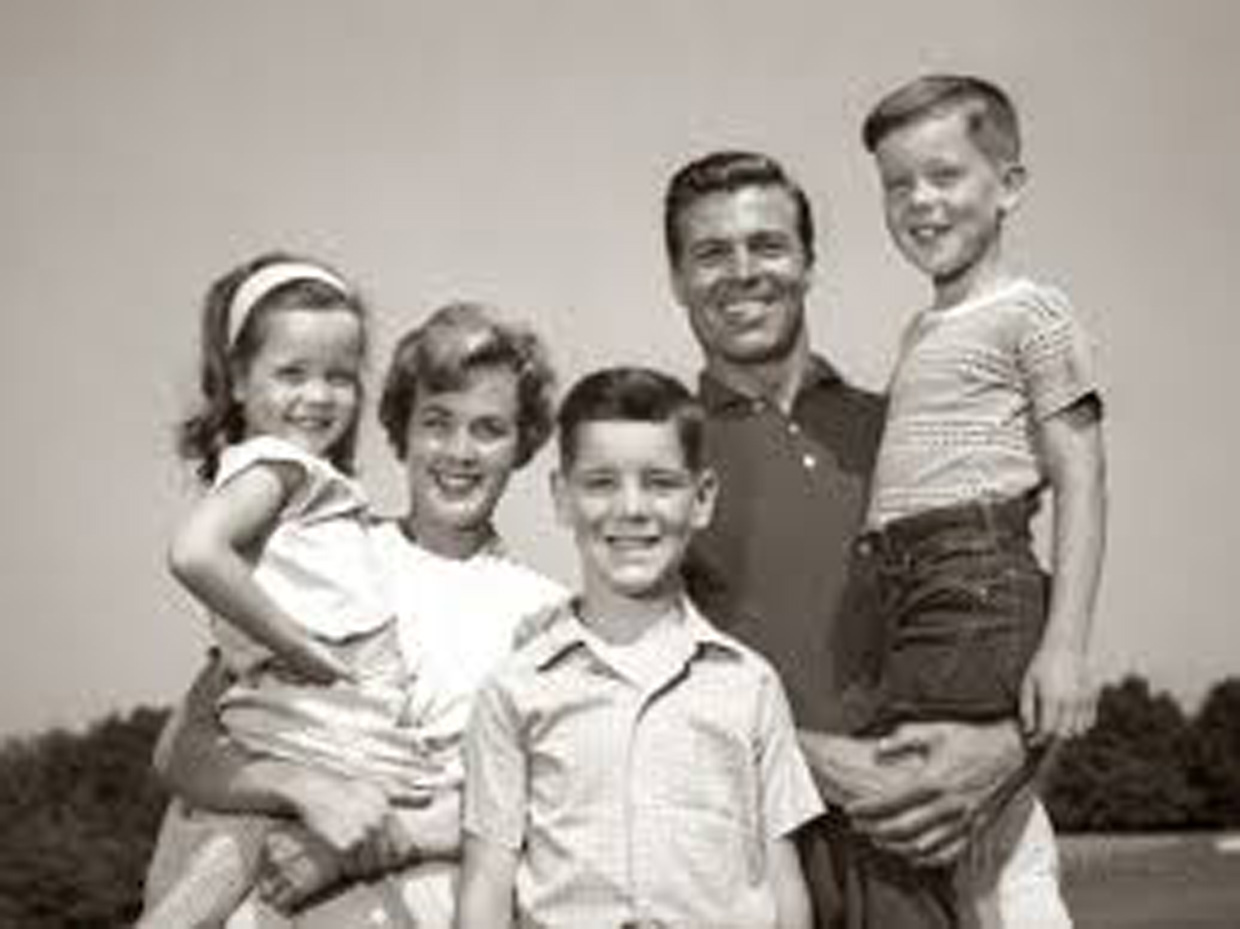
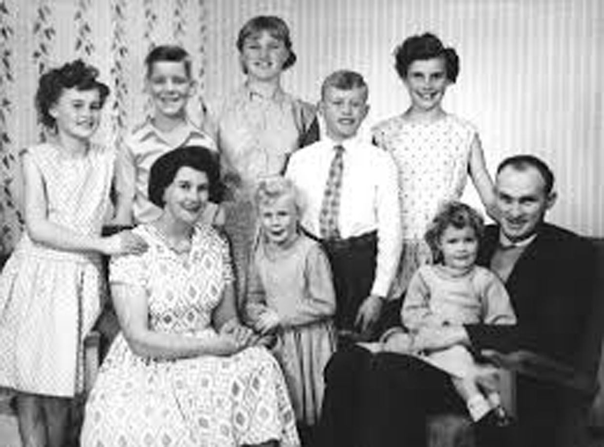
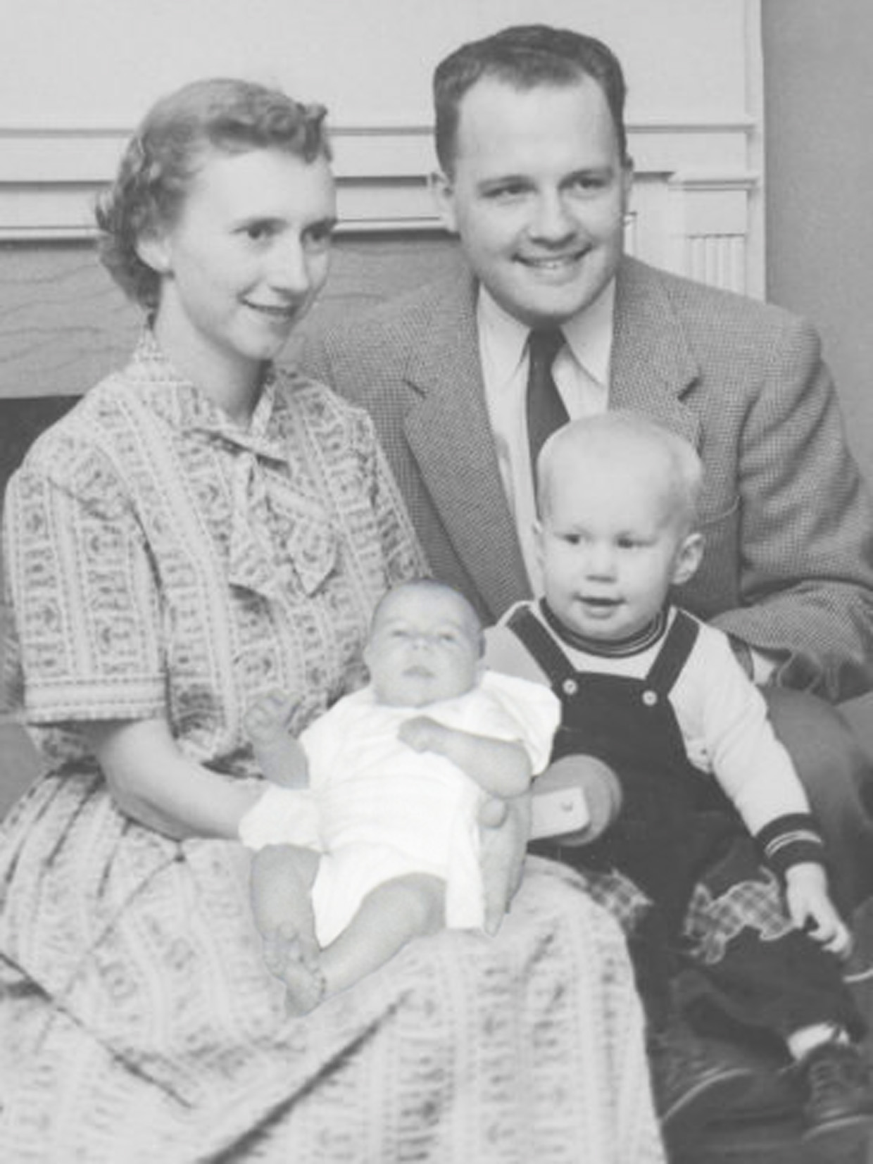
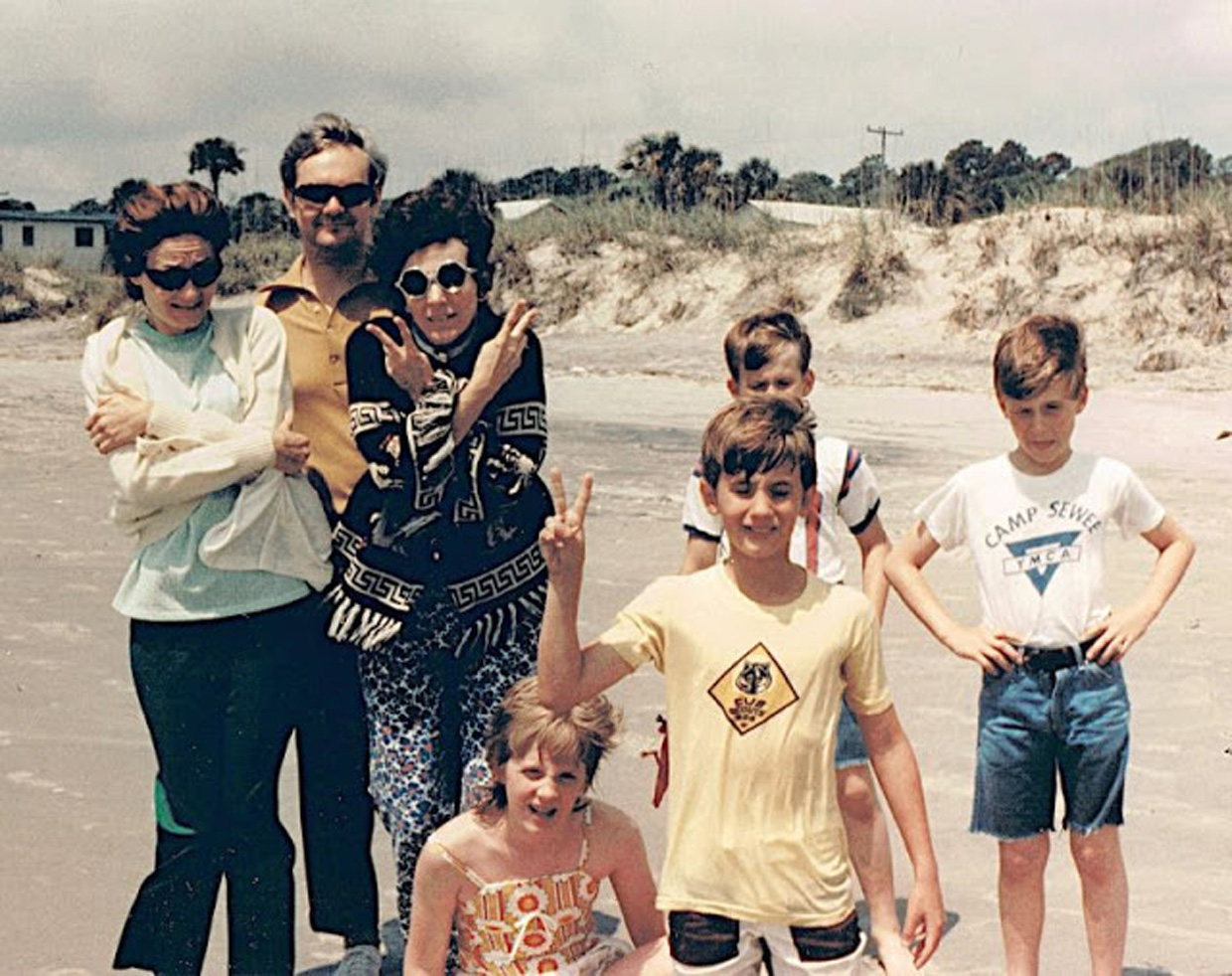
Having decided to create a series which includes the initial adoptions in the early 1960s and then potentially the reunions in the late 70s. My first task was to scour the internet to find suitable images. This turned out to be far harder than I imagined but kept away from stock photo sites where licenses might be in place. The biggest challenge was to store them in a way that I can trace the source, if, I then go on to use them in the assignment. I have decided to keep it simple and copy any images into word with the website address and date accessed.

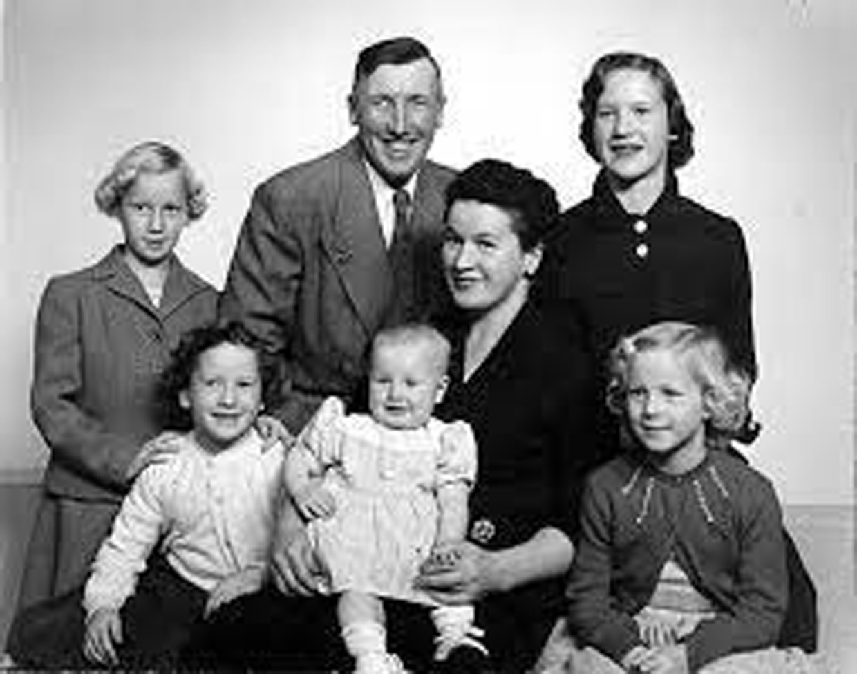
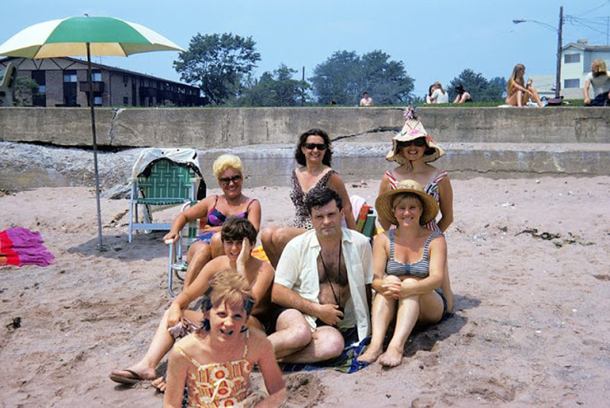
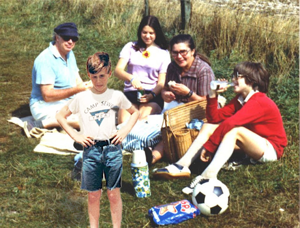
I ended up with a variety of images chosen for their look, age, style and image content suitability for merging including some of those below (Fig. 1-16)

There were several aspects of merging that I needed to take into account and caused me some frustration. The differences in tone, colour and the size (resolution) of the images were the hardest areas to deal with and although it was tricky I certainly learnt a great deal in photoshop!

I purposely used images from the era 1950 -1970 for the “stranger adoption” child images. Most were black and white but if they weren’t I desaturated them. For the images that were meant to represent the “stranger reunion”  I used images from the 1980s – 1990 and left them all in colour. I’m not sure if this is going to work and if that would be add anything to the images as a set.

I ended up with a varied set of images that was suggestive of my ideas but not quite right.

Without context just using the edited images wouldn’t make much sense. All too subtle perhaps. I wondered if I should make it more explicit and include baby/young child in a set of black and white and an adult set in colour. This might communicate the adoption day “stranger and reunion “stranger’ idea better. This seemed to work a bit better (sets below) but still not right.

Baby/Child set:

Adult set:

I began to think more about the  two occasions where the adoptive person could be a stranger in what would normally be seen as “their family”. On the day they were adopted and then the reunion. (adoptive and birth families – below) I’m hoping that looking at them in a sort of timeline will help.

Adoptive and Birth families

The key seemed to be that for the viewer they should not really be able to tell which family the duplicated individual belongs in, to try and communicate the idea of a loss of identity and the idea of them being a stranger. I’m not sure my photoshop skills are quite up to that but feeling happier with the below set I will work on those.

After some very time consuming work in photoshop, I showed the baby photos to my partner. The first thing he asked was ” which photo is the original?”. He obviously wasn’t zooming in and looking at it pixel by pixel but I was happy with his reaction. These will be my final images once I have done a bit more tweaking.

Bibliography

Figure 1-5,7
At: https://www.ukphotoarchive.org.uk
[Accessed 24/02/2021

Figure 6
At: https://i.pinimg.com/originals/0f/79/2e/0f792e2be0ef51cf5fadc165d76bcb33
[Accessed 22/02/2021]

Figure 8
At: https://www.pinterest.com/
[Accessed 22/02/2021]

Figure 9-13
At: https://www.vintag.es/2018/08/1970s-family-portraits.html
[Accessed 24/02/2021]

Figure 14-16
At: https://www.tasteofhome.com/collection/what-christmas-looked-like-the-year-you-were-born/
[Accessed 26/02/2021]

Note: Under no circumstances am I suggesting that any of the children or adults shown in the above images were adopted. All the images were selected for their era and suitability in relation to this assignment.

Part Four

Part Four: Project 1

Before you read any further, can you think of any photographs that are not used as a means of expression or communication? Blog about them. This was a fairly easy question to answer. As far as I’m concerned all photos communicate “something” regardless of intent. They may communicate something different to different people, they may…

Part Four Research Task: Insomnia

Brief Using the weareoca website you need to search ‘​ Beneath the Surface​’ to give you access to a blog about Jeff Wall’s (1994), ​Insomnia​, interpreted using some of the tools discussed above. Read and reflect upon the chapter on Diane Arbus in S​ingular Images: Essays on Remarkable Photographs ​by Sophie Howarth (2005). This is…

Part Four Exercise 2: Deconstruction Task

Brief Rip out an advertising image from a newspaper supplement and circle and write on as many parts of the image as you can. Comment on what it is, what it says about the product and why you think it’s there. You could use this as the basis for your assignment if you feel it’s…

Part Four Exercise 1: Erwitt Analysis

For this first exercise we were asked to look carefully at an image by Elliot Erwitt and make some notes about how the subject matter is placed in the frame and what the image might tell us about Erwitt as a person. The image is entitled Felix, Gladys and Rover. New York, USA (1974) and…

Part Three

Part Three: Exercise 3 – Childhood Memories

Brief Recreate a childhood memory in a photograph. Think carefully about the memory you choose and how you’ll recreate it. You’re free to approach this task in any way you wish. Does the memory involve you directly or is it something you witnessed? Will you include your adult self in the image (for example, to…

Part Three: Exercise – 4, Shafran Critique

Brief Nigel Shafran Go to the artist’s website and look at the other images in Shafran’s series. You may have noticed that Washing-up is the only piece of work in Part Three created by a man. It is also the only one with no human figures in it, although family members are referred to in…

Part Three: Exercise 2 – Self Representation

Brief Is there any sense in which Lee’s work could be considered voyeuristic or even exploitative? Is she commenting on her own identity, the group identity of the people she photographs, or both? Would you agree to Morrissey’s request if you were enjoying a day on the beach with your family? If not, why not?…

Part Three: Exercise 1 – Brotherus Research and Analysis

Brief Reflect on the pieces of work discussed in this project in your learning log and do some further research of your own. Here are a few questions you might ask yourself: How do these images make you feel? Do you think there’s an element of narcissism or self-indulgence in focusing on your own identity…

Part Three: Research Task – Francesca Woodman

Brief “It is difficult not to read Woodman’s many self-portraits – she produced over five hundred during her short lifetime – as alluding to a troubled state of mind. She committed suicide at the age of twenty-two.” (Bright, 2010, p.25) Look up Francesca Woodman’s images online. What evidence can you find for Bright’s analysis? Introduction It…

Part Two

Research Task: Relay

Examples of relay in contemporary photographic practice include Sophie Calle’s Take Care of Yourself​ and Sophy Rickett’s ​Objects in the Field​ (see interview in the Appendix to this course guide) where clashes of understanding or interpretation work together to create a perhaps incomplete but nonetheless enriching dialogue between artist and viewer. Look these pieces up…

Exercise 3: Poetry Interpretation

Choose a poem that resonates with you then interpret it through photographs. Don’t attempt to describe the poem but instead give a sense of the feeling of the poem and the essence it exudes. Start by reading the poem a few times (perhaps aloud) and making a note of the feelings and ideas it promotes,…

Exercise 1: The Dad Project

Brief How does Briony Campbells The Dad Project compare with Country Doctor What do you think she means by “an ending without and ending”? The Country Doctor is a series which  takes a look into the life of a country doctor; ……..photographer W. Eugene Smith spent 23 days in Kremmling, Colo., chronicling the day-to-day challenges…

Exercise 2: Newspaper Analysis

Brief Cut out some pictures from a newspaper and write your own captions. How do the words next to the image contextualise/re-contextualiseit? How many meanings can you give to the same picture Try the same exercise for both anchoring and relaying. Blog about it Original images and captions: When I was coming up with some…

Part One

Exercise 2: Street Photography

Brief Find a street that particularly interests you – it may be local or further afield. Shoot 30 colour images and 30 black and white images in a street photography style In your learning log, comment on the differences between the two formats. What difference does colour make? Which set do you prefer and why?…

Exercise 3: Public Order

Look at some more images from this series on the artists website. How do Pickering’s images make you feel Is Public Order an effective use of documentary or is it misleading Initially the images made me feel sad that we live in a society where we need these kinds of training facilities and also at…

Exercise 4: Digital Manipulation

Use digital software such as Photoshop to create a composite image which visually appears to be a documentary photograph but which could never actually be. 
 My composite image consisted of 2 images, (Fig. 2-3) which I found on line,  I was inspired by Peter Kennard and Cat Phillips (2002-2019) Photo Op series and in…

Research Task: Challenging Boundaries

Look online at Paul Seawright’s (1998) work, Sectarian Murders How does this work challenge the boundaries between documentary and art? Listen to Paul Seawright talk about his work at: https://vimeo.com/76940827 What is the core of his argument? Do you agree with him? If we define a piece of documentary photography as art, does this change…

Exercise 1: The Impact of Citizen Journalism

Find some examples of news stories where ‘ citizen journalism’ has exposed 
or highlighted abuses of power. How do these pictures affect the story, if at all? Are these pictures objective? Can pictures ever be objective? 
 Write a list of the arguments for and against. For example, you might argue that these pictures do…