Identity and Place – Part One: Assignment One – Research: “Take Nivarna” William S Burroughs

Whilst talking to my partner about portraiture and how to make an image that says something about the sitter, he mentioned a quote that he had heard many times due to the fact that it is spoken by William S Burroughs at the beginning of one of his favourite songs in the film “Made of Stone” by Shane Meadows. We did a bit of digging and discovered that it is a piece called “Take Nirvana” a visualisation exercise by Burroughs and the quote in the Stone Roses is slightly different and much shorter. I can only assume that Burroughs edited it himself.

First few lines of the piece certainly seem to be saying that ” the camera never lies” but if you listen to the full original version it tends to move away from that thought into a more abstract idea about people and their own “internal life movie” I am not suggesting that I full understand everything it is trying to say, but its very interesting nevertheless and it was something that seemed to be completely in opposition to the idea that a photographic portrait can say so much about a person.

At the beginning it suggests that the camera is neutral, perhaps it is until you put the photographer behind it and the sitter in front of it?

Camera and recorder, within range of limits, can photograph
and record without selection or distortion from a point of zero
interference.
The camera achieves a nirvana of uncritical acceptance.
It rejects nothing, it clings to nothing.
It fears nothing, it desires nothing.
It hates nothing, it loves nothing.
Camera and recorder are crude models of your own built
in equipment. You have all the screens you can fill and
all the projectors you need.
So turn the zero camera on yourself. Action! Camera!
Right in the middle of the middle screen.
Made of Stone – final scene – Fool’s Gold
Live at Heaton Park, Manchester England 30th June 2012


It is becoming obvious to me that the images I take are not just a representation of what is there in front of me but a representation that is  influenced by me, by the people round me and if it’s a portrait; by the sitter themselves. The camera can indeed lie, just as we can get the right or the wrong end of the stick about something or see something from an angle or in a particular light that makes it look like something different. This of course means that as image makers we can also manipulate to ensure we create a true version or manipulate to create a fantasy – or press the shutter and never quite know what the reality was!

Identity and Place – Part One: Assignment One – Research: Decoy

I came across this project online whilst looking at photographic portraiture in general. In this project  six different photographers create a portrait of the same man. Each photographer was told something different about the man and consequently took a completely different portrait of him. I believe it was later used as an advert for Canon. It’s a great example of how photographers and photography can manipulate images to say what they want them to say. It is also an example of how the viewer can be fooled into thinking something that isn’t true. In truth the man in the photographs is a good actor and the photographers are good portrait photographers.

Fig.2

Bibliography

Figure 1.
At: https://www.dailymail.co.uk/news/article-3311311/Ex-convict-self-millionaire-psychic-Six-photographers-told-different-backstories-one-man-remarkably-different-portraits.html
[Accessed 31/10/2021]

Figure 2 At: https://www.youtube.com/watch?v=F-TyPfYMDK8
[Accessed 31/10/2021]

Identity and Place – Part One: Exercise 3 Portraiture Typology

Brief

In response to the work of the artists you’ve read about so far, try to create a photographic portraiture typology which attempts to bring together a collection of types. Think carefully about how you wish to classify these images; don’t make the series too literal and obvious.

Once complete, post these portraits on your blog or in your learning log, with a written statement contextualising the work.

I was very unsure about how to pose the subjects for this exercise but after reading about and looking at the images of German photographer August Sander, I bought the book “Face of Our Time”. I was amazed at how many of the subjects in his images were wearing deadpan expressions. I really wanted to understand more about this type of photography and what its used for. The first thing that I wasn’t aware of was that the expression “deadpan” was used to describe more than just people and their expressions. It is also used to describe images that were created to portray many different subjects in a way that was as unbiased as possible. An additional blog on deadpan can be found here

I had read through this exercise prior to starting the unit and started to formulate an idea quite early on. I currently have quite a few family members and friends who are at a bit of a crossroads in their lives. They are aged between 23 and 33 and are all in stages of taking the next big step in their lives. They are all couples who have either just got married or are about to get married, just bought a house or just about to buy or rent together. I see this as a category of “youth” before children and all the trials and tribulations of relationships in a domestic setting.

I was unsure of the pose I wanted them to take and tried out a few, including asking them to choose a pose before selecting the one where they have their arms round each other and are looking at each other. This is the pose that I think best describes the stage of life that they are currently in.

The front door as background was something I wanted from the beginning. Front doors in our culture have been used to represent a move from childhood into adult hood. Phrases such as “Getting the key to the front door” being used when a young person turns 18, and other customs like the groom carrying the bride over the threshold. They are all standing on the threshold of something. Doors are also used to describe something finishing and a new start. “One door closes, another one opens” for example.

Couple A
I asked them to stand side by side, look straight at the camera without smiling (Img.1). I then asked them to hold hands and look at each other whilst smiling (Img.2). In the final image I asked them to pose however they wanted (Img.3). I was surprised by how different each image comes across. Image one is quite disturbing and a bit odd. I think they look uncomfortable but in hindsight I think this is only because I knew that they did feel uncomfortable rather than actually seeing this in the image. I do however think they look more uncomfortable in image two and this one looks very posed. I actualy expected image one to look the most posed. I think this might be because they are looking directly into each other eyes.

Couple B

I have two more couples lined up but may not be able to organise a meet with them before I have to submit the assignment.

Bibliography

Figure 1. Gursky, A., 1999. The Rhein 11. [image]
Available at: <https://www.tate.org.uk/art/artworks/gursky-the-rhine-ii-p78372&gt;
[Accessed 8 November 2021].


Identity and Place – Part One: Exercise 2 Background as context

Brief

Study the backgrounds of Sander’s portraits very closely and reflect upon what you see. Where does the subject sit in relation to the background? If location-based, does the head sit above or below the horizon? Has the background been deliberately blurred through the use of a wider aperture and therefore shorter depth of field? Does the background offer any meaning or context to the portrait?

Sander wanted us to know about the people he was photographing. The clothing, the props, locations and backgrounds often make it easy to determine class and employment(Figs 1-3)

His subjects tend to be positioned in the centre of the frame, with backgrounds that reflect the persons status/employment or class. In some cases the background is blurred but there is still enough information there to inform.  The heads are almost always above the horizon.

Brief

Make a portrait of someone you know, paying very close attention to what is happening in the background of the shot. Be very particular about how you pose the subject and what you choose to include in the photograph. Ideally, the background should tell the viewer something about the subject being photographed. Reflect upon how successful this project was in your learning log or blog, discussing specifically what your intentions were in terms of the background you chose in your image.

Img. 1

This portrait is of a friend of mine who works at in local wildlife park. The park is owned by her family and has been her family home since she was a child and her place of work for most of her life.
She works tirlessly to conserve, rescue and raise money for animals, from tigers to hedgehogs and has sacrificed a great deal to do so.
I felt that the portrait needed to be outside, and in front of a cage for context. She is wearing her work clothes and holding a feed bucket which also helps to place the portrait.  I wanted to try and show her strength and determination and the way in which she protects and looks after wildlife and went with a  “wonder woman” (Fig. 4) pose in order to try and show this side of her. I also took the shot from a slightly low angle to give the image more strength. The deadpan expression to help and focus all the other elements. I realised at this point that if she was smiling it would have taken away  the strength of the image.

Fig. 4


Bibliography

Figure 1 Sander, A., 1926. Master Mason. [Photograph]. The Museum of Modern Art. n.d. August Sander | MoMA. [online]
Available at: <https://www.moma.org/artists/5145&gt;
[Accessed 27 October 2021].

Figure 2 Sander, A., 1930 Varnisher. [Photograph]. The Museum of Modern Art. n.d. August Sander | MoMA. [online]
Available at: <https://www.moma.org/artists/5145&gt;
[Accessed 27 October 2021].

Figure 3 Sander, A., 1928 Pastry Cook. [Photograph]. The Museum of Modern Art. n.d. August Sander | MoMA. [online]
Available at: <https://www.moma.org/artists/5145&gt;
[Accessed 27 October 2021].

https://www.google.com/imgres?i

Identity and Place – Part One: Exercise 1 Historic Portrait

Brief

Do some research into historic photographic portraiture.

Select one portrait to really study in depth. Write a maximum of 500 words about this portrait, but don’t merely ‘describe’ what you see. The idea behind this exercise is to encourage you to be more reflective in your written work (see Introduction), which means trying to elaborate upon the feelings and emotions evoked whilst viewing an image, perhaps developing a more imaginative investment for the image.
The portrait can be any of your choice, but try to choose a historic practitioner of note. This will make your research much easier, as the practitioner’s works will have been collected internationally by galleries and museums and written about extensively. Read what has already been written about your chosen practitioner’s archive, paying particular attention to what historians and other academics have highlighted in their texts.

To help with the writing, you might also want to use a model developed by Jo Spence and Rosy Martin in relation to helping dissect the image at a more forensic level, this includes:
The Physical Description:​ Consider the human subject within the photograph, then start with a forensic description, moving towards taking up the position of the sitter. Visualise yourself as the sitter in order to bring out the feelings associated with the photograph.
The Context of Production: C​onsider the photographs context in terms of when, where, how, by whom and why the photograph was taken.
The Context of Convention: ​Place the photograph into context in terms of the technologies used, aesthetics employed, photographic conventions used.
The Currency:​ Consider the photographs currency within its context of reception, who or what was the photograph made for? Who owns it now and where is it kept? Who saw it then and who sees it now?
Post your thoughts in your learning log or blog.

Cameron, J,M. (1867) Portrait of Sir John F. W. Herschel

Julia Margaret Cameron born in the UK in 1815, took up photography at the age of 48 and soon becoming well known for her portraits of women and children and increasingly for her images of well known men of the time. Her images were criticised by her peers for being out of focus and unrefined but were also very much admired for their soft focus and sensitivity. she was awarded an honourable mention for “artistic photographs” for this and other selected images in Paris in 1967

“When I have had such men before my camera my whole soul has endeavored to do its duty towards them in recording faithfully the greatness of the inner as well as the features of the outer man. The photograph thus taken has been almost the embodiment of a prayer.” Cameron, J M. “Annals of my Glasses House (1874)

Sir John Herschel is described as amongst other things, as a mathematician, astronomer, chemist, inventor and experimental photographer. It is obvious that Cameron wanted to express something about Herschel in this image than just the “outer man”

“Cameron is best known today for her moving and sensitive portraits of eminent Victorians. A paramount example is her 1867 photograph of Sir John F. W. Herschel, in which the scientist, mathematician, and photographic experimenter looks directly at the camera, emerging from the shadows with the tousled hair and deep facial lines of a man devoted to the intellectual life. Her soft-focus style, ridiculed by many critics and photographers of the period who were devoted to sharp precision in photography, gives Herschel a timeless quality and emphasizes the essence of the man instead of transitory details” (Gaylord, Newhall and Newhall, 2016)

The image reminded me of a portrait of Albert Einstein, by Phillipe Halsman in 1947. They both emphasise the lined faces, tousled hair and the way the sitter seems to be emerging from a world of their own.

As she wrote to Herschel,

“I believe in other than mere conventional topographic photography—map-making and skeleton rendering of feature and form.”

She very much wanted to show more than the physical features and strove to show the spirit behind the man. Although this seemed to be her aim for many of her images, her close friendship with Herschel from 1835 until his death in 1871 might have given her an additional insight into the man himself and the knowledge to create an image that was far more than just the physical features. It is of course the physical aspects of the image that convey the additional information.

“He was to me as a Teacher and High Priest. From my earliest girlhood I had loved and honoured him, and it was after a friendship of 31 years’ duration that the high task of giving his portrait to the nation was allotted to me.”  Cameron, J M. “Annals of my Glasses House (1874)

Herschel sat for the portrait in April 1867 at his home in Kent. Cameron stated that her intent was to capture

 “faithfully the greatness of the inner as well as the features of the outer man.”

Bibliography

  1. Julia Margaret Cameron, “Annals of my Glass House [1874],” reproduced in Photography in Print: Writings from 1816 to the Present, edited by Vicki Goldberg, 180-187 [Albuquerque: University of New Mexico Press, 1988], 186.
  2. Gaylord, K., Newhall, B. and Newhall, N., 2016. Julia Margaret Cameron | MoMA. [online] The Museum of Modern Art.
    Available at: <https://www.moma.org/artists/932?=undefined&page=&direction=&gt;
    [Accessed 26 October 2021].
  3. Halsman, P., 1947. Albert Einstein 1947. [image]
    Available at: <https://onlineonly.christies.com/s/eclectic-eye/albert-einstein-1947-60/31363&gt; [Accessed 27 October 2021].
  4. Cox, Julian, and Colin Ford. Julia Margaret Cameron: The Complete Photographs. Joanne Lukitsh and Philippa Wright, contributors. (Los Angeles: The J. Paul Getty Museum, 2003), ill. p. 324, cat. 675.

Identity and Place – Part Two Exercise 1: Individual Spaces

Brief

In this exercise, you’ll build on your ‘Background as context’ exercise in Part One by taking the relationship between your subject and their surroundings a step further. The objective here is to try to create a link between the two components of your image, i.e. the subject and their surroundings.

  • Make three different portraits using three different subjects. Prior to shooting your portraits, engage with your subjects and agree three different specific locations which have some relevance or significance to them individually. You’ve already tried to give a particular context to a portrait by considering how the background might link to the subject positioned in the foreground, but now you must go one step further and negotiate a specific physical location where you’ll photograph your subject. This can either be inside or on location, but the key to this portrait is the interaction you’ve had with your subject in identifying a place that has specific meaning for them.
  • Each portrait should be accompanied by a very short piece of text explaining the choice of location or venue. Don’t be tempted to create a work of complete fiction here; it might make life easier for you, but you’d be missing an opportunity to really engage with your subject and collaborate with them in the image-making process.You have complete freedom to work this out as you feel appropriate; for example, you may choose to theme the narrative behind all three portraits. Think carefully about how these images could work together as a set. For instance, if you plan to shoot outside, try to make sure the lighting conditions/ time of day/weather conditions all work coherently.Present all three images together as a series​ and reflect upon how successful this exercise was in your learning log or blog. Write around 500 words.

Whilst planning this exercise I realised that for a few people close to me their idea of a location that meant something to them was not always a specific place but types of places or situations that were special to them.

My partner has a degree in physics and has for all his adult life loved the subject. This means that we often visit places where physics is demonstrated in a practical way and he is never more content and happy when in the company of such structures! Image 1 was taken on the edge of Romney march on the south coast of England. He wanted to see these structures which are described as sound mirrors or listening ears.

“The Denge Sound Mirrors form a strange cluster of concrete structures on the edge of Romney Marsh, between Lydd Airport and the seaside town of Greatstone in Kent. The three are rare survivors of a chain of acoustic listening devices built between 1914 and 1939 that dotted the coast up to Dover, with a further cluster in north-east England. Once the receivers were adjusted for best reception, the results would be compared with those from one of the other ‘ears’ and used to calculate an aircraft’s height, speed and flight path. They worked best at a range of between eight and 24 miles, but by the time the wall was ready in 1930 technology was already on its way towards radar” (Campbell, 2018)

I preferred this shot because he is actualy  looking at his phone and reading out detailed information about the structures to me. He was so engrossed in the structures and telling me about them that he forgot I was taking the shot. The boots the hat the waterproofs. This is just so him in his element.

Img.1

Another close friend has a love of horses and just loves being around them, on them, looking after them and spending  time with them. She, like so many other people,  find them therapeutic and calming. She doesn’t own one of her own at the moment so any horse or pony is fair game for some attention. She has had a rough time over the years and being with horses helps to keep her sane, calm and to put life into perspective. Riding for her, particularly in wide open spaces gives her an immense feeling of freedom and exhilaration.
I took a great number of shots during the time I spent with her and the only direction she was given was “just get on and do what you normally do, and I will stop you if i need a particular shot” I Explained the brief before taking any shots.
I cut them down to a few (Contact sheet 001) then again down to three (Img. 2, 3 and 4).
I like all three for different reasons. Image 4 because the way the horse is looking softly over its shoulder at the oncoming human and horses.   There is a softness in the way the horse has positioned itself as if hoping to be given some treats or affection when the human arrives. My human subject is very much part of the whole image rather than being the focus. She would very much see herself as belonging and being part of this this environment and the horses being the focus. Image 2 because of obvious affection and softness in the positioning of the subject and the horse. It has a gentle feel to it and to some extend allows the viewer to see the effect of this connection on both the subject and the horse.
The image I liked best out of all of the shots I took is Image 2. This surprised me greatly! In this shot I see things such as trust, affection and care. I think touch is a very positive action between humans and animals and there has been much research done in the affect on the human heart rate and anxiety whilst stroking animals. Just having the hand in the shot highlights this for me. I think this may be a bit of a conceptual photograph, although not being one hundred percent sure what one of those is, I will leave it up to others to decide!

ContactSheet-001


Final Two


Img.2

Bibliography 

Campbell, S., 2018. The ‘big ears’ of Kent built to keep Blighty safe from European invaders. Telegraph, [online]
Available at: <https://www.telegraph.co.uk/travel/destinations/europe/united-kingdom/england/kent/articles/denge-sound-mirrors-kent/&gt;
[Accessed 26 January 2022].

Identity and Place – Part Two: Assignment Two

Brief

The objective of this assignment is to provide you with an opportunity to explore the themes covered in Part Two with regard to the use of both studio and location for the creation of portraits.
This assignment is about taking what has worked from the above exercises and then trying to develop this further in terms of interchanging the use of portraits taken on location (street) with portraits taken inside (studio).
You need to develop a series of five final images to present to the viewer as a themed body of work. Pay close attention to the look and feel of each image and think of how they will work together as a series. The theme is up to you to choose; you could take a series of images of a single subject or a series of subjects in a themed environment. There is no right answer, so experiment.

“Sitters carry on with a handicap in a chancy business, since they can  only guess how they looked when the shutter was released. For  portrait subjects to have been off the mark in their self-affirmation or  for photographers inadvertently, or deliberately, to capture them  unaware of it, was human on both their parts.”

Kozloff, M. The Theatre of the Face: Portrait Photography Since 1900 (2007) London:  Phaidon Press. Pg 8.

Assignment Two – Planning

My intent was to show the subjects in a split second of not being sure if they are the focus of the camera lens or not. Their gaze is not specifically into the camera lens in the knowledge that their photo is being taken, nor is it accidental. The gaze is that of people who are unsure.

Final Five


Assignment One: Two sides of the story – Reworked Submission

Coming back to this assignment I  found that some of the things my Tutor said to me during our feedback meeting had stuck in my mind both in relation to the objects used and the feel of the images which I displayed in black and white. We also discussed putting some examples of entries from my mums diary in the assignment. I decided to focus on these three aspects as I felt they were vital in moving forward with this project. I did of course take into account all the feedback given.

I stated that the reason I used black and white was because the “objects stood out better”. At the time this seemed like a good reason! In hindsight I now see that is most defiantly is not and has changed the feel of the images to something I didn’t want – “cold and detached” which is in fact  the opposite of what I wanted. I need to illicit a warmth from the images that better suggest the relationship with my mother in those last 12months. I also need to make sure that everything in the frame is adding to my intent or certainly not taking away from it.

The objects I used were a mix of her original things which I still have and treasure, some of my own items. My tutor suggested watching a Ted Talk by Robert Bloom in relation to the value we ascribe to objects. A fascination insight and a really enjoyable talk. I realised that the objects I had used were a bit of a miss match of “real”,  “symbolic” and “replacement” which I feel is contributing to confusion in relation to what the series is about.

I found that selecting Diary entries ended up being far more difficult than I imagined! I love reading them now but trying to decide which ones to include was a very different matter. I am aware that few people will read the blog but I feel it is important for me to remember how proud, dignified and private she was and that she is not able to give her consent.

One entry that stuck me as central to the series was the one where she writes:

“Saw Dr. Parkes – gave me the bad news – couldn’t do crossword either!!! Still no heart scan. Didn’t sleep well
PULMINARY FIBROSING ALVEOLITIS”

This was the day that she found out about her terminal diagnosis. It also happened to be Friday the 13th (March 1998). Throughout her illness, the crossword was our way of judging how she was. How much oxygen she was getting could be determined by how quickly or how much of the crossword she was able to do.  The first real symptom of her illness was breathlessness. These words started to appear in the Diary entries in late January, just over a year before she died.

Thursday 29th January 1998
“Jessie came to coffee & we talked & talked!!!

Kathy phoned
feeling a bit off  V. breathless”

Up until the end of January 1998 her entries didn’t mention feeling breathless. She spent time shopping, having coffee with friends, going to music recitals and generally having quite a nice time.

Wednesday 21st January 1998
Music Society – Duo,
Clarinet &Guitar
Campbell Duo – he’s a Scot
Gas Boiler Service – morning
Jessie to coffee
Vio & I to Music Society – V.good
Vio back to supper. Good evening

The phrase “V. breathless” appears in nearly all of her entries up until the diagnosis. They had supplied her with oxygen in Feb/March so this helped. She doesn’t mention the crossword much in any of her entries other than the one in the entry on the day of her diagnosis. I don’t believe she was aware of her inability to finish it as she was often too poorly to realise. It was more a signal for her family and friends that something was wrong.

Working through these thoughts and observations I realise that the breathlessness/oxygen and the crossword were far more important than I realised. It is also clear that my communication and interaction with my mum increased greatly as the year went on and that prior to her illness we had a what I would consider now a normal amount of interaction between Mother and Daughter. We were in essence both just “doing our own thing”. What was “our own thing” changed greatly as her illness progressed.

How do I show our lives progressing over those months? Instead of trying to get to the final set of images immediately, I am going to take it slowly and work through it and try to get more of a feel or what I want. A pointer that my tutor gave me for Assignment Two was to “try and take your work through more cycles – more reflection and subsequent shooting” I think this is great advice and although I may not have time to create the same number of images for this re submission of the assignment, I think it’s an effective approach for my progression.

Starting from before her diagnosis, which was January/February and the beginning of March. Her life was quite full with things such as doing the crossword (with no problems), having coffee with friends and shopping. I wasn’t physically in her life a great deal but we would talk about once a week on the phone.

Some thoughts for images to represent the time prior to diagnosis:

Crossword (completed)
Coffee pot and cups/mugs
Telephone (in the back ground)?

Some thoughts for images to represent the time after diagnosis:

Crossword (not completed at all or partially completed).
Empty Crossword tied up with some tubing to represent the breathlessness/need for oxygen, that was stopping her from being able to do the things that she could before.
Telephone more in the foreground.

Apart from colour my tutor also mentioned the tablecloth that I had used. This was a tablecloth that belonged to my mother and I wonder if a colour image using the same table cloth would come across warmer. Rather than changing the table cloth entirely. The glasses I used also belonged to my mother and thinking back to the TED talk I am aware that these are an object that is valuable only to me. I’m also aware that if I used a completely different pair of glasses that didn’t belong to my mother and providing they weren’t obviously too modern, that anyone viewing the image would be none the wiser. It would be interesting to know if it would make a difference to how the image is perceived if people thought all the objects were hers or only the glasses and the table cloth.

I started with a some test shots as below to try and get a feel for where I was going with it all. After cutting them down to a set of six, I felt that Image ….56, (Fig.1) stood out for me. I am trying very hard to work out why,  and for the reason to be more than “it appeals or it looks better”. It has to be because It helps the story or the narrative. I see the crossword as important, (foreground) symbolising her time before diagnosis and coffee pot/mugs symbolising the normality and social side of her life at that time. I realised that the tablecloth is not showing in this image anyway!

Fig.1 I

I had started with an image that depicts her life before her illness so I thought I would go straight to the image(s) which would depict her life at the peak of her illness and the weeks prior to her death. I am currently not thinking about images to depict my life and our converging lives during that time, but will come back to them once I have a clearer vision.

Test shots done and after a bit of a cull of shots that really didn’t work, was left with what i think are the best six.

Image …..63 stood out for me from these shots. More disorganised that the initial shots, the image looks flatter and less interesting than Fig.1 which certainly reflects this time in her life. Most of the crossword has been left blank apart from the word breathlessness at 17 across. I included some medication in this one. We discussed her coming off some of the medication that she was taking. Often her tablets were very difficult for her to take or chew and some of them really were pointless considering her terminal diagnosis.

Fig.2

Thinking about the whole issue of her breathlessness, I had completely ignored the fact that towards the end of her life her world revolved around getting enough oxygen and all the physical and mental anguish that this involves. I decided therefor to represent this with some transparent rubber piping which , until we had an oxygen system properly installed, trailed itself after mu mum wherever she went bot inside and outside the house. It literally became her lifeline.

Once again I cut them down to a final six. Image …..73 stood out for me, putting the oxygen and crossword, which she still tried to complete and by this time usually failed,  in the foreground.

Fig.3

In September she started taking half a sleeping tablet, which, according to her diary was a bit hit and miss as to whether it worked or not. Her diary for the last few months always started (or ended with the words “half a pill” followed by the resulting good, bad or mixed nights sleep. I think this needs to be represented in the final image. She was told on so many occasions that she could take a whole tablet, which would probably give her a good nights sleep, but she said that she didn’t want to get addicted! None of us had the heart to tell her that she didn’t have enough time left for that. With this in mind the next image will be just the oxygen line and half a tablet or a pile of half tablets. I am still not thinking about how I might incorporate the other side of this story – my side – but I’m finding it useful not to try and think about both sides at the same time.

I wasn’t thinking about the back ground so decided to replicate the images using the tablecloth as a continuous background. In other words, no distracting background. I also used a couple of small lights to help to remove shadows and a good reflector to try and put a little bit of warm across the images. I also warmed the images up in photoshop but I actually think it has given them an impression of being in black and white and old!

1

2

3

4

I found myself looking at the last image and realised that it really struck a cord with me in reflecting my mums last few weeks. There is a feeling of emptyness, loneliness and sadness about it. Her life was all about getting enough breath and sleeping at night so that she didn’t think too much and was more likely to have a better day. I wonder if this means that I have at least one image that is saying what I wanted it too? I don’t have time to complete 2 sets of images as I did for the original submission, and I think it has been far more productive for me to concentrate on trying to get some aspects of a few images right, than another whole set of images that are rushed and don’t say what I want at all.

End of unit and Assessment Reflective Evaluation

My Tutor gave me some great advice early on in this unit, and that was to keep a log of all those moments of discovery, interesting thoughts, learning highlights etc. It was such useful advice and really helped to find a place for all those things that previously would end up as short paragraphs or sentences in an exercise or assignment blog that would get lost in amongst everything else. They would of course probably get missed by the assessors too. I am using these in part, to help me write this reflective evaluation.

As I was finishing a rework on Assignment one, I found myself writing the following

“I found myself looking at the last image and realised that it really struck a cord with me in reflecting my mums last few weeks. I wonder if this means that I have at least one image that is saying what I wanted it too?”

Considering I had never even thought of saying anything with my images before starting this course, I see this as great step forward in my understanding of images, photography and art. I am already looking at “art” in a completely different way.

It has been a very strange time for everyone and starting this unit in the middle of a pandemic was quite challenging, but I had manged to complete the last one so carried on not realising that fate had a few other surprises in store. In short, we lost two very close family members (not to covid) one in tragic and complex circumstances that rocked the whole family. At one point I thought I may have to take a break in my studies but soon discovered that the photography was giving me some relief from the sadness, grief and anxiety that ensued. It was hard to determine at the time, if, or how much these circumstances would affect what I was producing for the course but there is no doubt that it did. This unit was quite a leap for me in respect of creating images that have “meaning’ but I’m sure that the emotional turmoil helped me to see things differently and perhaps connect in ways I would have been able to. I did try to channel these emotions into something worthwhile across the whole unit.

I was very surprised when Trish Morrisys series Front (2005-2007) sparked emotions relating to my own adoption and subsequent reunion with my birth mother as an adult. It made me realise what an impact this area of art could have on people and made me wonder if my images could ever spark something in someone? Maybe that should be my challenge for the future. I also realised that I was trying to work out how I could express my feelings of being an outsider in a series of images. This really was a bit of a first for me and although I had tried to do it with my mum’s diary in the first assignment, I have never tried to do it with my own feelings.

I am having my understanding and thought processes challenged a great deal on this unit which is fascinating and really brings home the fact we humans should never stop learning. As an example, I always thought that a self-portrait had to include the artist in the image. Of course it doesn’t! The artist can be depicted in so many ways, and indeed can make for great images that can say so much more about the artist, their lives, and emotions. This understanding helped so much in the creation of my adoption and reunion series.

One thing I have realised as I come to the end of this unit, is to keep looking back at the feedback from previous units as I move forward. I get so wrapped up in a current unit that I forget to apply what I have learned in previous units. I seem to find it hard to think about all the different aspects involved in creating a meaningful image at once. If I took the time to look back over previous feedback it would help me to keep these things in mind. This became obvious when I realised that my feedback for several of the assignments in the unit included comments on the colour of the images not matching what I was trying to portray.

This really was the start of me beginning to fully understand that everything in the frame must add to the meaning or at least nothing should be the opposite of or take away from the meaning. That does not just include the objects but the framing, colour, focal length, and location.

One thing that did happen as I progressed through the unit was my frustration at not having time to go back and fix the things that I could clearly see were wrong properly. I discussed this with my tutor who agreed that if these were “real projects” then they might be done of a much longer timescale. In some cases, I chose to focus on getting it right in one or two images so that I could prove to myself that I understood.

My understanding of art has progresses far more in the unit than it ever has. I realised that a beautiful image is beautiful or nice and that may be all it is. It may of course also be very meaningful. An image that is not beautiful or even look like it has been very badly taken, may also be very meaningful. In the past my images all had to be “nice” to look at. All very well but all very meaningless and not images that would necessarily spark something in someone! It is becoming clear that images have been saying things to me even if I wasn’t aware of it. I have to admit that Jeff Wall’s Insomnia is an image that I saw a long time ago and disliked a great deal. I remember thinking how bad the lighting was, how unsettling the figure under the table was etc..etc… It jarred. It did everything it was meant to! – I just didn’t realise it at the time. I have enjoyed researching other artists and realise now how essential it is in my progression. It also struck me how little I know about art and artists in general and will make a much bigger effort now that we are coming out of lockdown to get out and experience the art world.

Around assignment three I found myself losing sight of what I was trying to create, and then realised that if I ask myself what I am trying to say, it then becomes much clearer.

I think one of the most important things I have learned during this unit is that I am learning! I don’t have to get it right first time! It’s OK to give myself the time and space before going back and re-evaluating. My tutor has been very supportive in allowing me to go my own way on several of the assignments and this has really helped me to discover so much about my knowledge my lack of knowledge and the route to finding my own voice.

Context and Narrative: Assignment Three – Reworked Submission

There were so many things I hadn’t really thought of in the feedback from my tutor and once again I think much of this is down to the fact that I struggle to think about more than two or three aspects of the project at once. I think some of this is due to the timescales involved and that given more time I think I would be more successful at discovering them and therefore focusing on them.

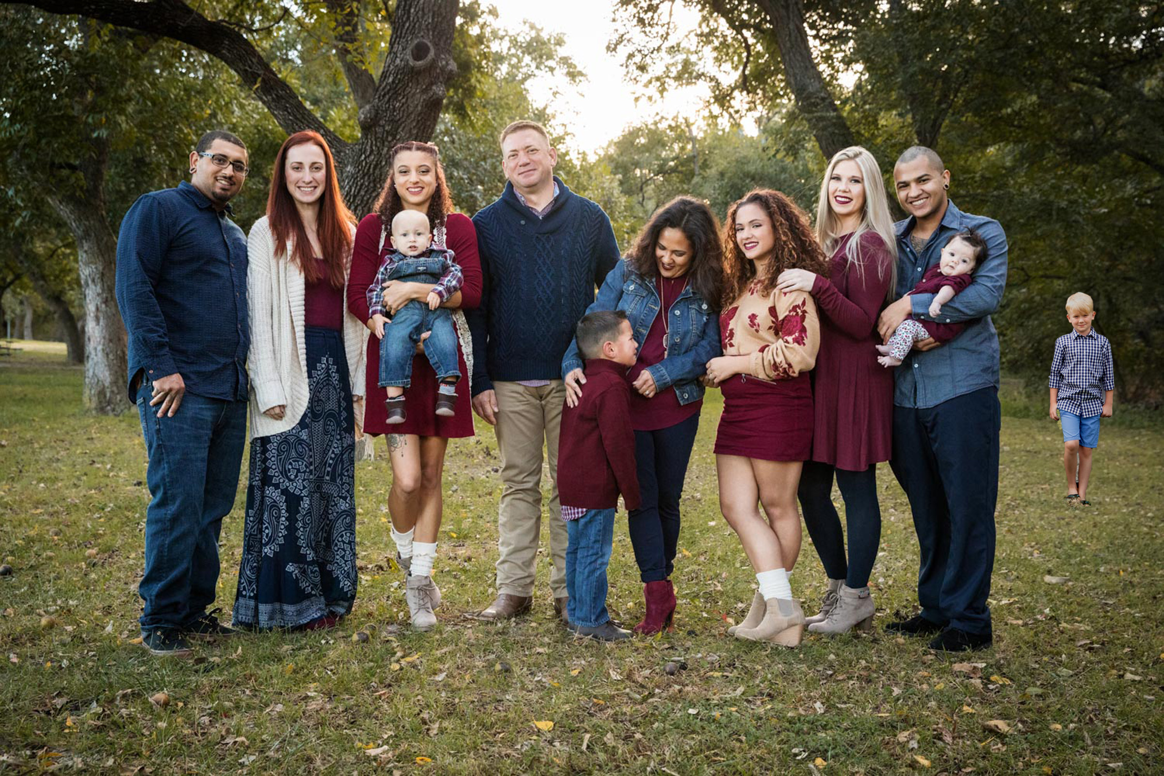
He also suggested I think about offsetting the “inserted” character and was something I thought would be really interesting to look at and something I would be able to complete before assessment.

I decided to test this with one of the larger family group images

Original image.2

The hardest part of this seemed to be where to place the “inserted” character. Too far away and they seemed not to be part of that particular group, but had a bit of a strange feel to it. It seems to be that because you don’t see the child in the distance on the right straight away, but when you do its a bit if a surprise followed by feeling a bit worries as to why he is there on his own. (Offset 1). Placing them near enough to be part of the group but not actually in the group seemed to work well, although both these images made me feel quite uncomfortable. It would be an interesting experiment to show all three images to both adopted and non adopted people and ask them to rate their uncomfortableness on a scale! Offset 2 made me think that the child desperately wanted to be part of the group which made me feel quite uncomfortable and a bit sad.

Offset 1

Offset 2

When I initially read the feedback around offsetting one of the figures I thought it might look a bit obvious. It really doesn’t and although this doesn’t say everything that I was attempting to say, the fact that both images resonate with me means they are working at some level.