Assignment Two:Narrative – Submission

Brief

Choose between the following two assignments:

1. Photographing the unseen

Start by doing some reflecting in your learning log. What kinds of subjects might be seen as unphotographable? How might you go about portraying them using photography? List a few examples of things you’re experiencing now or have recently been thinking about. This doesn’t have to be too in-depth or revealing, but it can be if you want. Equally, it might be something as apparently trivial as how you’re going to fit everything into your busy day. At first you may come up with literal examples, but the more you think about them the more those ideas will develop into specific and more original ones. Make a list of at least seven ideas. Try and keep to things you have a personal interest in or curiosity about.

Keep a notebook​ with you at all times and make notes when ideas strike you as interesting. (This is good practice for all stages of the degree and beyond. Ideas books are something to be revisited time and again for ideas and hints for the photographer you’re becoming.)

Now implement one of your ideas. Aim for a tightly edited and visually consistent series of ​7–10 photographs.

2. Using props

This option is about photographing an object to suggest a narrative.

Choose between a white shirt and a handkerchief for your object. Once you’ve decided; make a series of ​7–10 photographs​ which tell a story about or including your object.

You can make your photographic style anything you like. You may wish to include the prop in all of your series or just some of the images, depending on the narrative. Bear in mind that the story is being alluded to through the use of the prop and its location – and characters should you choose to include them.

Draw a storyboard​ before you start to help you consider the progression of the plot and how you’ll set up the shots.

Now implement one of your ideas. Aim for a tightly edited and visually consistent series of 7–10 images.

Introduction

Unfortunately my partner and I have attended several funerals in the last couple of months. I guess this is par for the course as you get older but with both of us being fairly young 60yr olds and the people who died being around the same age, we are aware that we have experienced a few too many than would be expected. None of the deaths were covid 19 related, two of them were expected due to illness and one sudden and unexpected. My partners white shirt (not always the same one) has evolved over the years as he got older and in the last couple of months has been well and truly put into the role of “funeral shirt”. I only really became aware of  this when I was putting the ironed shirt back in the wardrobe after the funeral of a friend, knowing that it was likely to be needed again in a few weeks. The second funeral and the shirt, needed a bit sooner that expected, but expected. When the shirt was placed back in the wardrobe the second time, I had no expectations that it would be needed again quite so soon. It became clear to me after the third and sudden death that the white shirt and its role in my partners life had started to represent something important in my head, if not in his. I think perhaps I was more conscious of it.
In simple terms the white shirt, and its role in my partners life is telling the same story over and over again, of loss and healing.

In my planning, (Link) I created a story boards as suggested, and found this really helpful in keeping me on track and recording my ideas (my ability to sketch is not the best however). It was a challenge to complete this part of the course whilst dealing with all the emotional and practical aspects that come with this kind of loss but there were elements of healing in continuing and not letting it consume my thoughts. The research (Link) and reading I did at times helped to keep me sane. Christmas and covid restriction put a whole extra level of stress an anxiety in there! I have not added text to the images but I do believe the series would benefit from some. I just don’t know what! I did think of just adding three dates to each image. The dates that the white shirt was in any of the particular states for the three people we lost. This would however make it personal and that was something I was trying to move away from (rightly or wrongly). I am hoping my tutor can point me in the right direction.

I don’t think this assignment is going to be one of my best. I did consider asking for an extension but I’m not sure that would have helped.  I do think however that as with assignment one, that in a few months, when some of this turmoil has quietened down I will be able to revisit and perhaps do them both justice. I am keeping my fingers crossed that the next part of the course can be completed without a life changing event occurring!!!

Final Submission

Img.1

Img.2

Img.3

Img.4

Img.5

Img.6

Img.7

Img.8

Research Task: Relay

Examples of relay in contemporary photographic practice include Sophie Calle’s Take Care of Yourself​ and Sophy Rickett’s ​Objects in the Field​ (see interview in the Appendix to this course guide) where clashes of understanding or interpretation work together to create a perhaps incomplete but nonetheless enriching dialogue between artist and viewer.

Look these pieces up online. Investigate the rationale behind the pieces and see if you can find any critical responses to them. Write down your own responses in your learning log.

● How do these two pieces of work reflect postmodern approaches to narrative?

Sophie Calle’s Take Care of Yourself

Fig. 1 (Calle, 2007) Take Care of Yourself

Trying to get into this work was very frustrating and I’m still not sure if I have got to the bottom of what the “installation” fully consists of. Sophie Calle is described by the Tate as;

“a French writer, photographer, installation artist, and conceptual artist” (Tate, n.d.)

Her installation Take Care of Yourself (2007) was inspired by an email sent to her from a boyfriend in which he broke up with her. She asked 107 women to read and analyse it in respect of their various professions and recorded their reactions.

“It was set to music, re-ordered by a crossword-setter, performed by an actress, and probed by a forensic psychiatrist, amongst others” (Tate,n.d.)

Calle herself says that;

“There is a lot of text, and I try to find another kind of way to interpret the language like a dancer, singer, or actress, to at least make it more accessible” Calle, S (2007)

If I have understood correctly she initially chose women by their profession and in particular those who were used to interpreting text such as writers, to look at style, language and syntax. She then looked at a more subtle way to interpret the text. This included women who created a crossword grid of the words in the letter.

“I chose women by the profession. I decide to give the letter to woman used to interpreting text so they were very obvious ones at the beginning. The writer for the style, to study the language, or the syntax. Then I started to find more subtle way of interpretation like the crossword woman that makes a grid with the words of the letter. Poems with them etc.etc” Calle, S (2007)

Realising that there was a lot of text and the problem of language, she looked at other ways to interpret it, including actors, dancers and singers.

“I realised the problem of the language in such a work which a lot of text, and I tried to find another kind of interpret protagonists like singer, actresses at least to make it more accessible” Calle, S. (2007)

It was interesting to see that her work evolved from the initial choice of women used to interpret text to poets and crossword makers on to singers, dancers and actors. I had made the assumption that the work was completed then exhibited without any change. Her response to the email is so unique and inspiring and the project itself helped her to deal with and get past the break up.

Looking at it in simplistic way I can see the value of interpreting text though other mediums such as music, image, and many more. However I’m not sure that having a parrot repeat some of the email and then tear it up isn’t a bit over the top. It would however certainly be something worth seeing! I was a bit dubious about Calle’s work at the beginning of this task but now that I understand it a bit better, have a respect for some of the ways in which she thinks and works.

Sophy Rickett’s Objects in the Field

Fig. 2 Sophy Rickett (2013)

For a long time, for me, art has been something you look at and it should, in some way,  be aesthetically pleasing. I do understand that there is often far more to it than that and as I process through the course, this is something I am beginning to understand and appreciate.

I found the majority of Rickett’s images to be very pleasing to the eye and it took me quite a while to get away from the images themselves and start looking at the narrative. I don’t actually believe these images need a narrative as such,  they are just wonderful to look at and I made a mental note to see if my view of them changed in any way after reading the narrative and if this was positive or negative or perhaps just different. I also love anything to do with the solar system, planets, space, stars, so this too may have made the series something that attracted my attention visually.

“The project consists of several series of photographs, a monitor based video and a text, each of which reflects in some way upon her encounter with Dr Roderick Willstrop, a retired astronomer based at the IoA” (Boothroyd, 2013)

I found her narrative difficult to read and initially didn’t understand the relevance of her references to an eye test at an early age and her journey home where she recalls seeing a couple of children playing. They didn’t make sense to me in respect of the project. I assumed I must be missing something. I gave myself some time to try and get my head round it all and kept coming back to it and reading it in sections, along with other information I was finding in books and online. The mist did start to clear somewhat but I’m still not sure I fully understand what she was trying to convay.

“Other parallels began to emerge over time, to do with photographic processes, but also to do with using lenses to extend the limits of our vision, which in turn took me back to memories having my eyes tested in a hospital corridor when I was young, and all the language around that” (Rickett, 2013)

“It recalls something I saw years ago, when I was sitting on a train as it pulled out of a small seaside station in Devon. A young boy was standing on the sea wall smiling and waving at the train, but the waving stopped abruptly when he was drenched in water by his companion who threw a boulder in to the water that made a big splash.  In an allusion to the incompleteness of my interpretation, the partiality of my account, I write that I see ‘just the beginning of what is to pass between them, a fragment of story as it begins to unfold’ before the trains speed up, ‘and then I have gone’.” (Rickett, 2013)

Looking at the question at the beginning of this exercise, How do these two pieces of work reflect postmodern approaches to narrative? I first had to gain a better understanding of the phrase/word “Postmodernism”. It was clear that I didn’t have a good enough understanding of it to answer the question.  I found a paragraph from MoMA which I think gives a good explanation and helped the most.

“In art, postmodernism refers to a reaction against modernism. It is less a cohesive movement than an approach and attitude toward art, culture, and society. Its main characteristics include anti-authoritarianism, or refusal to recognize the authority of any single style or definition of what art should be; and the collapsing of the distinction between high culture and mass or popular culture, and between art and everyday life. Postmodern art can be also characterized by a deliberate use of earlier styles and conventions, and an eclectic mixing of different artistic and popular styles and mediums” (Postmodernism | MoMA, n.d.)

There were several ways in which Calles work reflects a post-modern approach to narrative. She is definitely refusing to adhere to a single style and no distinction between art and everyday life. The publication of something so private and her use of varying media to allow people to take from it what they will. As Calle herself says,

“I don’t want anything from visitors interests they are free to do what they want I cannot give the rule of the game of the project then give the rule of the game for the visitors of how to take it it’s not anymore my problem I mean is their territory after not mine” Calle, S. (2007)

Rickett’s work also reflects postmodernism in art in the way the narrative brings up seemingly unrelated memories and events. Her need to find connections between her work and that of the collaborator and her willingness to admit failure in bridging the the two practices.

“…..so the failure would be to do with a kind of misalignment between the way we think about our work.  Insisting that the project had bridged our two practices, or brought them together in any real way would feel like a platitude” (Rickett, 2013)

I found both these pieces of work difficult to understand and work through. I believe I have only scratched the surface in fully understanding them but I feel I gained in my understanding of the use of narrative and the varying ways it can be interpreted.

Bibliography

Tate. n.d. Sophie Calle Born 1953 | Tate. [online]
Available at: <https://www.tate.org.uk/art/artists/sophie-calle-2692&gt;
[Accessed 23 November 2020].

Figure 1
Calle, S., 2007. NYAB Event – Sophie Calle “Take Care Of Yourself”. [online] Nyartbeat.com.
Available at: <http://www.nyartbeat.com/event/2009/4C2E&gt;
[Accessed 23 November 2020].

The Museum of Modern Art. n.d. Postmodernism | Moma. [online]
Available at: <https://www.moma.org/collection/terms/84&gt;
[Accessed 28 November 2020].

Boothroyd, S., 2013. Sophy Rickett. [online] photoparley.
Available at: <https://photoparley.wordpress.com/2013/12/03/sophy-rickett/&gt;
[Accessed 15 November 2020].

Figure 2
Rickett, S., 2013. Sophy Rickett. [online] photoparley.
Available at: <https://photoparley.wordpress.com/2013/12/03/sophy-rickett/&gt;
[Accessed 28 November 2020].

Exercise 3: Poetry Interpretation

Choose a poem that resonates with you then interpret it through photographs. Don’t attempt to describe the poem but instead give a sense of the feeling of the poem and the essence it exudes. Start by reading the poem a few times (perhaps aloud) and making a note of the feelings and ideas it promotes, how you respond to it, what it means to you and the mental images it raises in your mind.

Next, think about how you’re going to interpret this visually and note down your ideas in your learning log.

You may choose to develop this idea into creating a short series of images reflecting your personal response to the poem (or another poem). Write some reflective notes about how you would move the above exercise on. The number of pictures you choose to produce for the exercises and assignments in this course, including this one, is up to you.

Try to keep in mind the following tips for knowing when you have done enough/not done enough:

  1. Are the images repeating themselves? Are there three versions of the same picture for example? Can you take two out?
  2. Does each image give a different point of view or emphasise a point you want to make?
  3. Do the images sit well together visually?
  4. Have you given the viewer enough information? Would another picture help?

I became interested in the poet Rupert Brooke, a few years ago when I picked up a leaflet about him in a local tea shop. It was his life that interested me more than his poetry, at the time, and as such, I thought one of his poems might be a good subject for the exercise.

Fig. 1 Rupert Chawner Brooke English war poet 3 August 1887 (Photo by Culture Club/Getty Images)

Fragment

BY RUPERT BROOKE
I strayed about the deck, an hour, to-night
Under a cloudy moonless sky; and peeped
In at the windows, watched my friends at table,
Or playing cards, or standing in the doorway,
Or coming out into the darkness. Still
No one could see me.

I would have thought of them
—Heedless, within a week of battle—in pity,
Pride in their strength and in the weight and firmness
And link’d beauty of bodies, and pity that
This gay machine of splendour ’ld soon be broken,
Thought little of, pashed, scattered. …

Only, always,
I could but see them—against the lamplight—pass
Like coloured shadows, thinner than filmy glass,
Slight bubbles, fainter than the wave’s faint light,
That broke to phosphorus out in the night,
Perishing things and strange ghosts—soon to die
To other ghosts—this one, or that, or I.

This poem i reminded me of the melancholy feeling of Christopher Doyle’s cinematography and Nishi-ikebukuro’s images of  Tokyo in 2006, which I looked at in a previous unit for an exercise on artificial light. I marked in bold the parts of the poem that resonated with this style. I tried not to think of the words in the poem and match them with objects but rather feelings and atmosphere.

Initially, instead of taking new shots, I decided to look at these images and try to determine why they had come to mind. The poem made me feel quite melancholy, lonely, it had an “empty rainy street” atmosphere about it.  I pulled a selection of the images into photoshop (Img 1-3) as layers, turned some of them black and white, and brought them together as a single image to try and reflect those feelings. (Img. 4)

Fig. 2

Fig. 3

Fig 4. Shiba, Minato Ward, Tokyo 2004

Fig. 5 Nishi-ikebukuro, Toshima Ward, Tokyo 2006

Img. 1

It didn’t occur to me until after I had saved the image that it is made up of fragments of an exercise, brought together in response to a poem called “Fragment”

I often find myself using the word “atmosphere” when trying to describe something that can’t be described easily in relation to feelings or how I feel in a particular place or situation. I suspect it might be my way of describing something that other people might describe as being left with a strange (not always bad) feeling – usually something that may take time to dissipate. Perhaps after a dream or a happy or sad event. It’s not one particular part of it,  but an atmosphere that is left. (pretty hard to describe -sorry). I find this happens with memories too, particularily ones from a long time ago. They don’t always have distinct parts to them,  just an “atmosphere”. The poem had a particular atmosphere that reminded me of the images. I’m not sure my image has completely captured it but it’s a start.

I am now left pondering on how difficult it might be to capture an “atmosphere” in an image(s)?

My “Atmosphere’s may have:

  1. Colours
  2. Light
  3. dark
  4. Tones
  5. Shapes
  6. Textures


Bibliography

Figure 1
Poetry Foundation. n.d. Rupert Brooke | Poetry Foundation. [online] (Photo by Culture Club/Getty Images)
Available at: <https://www.poetryfoundation.org/poets/rupert-brooke&gt;
[Accessed 15 November 2020].

Figures 4-5
At: https://www.lensculture.com/sshintaro?modal=project-1861
[Accessed 11/12/2019]

Figures 2-3
At: https://www.indiewire.com/2012/12/watch-bbc-docu-about-christopher-doyle-his-work-on-in-the-mood-for-love-chungking-express-more-103091/
[Accessed 01/12/2019]


Exercise 1: The Dad Project

Brief

  1. How does Briony Campbells The Dad Project compare with Country Doctor
  2. What do you think she means by “an ending without and ending”?

The Country Doctor is a series which  takes a look into the life of a country doctor;

..……photographer W. Eugene Smith spent 23 days in Kremmling, Colo., chronicling the day-to-day challenges faced by an indefatigable general practitioner named Dr. Ernest Ceriani. (Cosgrove, 2012)

and doesn’t chronicle a particular event like Briony Campbells The Dad Project. Campbell’s work is also very personal, she is part of the story and not an outsider taking shots of strangers and places.Because of the very personal nature of Campbells project, it was not an easy task right from the start as she points out;

My desire to undertake this challenge was not followed easily by the decision to go ahead… far from it. I’ve never deliberated so heavily over anything. For a while this decision became the most agonizing aspect of my grief. (Campbell, 2011)

This is an aspect that was not there for Smith, and although there must have been some harrowing moments, he was not personally involved with the people in the shots.

In trying to answer the question – What do you think she means by “an ending without an ending” I got caught up in determining “ending” to mean two things, the end of her dads life and the end of the project. The project itself has continued and her relationship with her dad has continued through it. It has helped others to cope with their own grief, and helped her to cope with the absence of her father, as her life moved forward – with her dad.

In realizing The Dad Project I made a lot of tough decisions. Without my dad, but very much with him.(Campbell, 2011)

Bibliography

Figure 1.
Campbell, B., 2011. The Dad Project – Briony Campbell | Photography & Film. [online] Brionycampbell.com.
Available at: <http://www.brionycampbell.com/collaborations/the-dad-project/?overview&gt; [Accessed 23 November 2020].

Figure 2.
Smith, W,E. 1948. Country Doctor
Magnum Photos. Country Doctor • W. Eugene Smith • Magnum Photos. [online]
Available at: <https://www.magnumphotos.com/newsroom/society/w-eugene-smith-country-doctor/&gt;
[Accessed 23 November 2020].

Cosgrove, B., 2012. W. Eugene Smith’s ‘Country Doctor’: Revisiting A Landmark Photo Essay. [online] LIFE.
Available at: <https://time.com/3456085/w-eugene-smiths-landmark-photo-essay-country-doctor/&gt;
[Accessed 9 November 2020].

Campbell, B., 2011. [online] Brionycampbell.com.
Available at: <http://www.brionycampbell.com/wp-content/uploads/2013/03/The_Dad_Project_Briony_Campbell.pdf&gt;
[Accessed 9 November 2020].

Assignment One: Reflection and Feedback

Note: (Having just finished part one and then having given part two (Narrative) a quick look I wonder if this assignment fits better with this section!)

My first thoughts after completing this assignment were that I don’t yet have the skills or the knowledge to do the subject justice. But, I do believe I have taken a huge step in my ability to move into a more conceptual way of thinking.

With hindsight I am not sure that my response to this assignment precisely fits the brief, but once I had come up with the idea I wasn’t able to come back from it. The two sides of this story are both true, but the observer could take something completely different from without the context.

Some of the things I learned:

  • I was surprised that visualising the images mounted on a wall before I had actually picked up my camera, helped to inform and visualise what I felt the images should contain and look like.
  • I hadn’t attempted any type of hanging plan or style pf presentation thus far in the course and this is  a new and welcome addition to my image making.
  • Knowing when to stop! I had so many different ideas in the end that trying to apply them all would have really started to disrupt the concept. I wanted it to be “deep” but “simple”
  • Focus stacking in Photoshop to get a sharp image whilst using a wide aperture.
  • What I had learnt in a previous exercise (Street Photography) when considering the benefits to the series of colour or black and white. In the past, I would have made the decision between black and white and colour, purely on aesthetics
  • The value of research in providing inspiration and nudging curiosity.
  • To take more organised notes during the planning process and make sure I jot down ideas rather than thinking I will remember them.
  • To keep scribbles and sketches to include in my blog.
  • Having the diary really helped fire my imagination and I found it so useful to have something to use as inspiration.

This was a challenging project, but one that I feel has shown that I can come out of my comfort zone. I do have concerns that I have strayed too far from the brief and have overlapped into part two, but I will wait for Tutor feedback to answer that one!

Tutor Feedback

Overall Comments

  • Despite your worries about fitting the brief, this is an interesting, albeit difficult subject to work with. Personal experiences are what helps to make individual and meaningful work but also can create problems of objectivity.
  • Some pertinent research that sets up your visual strategy well 

Demonstration of technical and Visual Skills, Quality of Outcome, Demonstration of Creativity

  • I am not concerned about how much or little this fits the brief, this is fine.
  • Although the act of creating a tableau is, of course, a construct, there is something about these sets of images that feels very cold and detached, is this deliberate?
  • Is it sensible to use the same objects in each set? If you don’t have her actual things any more, could you search out similar items to use for her set? This could be interesting in terms of the relationship between documentary photography and truth, in that the viewer would be asked to decide if it is ok to use ‘props’ instead of actual object. Could you also have chosen a different table cloth? Background?
  • Without actually seeing the colour versions, I don’t necessarily agree with you about the brutal removal of colour. You said, ‘Objects stood out better in black and white? – really, what does this mean? And this may be true in terms of a formal account of the pictures but what you also do is remove the potentially different characters depicted by the differing sets of images.
  • It would be good to see some examples of entries form your mother’s diary – if that is ok with you emotionally. I was interested to read about the way that your life gradually began to feature more heavily as time went on – is this something that you could explore through these images?
  • You did some good research around the history of still life, as well as a more contemporary look at the genre but please be careful that you do not try to transplant meaning from one era to another. You said, ‘symbolise feelings and other abstract concepts’ – be careful particularly given the different way that images are read in different times – an extreme example perhaps but the swastika or a more contemporary symbol, the facemask? Different cultural epochs render different meanings to different objects – is this something that you could utilize in your work? Could you choose different objects from your’s and your mum’s own eras that have slightly different meanings in different times? Beware, specifically of using clichés like clocks – unless this is part of your visual thesis. For example, I could look at those objects and they would have very different associations,–
    • Watch – fitness, I use my apple watch to stay fit during lockdown
    • Small bunch of keys – the problems that my son has with anxiety
    • Whiskey glass – American movies

Coursework

Demonstration of technical and Visual Skills, Demonstration of Creativity

This looks fine, good to see you persevering with experiments that you don’t particularly enjoy!

Research

Context, reflective thinking, critical thinking, analysis  

  • Some good stuff here and it is clear you understand the use of symbolic object.
  • Now you need to think about extending this research to a more analytical phase to bridge the gap between this and your own visual experiments.
  • Remember also that your own experimentation is part of your research process.

Learning Log

Context, reflective thinking, critical thinking, analysis  

  • Could you start a completely different word press blog?
  • We’ll have a proper look at this when you have new blog in place.

Suggested reading/viewing

Context

Ted Talk – Robert Bloom in relation to the value we ascribe to objects.

https://www.ted.com/talks/paul_bloom_the_origins_of_pleasure?language=en

Pointers for the next assignment / assessment 

  • Work on your analysis and reflection, think further about the images you are making as well as those that you are researching.


Assignment One: Research – Contemporary Still Life Photographers

Still life photographers

I had decided that I didn’t want the images to be in the style of the “Old Masters”. I find them quite dark, depressing and the religious connotations don’t fit with the meanings, and feelings I was attempting to convey.

I looked at the work of several photographers, creating pin boards of images that struck a chord with me. I decided to have a closer look at the work of a few of them and selected: Irving Penn, Martin Parr, Marian Drew and Laura Letinsky, all of whom have produced work that I felt might be inspirational for my images.

Irving Penn:

Born 1917 Penn, an American photographer is well known for is still life and fashion photography, working for many famous brands such as Vogue and Clinique. His images have echos  of the symbolism used by the old masters,  but not often in the same style. (Fig. 1-3)

“He made still life for use as editorial photographs for Vogue, as advertising photographs for various companies, and for himself…… Penn produced a number of still-life photographs celebrated for their elegance and clarity. He switched between black and white and color as called for by the objects at hand, and his diverse subject matter included food-stuffs, human skulls, animal bones, flowers makeup, luxury goods, and detritus found in the gutter” (Martineau, 2010)

Several aspects of Penn’s images seemed pertinent  to my “story”.  I had started to consider composition at this point, and found the style of Fig. 2 the most appealing, which I have no doubt has something to do with the composition and the tone. The lack of colour gives its calm, even, feeling without any single aspect grabbing too much attention.

Martin Parr:

A British photographer born in 1952, and known for his photojournalism around the subject of everyday life in England, although he also travelled extensively and took photographs around the world. His still life’s often feature food and everyday objects which again echo back, at times,  to the symbolism of past paintings. His use of images to portray something that may look like a snap shot of someones “dinner”, but is in fact expressing a serious and far more meaningful concept, is one of the reasons I chose to take a closer look at his work.

‘I make the pictures acceptable in order to find the audience but deep down there is actually a lot going on that’s not sharply written in your face’, Parr has said of his practice. ‘If you want to read it you can read it” (Parr, N.D)

“What the wily photographer is in fact doing is transforming his viewer into a kind of subjective judge; as we try to unravel the image, guessing the location, the occasion and the class of its subject, we are simultaneously creating a narrative about the characters in it, based on their snack of choice” (Seymour, 2016)

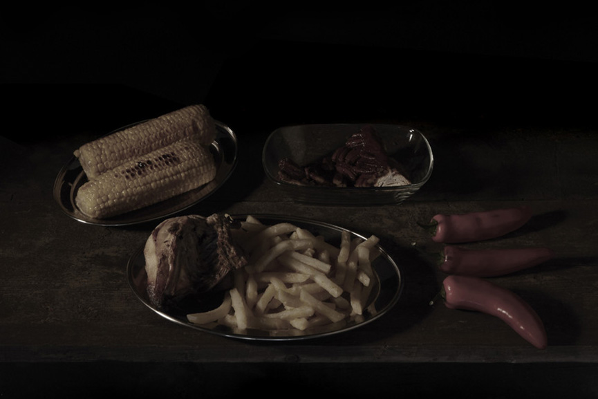
Although many of the images I examined were centred around food, he also included a wide variety of people, places and other seemingly everyday subjects in his work. I did notice the tablecloths in some of his shots which provided and indication of the location of the shot and therefore the nationality of the food itself, particularly in Fig.1 (British) and 2 (Mexican).

Marian Drew:

Australian photographer Marian Drew’s work has a strong suggestion of the tradition of painting symbolism as suggested by Dr Marcus Bunyan in 2011

“Drew’s tabletop still life compositions feature fruits, vegetables, and dead animals and birds presented as game. While the unusual angles and lustrous colours bring to mind paintings by Paul Cézanne, the richness of the fabrics and dramatic lighting look back to 17th-century examples. Road kill gives Drew’s photographs a dynamic twist that calls into question mankind’s stewardship of the earth and it’s creatures.” (Bunyan 2011)

Drew says of her work

“With this work I aim to bring actual and specific deaths to our attention and to acknowledge their close links to the sustainment of our lives. Through a process that aims to honour the specific through the verisimilitude of photography and the general through formal, ritualistic frameworks of kitchen and the historical genre of still life painting, I hope to promote a sense of gratitude, respect and responsible awareness to  ‘other’ animals as well as to ourselves.” (Drew N.D)

There is also an element of surprise in Drew’s work. We would not normally expect to see a dead bird in a kitchen today, on a table or in a bowl. It was not clear if her use of fruit, such as lemons and game are included as symbols in their historic traditional sense or if they are being used as symbols personal to Drew.

“The lemon has come to symbolise many opposing ideas – while it’s considered a symbol of luxury, love and longevity, it’s also emblematic of sourness and disappointment. The lemon is bittersweet: its beauty at odds with the sharpness within. Of all the icons in the still life scene, the lemon is the most favoured. Its appeal was both to the artist, as a chance to display their skill – and to the patron as an opportunity to demonstrate their sophisticated tastes” (Marks, 2020)

“Like all representations of meat, game and shellfish, the lobster is most commonly thought to symbolise wealth, gluttony and temptation” (Marks, 2020)

I noted again the use of tablecloths, and napkins, which in this case add to the incongruity of the dead animal or bird placed on them.

Laura Letinsky:

Canadian born still life photographer Laura Letinsky moved from photographing people to photographing objects in the late 1990s. Her work resonated with me more than any of the other images I had researched so far. Her placement of objects seemed to be saying something about the passing of time and items about to fall off the table about endings. The idea of objects moving further away as they become less important to my mother and closer as they become more important was an interesting idea to consider for my sets. Tablecloths featured heavily too!

“Letinskys photographs appear to be about loss, reminding the viewer of the ephemeral nature of life in a different, and perhaps more subtle way than has been done previously” (Martineau 2010)

There were two images in particular that I felt were likely to influence the style and composition of my sets; Irving Penn’s still life (Fig. 2 New York Still Life New York 1947 Platinum) and Laura Letinsky’s still life (Fig. 19 Laura Letinsky, from the series Hardly More Than Ever, 1998).


Bibliography

Martineau, P., 2010. Still Life In Photography. Los Angeles, Calif.: J. Paul Getty Museum, p.13.

Figures 1-6
Penn, I., n.d.
[online] The Irving Penn Foundation.
Available at: <https://irvingpenn.org/still-life&gt;
[Accessed 28 October 2020]

Seymour, H., 2016. Martin Parr’s Unusual Take On International Cuisine. [online] AnOther. Available at: <https://www.anothermag.com/art-photography/8534/martin-parrs-unusual-take-on-international-cuisine&gt;
[Accessed 28 October 2020].

Art Fund. 2015. Martin Parr: Museum Of The Year Finalists In Pictures. [online] Available at: <https://www.artfund.org/blog/2015/06/30/martin-parr-museum-of-the-year-finalists-in-pictures&gt;
[Accessed 28 October 2020]

Figures 7-12
Parr, M., n.d.
[online] Magnum Photos.
Available at: <https://www.magnumphotos.com/&gt;
[Accessed 28 October 2020]

Bunyan, M., 2011. Marian Drew Lorikeet With Green Cloth – Art Blart. [online] Art Blart.
Available at: <https://artblart.com/tag/marian-drew-lorikeet-with-green-cloth/&gt;
[Accessed 28 October 2020]

Figures 13 – 18
Drew, M., n.d.
[online] Slate Magazine.
Available at: <https://slate.com/culture/2013/02/marian-drew-photographing-still-lifes-of-dead-animals-in-australia-photos.html&gt;
[Accessed 28 October 2020].

Martineau, P., 2010. Still Life In Photography. Los Angeles, Calif.: J. Paul Getty Museum, p.14.

Figures 19-24
Letinsky, L., 1998-2014
[online] Yanceyrichardson.com.
Available at: <https://www.yanceyrichardson.com/artists/laura-letinsky/featured-workds?view=slider#17&gt; [Accessed 28 October 2020].


Assignment One: Planning and Creating the series (Two sides of the story)

I decided to produce two sets of five images. One set to represent my mum’s year;  going from her being unaware of her future diagnosis, the moment immediately after diagnosis, the period where she was coming to terms with it, living with it and then the time just before her death. The other set to represent my own version of  the same year going from living my own life with a mum who lived 2 hours away, was independent and who I saw fairly regularly but who’s life was very different to mine. I wanted the images to represent the way our respective lives changed as the year progressed and the way in which we became closer.

I could visualise the images on a wall and I could see them coming very subtly closer together as time went on. (Fig. 1) (Exaggerated offsetting to remind me.)

Fig. 1

Visualising the images helped me to inform the style and the composition. I could see my mums set getting gradually getting darker from the first to the last with objects changing their position to reflect their relative importance in her life. And some objects moving from her set to mine to express the increasing closeness and closure.

Fig. 2

The objects and their symbology

Set One – My Mum’s

  1. Watch – Time – limited time.
  2. Small bunch of 2 keys – symbolising independence.
  3. Glasses – active, independent.
  4. Whiskey glass – A glass seems to symbolise different things but there is a reference to them. symbolising  “the overthrow of worldly achievements by death” Slowly emptying
  5. Flower – Symbolising life.
  6. Petals (leaves) falling – Her health declining as she moved towards death.
  7. Tea Pot and cup/saucer – The move away from precious possessions.
  8. Diary-  Only in the first 4 images – then it moves to my set, (final image).
  9. Books – Knowledge – still a need to learn
  10. Christmas tea light  (moves to my set in chapter 5) the passing on of traditions after death.

Set Two – Mine

  1. Books: – Work and study – there are less books in the later images due to less time being available.
  2. Grater and Lemon:  domesticity – caring for my son
  3. Large bunch of keys: Busy and independent
  4. Flower: symbol of life
  5. Watch and Clock: Busy
  6. Mums Diary in image 5: Keeper of her possessions
  7. Christmas Tea Light: Creating own tradition
  8. Additional Tea Light in final image: Continuing tradition and joining of traditions.
  9. Phone – communication
  10. Cup and saucer – moves from Set 1 to Set 2 final image – her possessions now move to me.

Reviewing the images that I looked at for inspiration, I picked out three to focus on whilst creating my sets;


I initially used a glass table with a slightly scrunched up crochet tablecloth and a light underneath, to give a bright, almost ethereal look, with the background wall kept dark with a shadow pattern being thrown on it through the tablecloth from the light. But I found the  pattern too distracting . I used a smaller light coming from the left to reduce the shadows on the objects. At this point I hadn’t come to a decision about composition, preferring to allow this to evolve with the test shots.

I wanted all the objects to be in sharp focus, and took 4 test shots (Fig. 6 – 9) with different areas in focus. This allowed me to keep the aperture wide. I used photoshop to stack and blend all the shots into one (Fig. 10). This worked well and was another Photoshop first for me.

Fig. 10 Blended image, with all required area in focus

After some deliberation I changed the tablecloth as I was finding it too distracting and I felt it really wasn’t adding anything to the images.
I took a whole series of test shots, playing with different objects and positions, and a different table covering. As this was very much experimental, I chose to do this without a memory card, reviewing the images quality on screen. I only started to capture the images once I felt things were worth deeper review.

The next set of test shots worked quite well, but I needed to fix a “falling forward’  issue that was noticeable on the coffee pot glass and cup, by rotating and cropping the images. The result wasn’t ideal as the flower was then too close to the top and caused tension.  (Fig. 11,12). I was basically happy with the composition and the objects themselves, but the changing light needed to be more subtle. The main light source was still natural light and so I decided to try taking the shots at 15 minute intervals, starting at 16:00, to capture the fading winter light. In the end i found adjusting the exposures in Photoshop gave me more effective control.

Final test Set

In a previous exercise we were asked to take colour and black and white shots and then review them. Looking at my test shots, I asked myself what the colour was doing for the images in relation to what I was trying to represent. The orange of the flower certainly caught the eye but this didn’t  add to the meaning. Turning them black and white gave the images texture and depth and although I can’t pin down exactly why, seemed to express more of what I’m trying to say.


Assignment One: Research – Symbolism in Still Life Photography

Symbolism in Still life photography

I didn’t know very much about this subject but I suspected it would fit well with my idea. I needed a way of representing the last 12 months of my mothers life, using her diary as the guide to what those days were like and how they changed over the subsequent months. At the same time I would symbolise my own life over the same time period as it drew closer to hers. After some thought I decided that a selection of objects might be a good way of expressing this and so started looking at Still Life Photography

Symbolism in still life photography appears to have its roots firmly grounded in the old masters of the 16th and 17th century.

“Burnt candles, human skulls, dying flowers, fruits and vegetables, broken chalices, jewellery, crowns, watches, mirrors, bottles, glasses, vases… Today, we can see them in the works of still life photographers, but more notably, these were the typical, prominent feature of the paintings created by the Dutch and Flemish Old Masters of the 17th century” (Kordic, 2016)

A symbol did not always symbolise the same thing, as it often depended on the painter or indeed the religion and education of the viewer. For example;

“Devout Catholics meanwhile would recognise in the careful spacing of Zurbarán’s quietly meditative Lemons, Orange and a Rose a reference to the Holy Trinity” (Pound, 2018).

 Osias Beert, a Flemish painter used fruits such as strawberries and cherries to depict the souls of men (Fig. 1).

Fig. 1 Osias Beert (c.1580-1623) – Still Life with Cherries and Strawberries in Chinese porcelain bowls

The use of symbols, it seems,  was not just for fun!

“……when the Dutch Reformed Protestant Church made it illegal to depict any religious icons in art. That meant that if an artist wanted to talk about anything to do with religion (which was pretty much the hot topic back in the day) they had to get clever. And so, everyday objects became codes for things you weren’t supposed to be talking about with a paintbrush…” (Knapp, 2019)

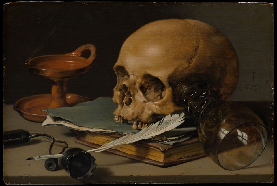
The word Vanitas kept popping up in my research and having never come across it before. I looked it up in the Tate glossary where it is described as,

“A still life artwork which includes various symbolic objects designed to remind the viewer of their mortality and of the worthlessness of worldly goods and pleasures” (Vanitas – Art Term. Tate, n.d.)

Figure 2 Pieter Claesz – 1628

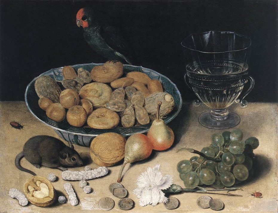
Another artist using symbolism at around the same time, was the Dutch painter Georg Flegel. His still life below (Fig. 3) is an absolute cacophony of symbolism; in fact there isn’t anything in it that doesn’t appear to have a symbolic meaning. The cross is represented by the walnut, Holy Communion by wine and grapes, Jesus by a white flower, Judas (betrayal) by the coins. The nuts were being guarded by a bird rather than the mouse who, being on the ground, is seen as closer to satan. In the words of the author;

“It was basically a Bible School cheat sheet” (Knapp 2019)

Fig. 3  Georg Fegel Dessert Still Life (first half of 17th century)

It had already occurred to me that I would have to be very careful in selecting the style of images. On looking at the Old Masters, I became very aware of  light and shadow and the challenges this might bring to the technical side of the shots. Looking further at contemporary still life photography, it was clear that this very challenge was often the inspiration itself;

“One of the most interesting and challenging aspects of this genre of painting and the reason why many still life photographers are attracted to it is the chance to explore the composition and lighting, probably much more than the topic of vanity itself. Because the medium of photography relies on light so heavily, still life of this kind provides a vast field of technical experimentation – in the manner of the Old Masters, still life photographers create the perfect contrast between deep shadows and penetrating light which highlights only certain objects” (Kordic, 2016)

Many of the images seen in contemporary still life photography bear a strong resemblance to the style of the old masters, in the subjects or visual countenance. In Figure 4 Krista Van der niet, a Dutch still life photographer has chosen items of food and butterfly’s, often found in the old masters but has; apart from the black background, given the image a very different look by her choice of lighting.

Fig. 4 Krista van der niet (N.D)

In Mat Collishaw’s series Last Meal on Death Row (2011) , (Fig. 5) he has incorporated food, and the style of lighting and composition used in the 16th and 17th century. There was quite a dark theme behind the series and this is reflected in the overall look of the images. Collishaw recreated the last meals eaten by prisoners on death row and states,

“I remade the meals in a manner usually used for reflecting on the accumulation of worldly goods, vanity and mortality,” Collishaw (N.D)

Fig. 5 Mat Collishaw. last Meal on Death Row (2011) – Paul Nuncio

Having discovered a whole wealth of information relating to the symbolism used in painting and often incorporated in still life photography, I needed to look closely at how I am going to express this in my own mages.

I moved on to look at some still life photographers and their work in order to get further inspiration. (Link)


Bibliography

Pound, C., 2018. Secret Symbols In Still-Life Painting. [online] Bbc.com.
Available at: <https://www.bbc.com/culture/article/20180318-secret-symbols-in-still-life-painting&gt;
[Accessed 26 October 2020]

Figure 1
Available at: <https://www.bbc.com/culture/article/20180318-secret-symbols-in-still-life-painting&gt;
[Accessed 26 October 2020]

Kordic, A., 2016. Still Life Photographers Who Give A Fresh Meaning To Vanitas | Widewalls. [online] Widewalls.ch.
Available at: <https://www.widewalls.ch/magazine/still-life-photographers&gt; [Accessed 26 October 2020]

Knapp, F., 2019. The Secret Language Of Still Lifes. [online] Messy Nessy Chic.
Available at: <https://www.messynessychic.com/2019/04/05/the-secret-language-of-still-lifes/&gt;
[Accessed 26 October 2020]

Figure 3
Flegel, G., (first half of 17th century). The Secret Language Of Still Lifes. [online] Messy Nessy Chic. Available at: <https://www.messynessychic.com/2019/04/05/the-secret-language-of-still-lifes/&gt; [Accessed 27 October 2020]. 

Figure 2
Claesz, P., 1628. [online] Metmuseum.org.
Available at: <https://www.metmuseum.org/art/collection/search/435904&gt;
[Accessed 27 October 2020].

Tate. n.d. Vanitas – Art Term | Tate. [online]
Available at: <https://www.tate.org.uk/art/art-terms/v/vanitas&gt;
[Accessed 27 October 2020]

Figure 4
Van der niet, K.,
Available at: http://www.kristavanderniet.nl/portfolio/arts-holland-magazine/#1
[Accessed 27 October 2020]

Figure 5
Collishaw, M., Last Meal on Death Row (2011) Paul Nuncio
Available at: https://matcollishaw.com/works/last-meal-on-death-row-texas/
[Accessed 27 October 2020]

Collishaw, M.,
Available at: http://content.time.com/time/photogallery/0,29307,2095889_2316164,00.html
[Accessed 27 October 2020]

Assignment One: Two sides of the story – Submission

Brief

Create ​at least two sets of photographs telling different versions of the same story. The aim of the assignment is to help you explore the convincing nature of documentary, even though what the viewer thinks they see may not in fact be true. Try to make both sets equally convincing so that it’s impossible to tell which version of the images is ‘true’.

It might be interesting to consider the project as evidence for a court case. What conflicting stories can you make your images convincingly tell? Would it stand up in court?

Choose a theme and aim for 5–7 images for each set, depending on your idea. Discuss this with your tutor.
Here are a few ideas:

  • You could interpret this brief by showing the same scenario from two different angles. Does this alter how we read the situation?
  • You may wish to create an alter ego by using snapshots of yourself or a friend. This could involve photographing them in two very different and potentially conflicting personas.
  • You could make a parody of a dating website profile picture. Create different versions of the same person looking completely different in each one. Which one represents them best and how can we know?

Or you may prefer to use your own take on the theme. However you choose to interpret the brief, ensure the images are candid and ‘taken from real life’. Be experimental and take some risks. Perhaps you could make a list of ideas and choose the most challenging or absurd option to stretch yourself.
Send your sets of images to your tutor by the method you’ve agreed. Include an introduction of 300 words​ outlining what you set out to do and how you went about it.

Introduction

For this assignment I set out to create 2 sets of images that express the same year, 1998, taking inspiration from my mothers diary. With one set representing my mums point of view and the other, mine. 1998 was the last year of her life. From her point of view there were changing priorities and a gradual reduction in her physical, social and general well being. For me there were also changing priorities, difficult decisions and a balancing of the present and the future. I wanted to show these changes in ten images in two parallel series, both containing five chapters.

I began by researching still life paintings, photographs and photographers. I collected together objects that would represent the changing months, using the diary as my guide to our lives during the year. I began to visualise the images very early which helped to inform the composition and style. I selected objects in order to symbolise feelings and other abstract concepts, and changed the positions of some of them to reflect their changing importance. My research into Still Life photography took me into the realms of the Old Masters and symbolism  (LINK) which fitted well with my ideas. Further research into  photographers such as Irving Penn and Laura Letinsky introduced more contemporary styles and techniques. (LINK). In addition to the symbolism, I decided to reflect the move towards the end of her life with subtle shifts in the brightness of the images, reducing the exposure slightly for each one.  I reviewed the shots in both colour and black and white and concluded that the objects stood out better in black and white, and this also exposed some nice texture on the wall and from the table covering, which adds depth. It also avoided the strongly coloured flower becoming the focal point, which did not really add anything to the meaning of the series.

With hindsight I’m not sure that the project fits the brief entirely. The images are candid in the non photographic sense of being open and honest, but not in the photographic sense of not having been staged. They tell two different versions of the same story, both of which are “true”. But im not sure they explore the convincing nature of documentary.

Set one, shows my mother’s side of the story, set two my own. The latter were naturally busier as my life was more complex at the time, and I maintained this complexity by keeping the number of objects constant, but rearranging them or swapping them in and out. I also added a couple of objects from my mums set to my final image to show family traditions passing on and  the move from being the child of a mother, to truly being an “adult” and no longer having the generation above.

Information detailing the planing and creation the images can be found here (LINK) and further information relating to my mums diary here (LINK)

The story: 1998; The sides; Mum – Me

I see the images being viewed in vertical pairs, from left to right, so that the viewer can compare the two sides of the story as the year progressed. I had been visualising the presentation of the images from very early in this process and as part of this I wanted the two sets to move very slightly nearer to each other, to express the way in which we became closer over the this time period.

Hanging Plan:


Set 1: Chapter 1

Set 1: Chapter 2

Set 1: Chapter 3

Set 1: Chapter 4

Set 1: Chapter 5

Set 2: Chapter 1

Set 2: Chapter 2

Set 2: Chapter 3

Set 2: Chapter 4

Set 2: Chapter 5

Exercise 2: Newspaper Analysis

Brief

Cut out some pictures from a newspaper and write your own captions.

  1. How do the words next to the image contextualise/re-contextualiseit?
  2. How many meanings can you give to the same picture

Try the same exercise for both anchoring and relaying. Blog about it

Original images and captions:

When I was coming up with some alternative captions, I realised that I may watch too many episodes of “Have I got News for you” I had the need to make them humorous and controversial and felt like I was doing the caption competition! I tried to make a couple of them appear real although completely wrong according to the original article.

  1. How do the words next to the image contextualise/re-contextualiseit?:

Figure 1. The original caption adds to the emotional response that most people would have reading the article. I tried to change the meaning but keep the subject matter the same. When I read the caption, I was doubtful as to how long any ceasefire might last in that part of the world and wondered if a more positive outcome would still work with the image; It does, although it is still adding to the emotional response.

Figure 2. This one was quite different from Fig. 1 (assuming fig one was a true image) because the image is not being used to send a message, or to control meaning. It is purely a picture of the people in the article but the image itself doesn’t add meaning to the article. For this one there was no meaning to change as such, but I used it in a similar way to the way in which stock photos are used.

Figure 3. The original caption as in Fig. 1 helps to illicit an emotional response. The way the shot has been taken also gives an idea of the scale of the problem. The caption change was around the fact that the pollution also looked like freezing mist or snow. It changes the meaning of the image but there is still a hint of the natural work being in trouble and the scale of that problem.

Figure 4. The original caption and image give the impression of a triumphant President on one of his golf courses. The new caption is a direct reference to the current political issues surrounding the election in the US, where President Trump is refusing to concede, and completely changes the meaning. Not triumphant any more, but incredulous. It is meant to be humorous with a hint of satire.

Figure 5. This alludes to images being used to portray almost the opposite of what they were originally taken for.

  1. How many meanings can you give to the same picture:

Try the same exercise for both Relay and Anchoring

For some reason I found myself wanting to put quote marks around the captions or questions marks at the end of them. Partly, to try and get the message across that it was me; the author of the caption saying something. And that I wanted the viewer to think about the image and the caption rather than see it as an extension of  information.

Bibliography

Figure 1.
Zavallis, A., 2020. The Observer, p.32.

Figure 2.
Vidotto, F., 2020. The Observer, p.41.

Figure 3.
Mann, B., 2019. The Guardian, p.9.

Figure 4.
MacNicol, I.,/Getty, 2016. The Observer, p.14.

Figure 5.
Zeya, S., 2017. The Observer, p.5.